
LinkedIn helps people build and engage with their professional network. For its New York City campus in the historic Empire State Building, LinkedIn wanted to honour the building’s history while updating it for a modern technology company.
Occupying the building’s entire third-floor, our New York team designed the 90,000 sq ft LEED-Gold office as the first point of contact for its guests and talent.
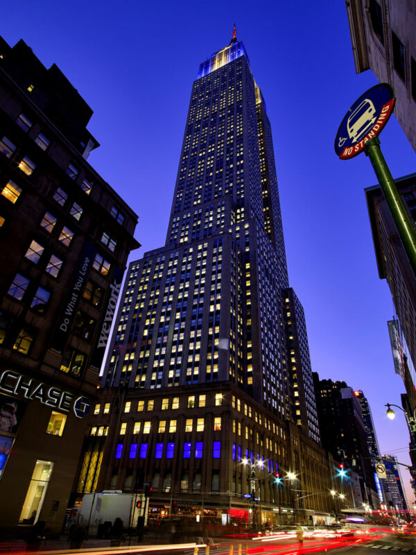
The LinkedIn experience begins on the corner of Fifth Avenue and 34th Street at the Empire State Building’s exterior. A dynamic wash of colour from inside the windows of LinkedIn’s Pulse A/V studio, signals the company’s presence. This innovative exterior branding element adjusts to match a guest’s signature brand colours, or synchronise with the building’s Tower Lights programme.
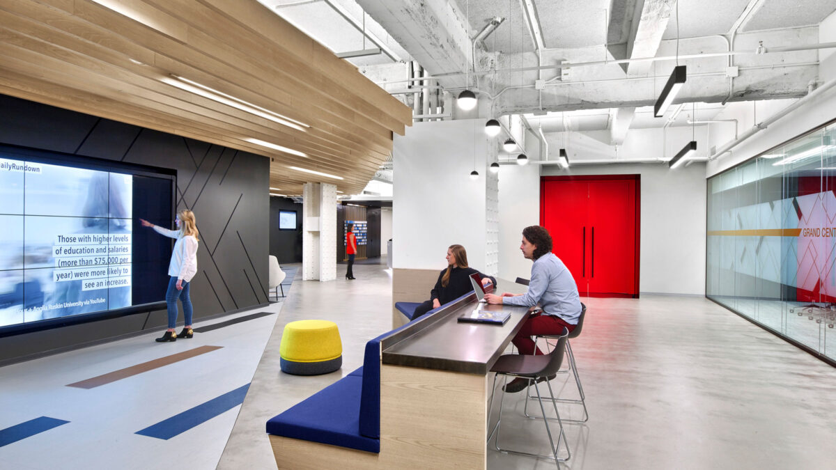
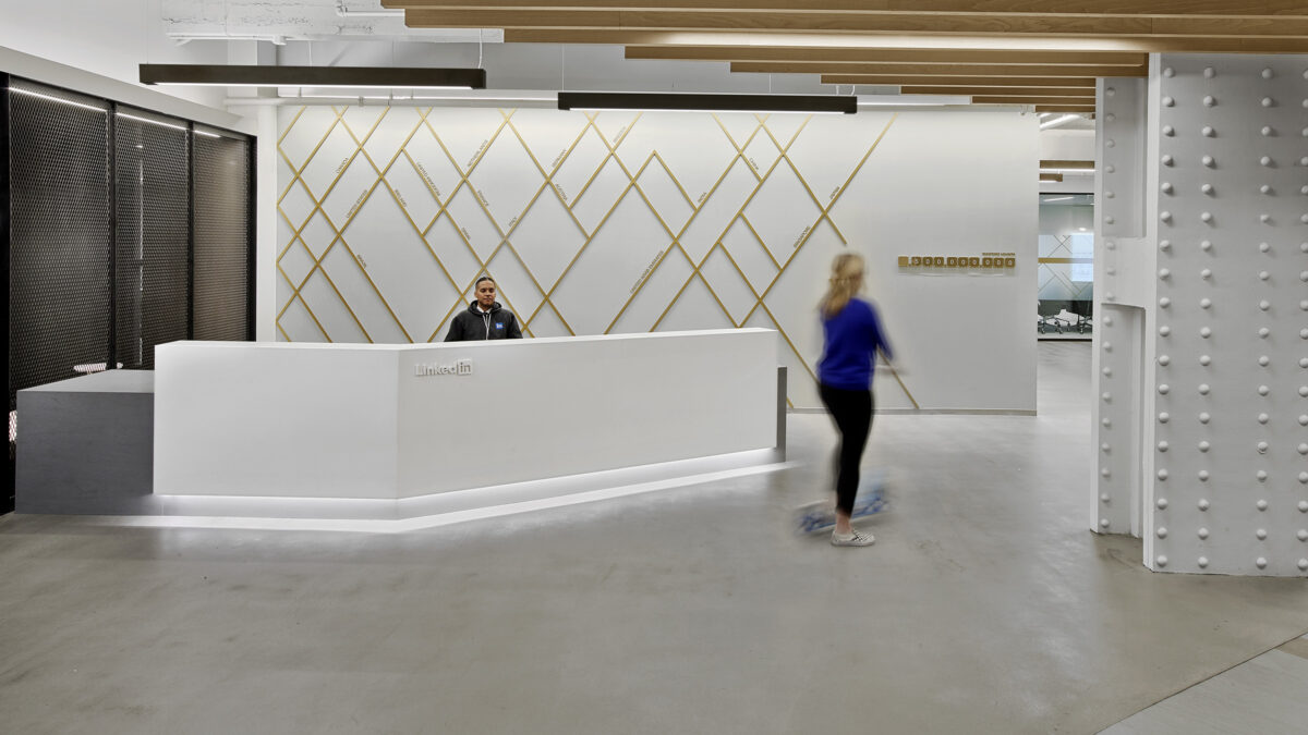
On arrival to the third floor, visitors enter a central arrival area in a neutral palette of alabaster and charcoal, framed by raw walls and unmasked columns. In addition, white oak finishes and bronze metal signage establishes warmth to the office design.
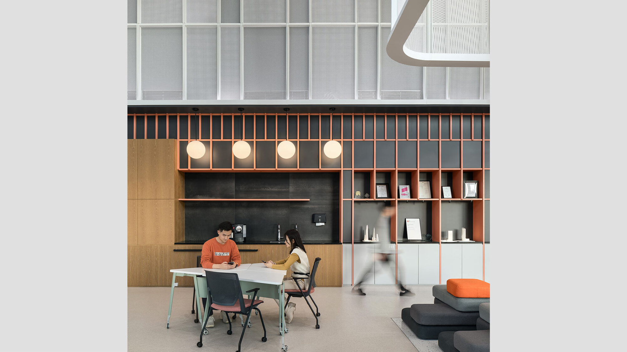
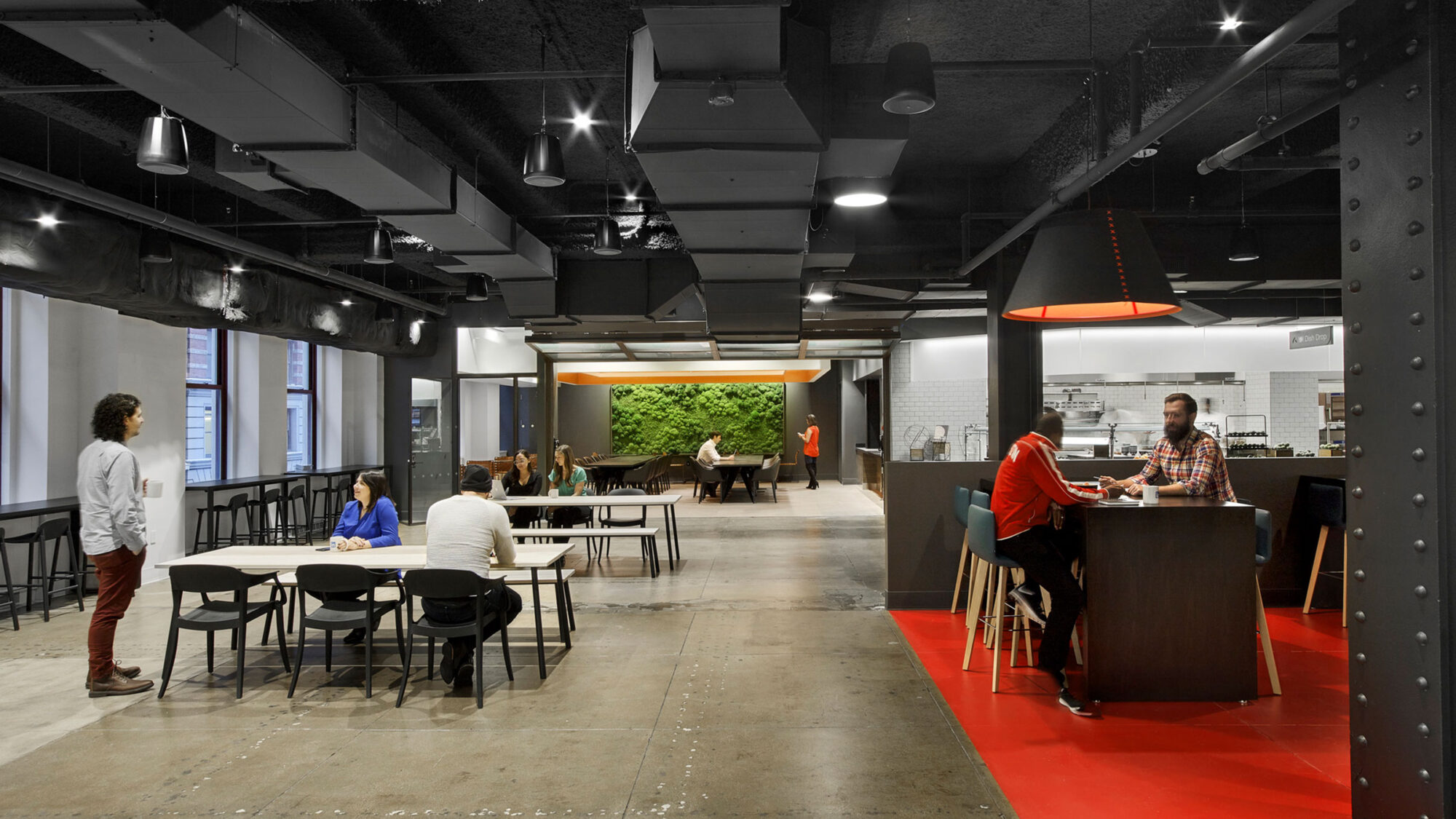
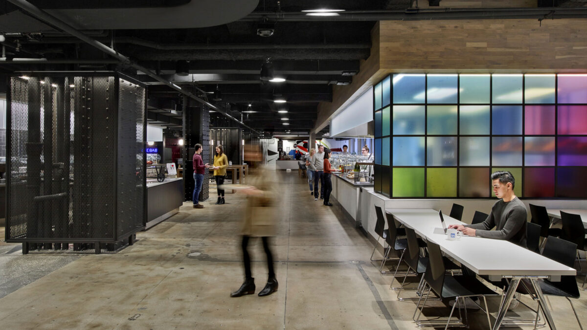
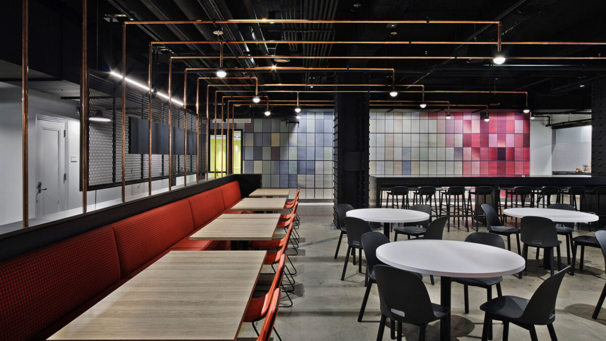
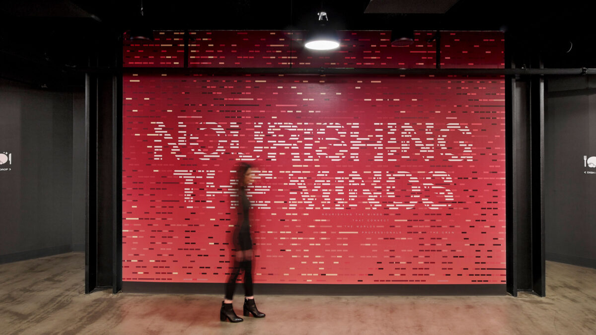
LinkedIn’s full-service café spans half of the floorplate, featuring a back-of-house preparation area and five serving stations. Hanging metal fixtures, a living plant wall and neon art add ambience and give the room a coffeehouse feel.
Dining areas are inspired by New York City’s outdoor spaces, including the High Line and Brooklyn Bridge Park. So, the eatery creates a sense of community and place for LinkedIn’s 1,350 New York employees.
 LinkedIn, New York
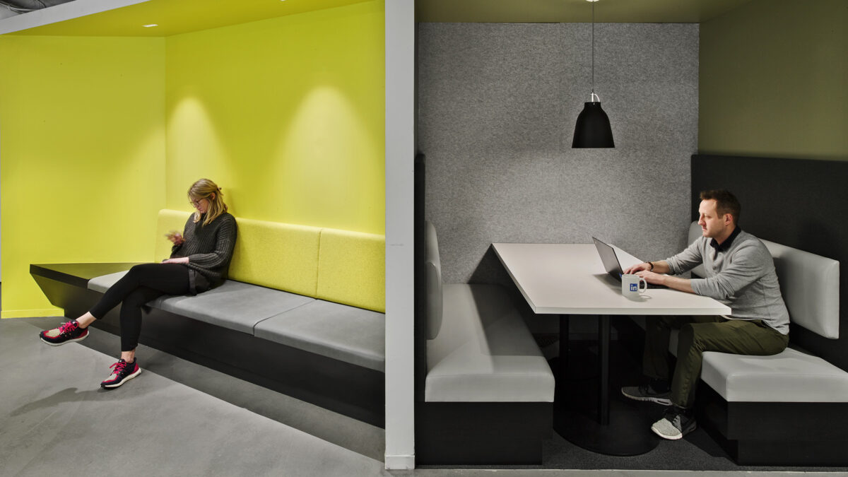
 The workspace uses colour as a wayfinding tool. Hot pink and blue direct the eye to conference room doors. Vibrant reds mark collaboration rooms, shades of green signal the library, and tranquil blues symbolise calm quiet areas.
Clustered around the meeting rooms, team bays with height-adjustable workstations create intimate groupings within the open environment. Circulation paths meander through the bays, encouraging chance meetings and connections.
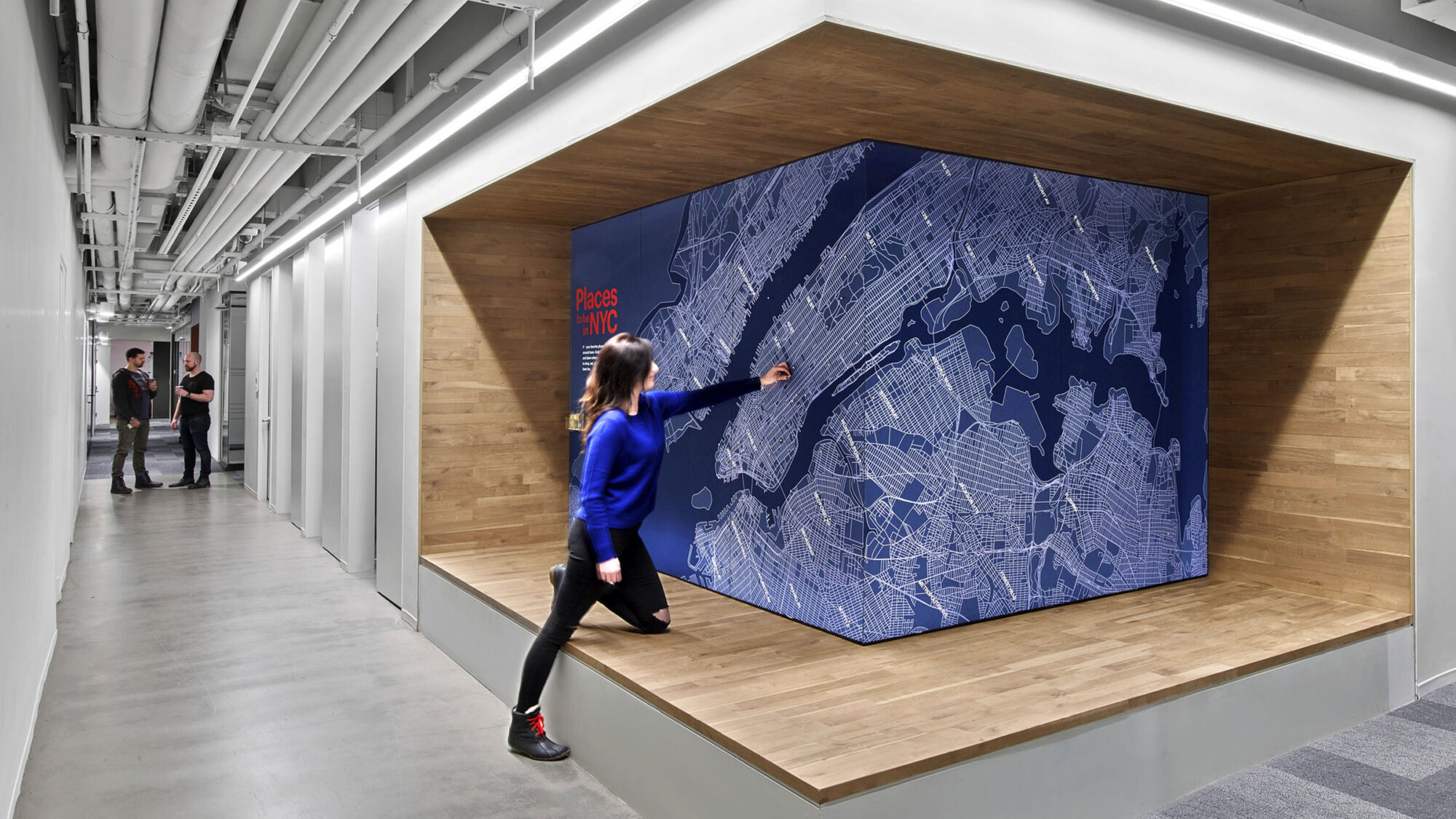
Circulation studies yielded staggered seating and serveries to prevent bottleneck. 70% of the café seating is anchored to the floor. This allows the space to be used for work as well as all-hands meetings. Integrated power outlets in tables and benches support laptop use, and a sliding garage door converts one corner of the room to a private area for hosting executive lunches and cooking demonstrations.
2017IDA - Bronze
2016Interior Design & ICFF - Honoree
2014Interior Design Magazine - Honoree
Completed
2017
New York
90,000 sq ft
Eric Laignel