
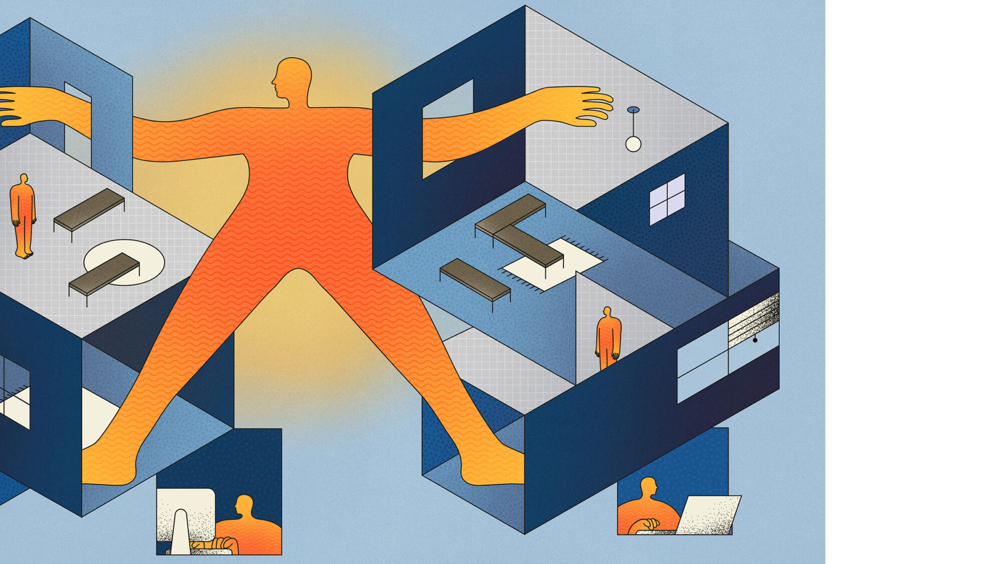
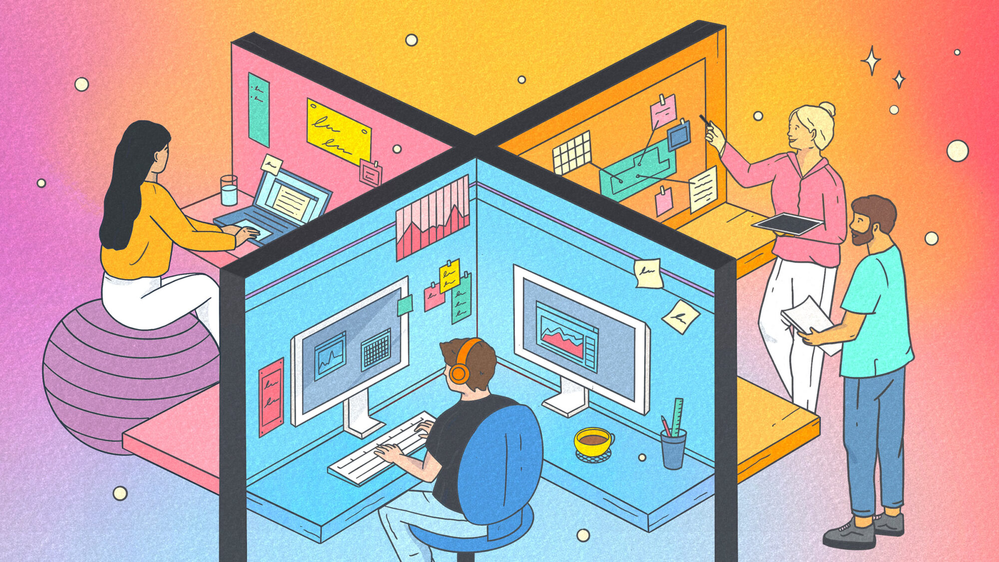
 Illustration by Rosie Barker @rosiebarkwr
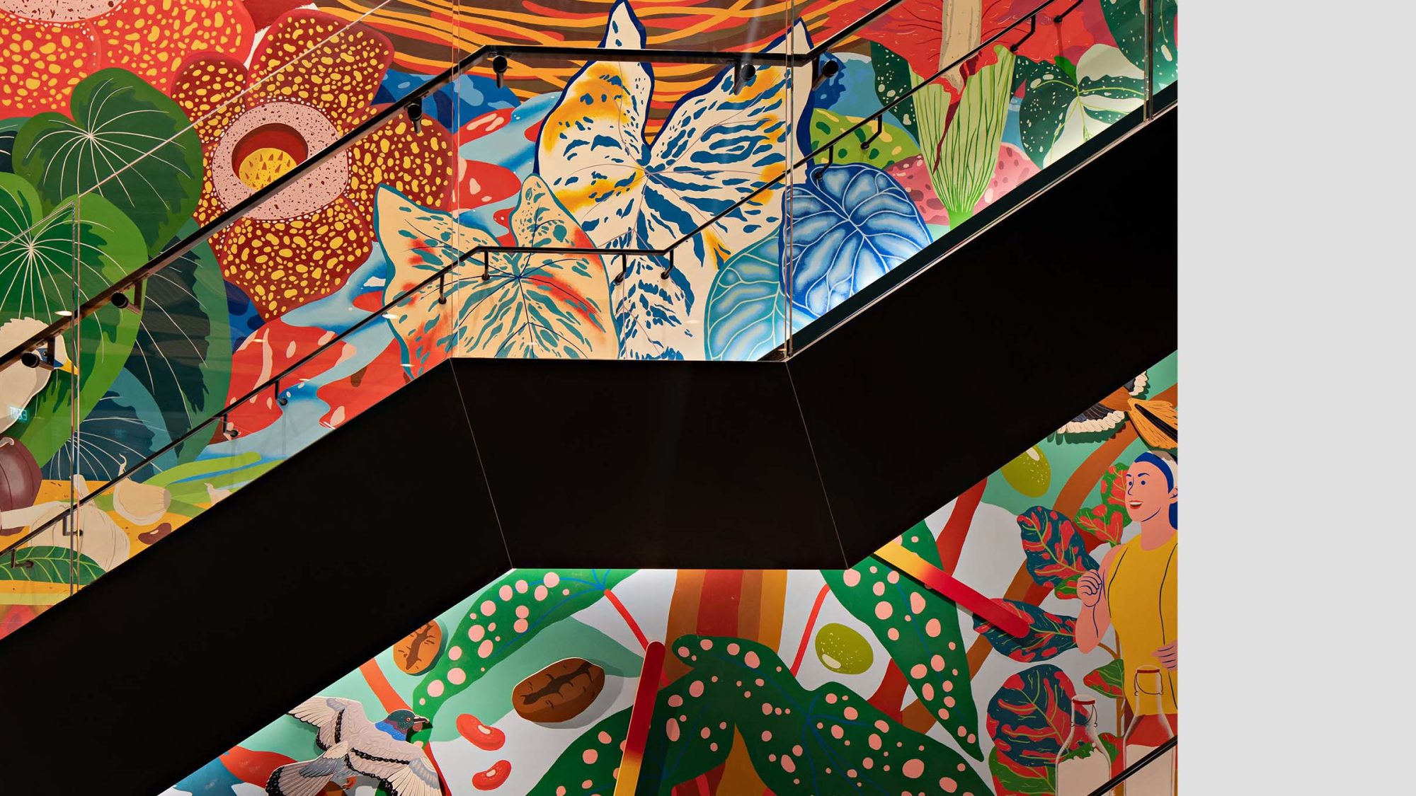
Countries with warm climates are often bursting with colourful textures and patterns. The boldness and brightness is emphasised by an abundance of sunlight. This can create a strong sense of happiness. In contrast, countries with colder climates focus on decluttering, muting or toning down colours. This also brings out specific aspects of a space.
Working in London, I learned that many suppliers created a higher volume of colour collections for grey, black and white tones. People resonate with the colours of their culture and their environment. However, as designers, we have a responsibility to push the boundaries of colour to challenge perceptions and create memorable experiences.
Colour and texture inspired me long before I trained as an architect in Venezuela. I continue to be fascinated by how cultural background can influence the way we feel and use colour. How can it create ambience? How does natural light affect tone? Can it also influence mood and behaviour?
Just like the uniqueness of each workplace, the use of colour in design must also adapt to the needs of a business and its desired behaviours. Therefore, carefully accommodating regional taste. Too much colour may be too distracting. On the other hand, too little may feel uninspiring. Selecting the right colour is equally important. It’s a fine line to tread, but doing it well can have a transformative effect on how people feel, their individual wellbeing and their ability to perform.
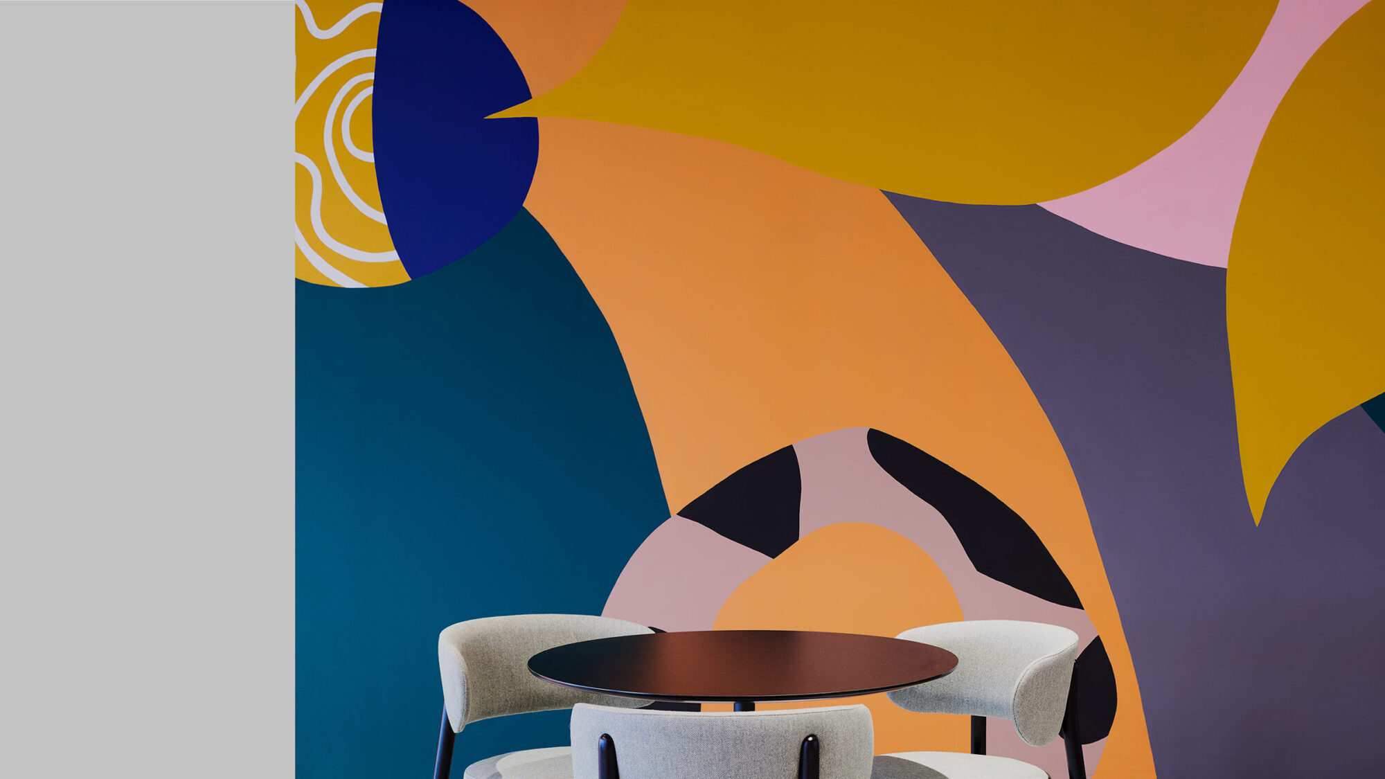
Today we see muted colour palettes brushed aside in favour of more experimental shapes with a 1960s/1970s influence. Spanish architect, Patricia Urquiola, blends Nordic-style furniture with Italian tradition. She combines hospitality-inspired textures, shapes and patterns. The result is a refreshing. It’s European “Tropicália” with a unique stamp. This style may not be for everyone, however it’s exciting to see a reinvention of textures and layers of transparency. Ultimately, the effect these changing colour trends have on the human eye makes anything feel possible.
I’m always looking for new inspiration. From nature, fashion, art, industrial design and culture. It’s interesting to observe what’s getting a reaction from people. From the vibrancy of Matisse’s “La Danse” and Verner Panton’s exotic, futuristic furniture designs, to the mesmerising iridescence of the common green bottle fly – we are constantly immersed in new ways to explore colour.
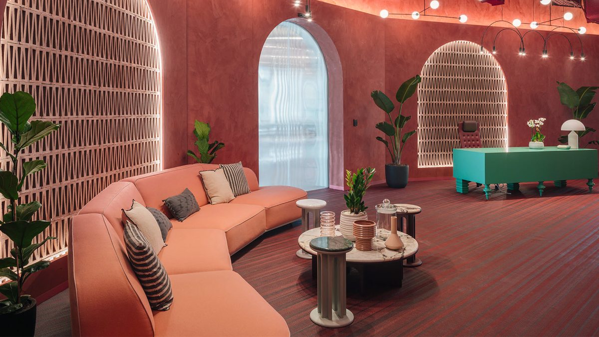
Colour is only visible when light bounces and therefore everyone experiences it differently. It’s long been believed that colour has a dramatic effect on our minds and feelings. Some colours are even associated with increased blood pressure, metabolism and eyestrain. Our emotional response to colour relates to saturation and brightness. We can use colours to influence mood, change the shape of space and also create perceived shifts in temperature.
Although there are some standard colour parameters in the industry, there isn’t a defined recipe. Warm palettes are often used to activate and create high energy moments. Cold colours are more commonly used for feature areas and immersive colour rooms. Softer, cooler tones can benefit quiet heads-down spaces. However, we must continue to look beyond the traditional, creating new, bespoke colour palettes to deliver truly impactful experiences.
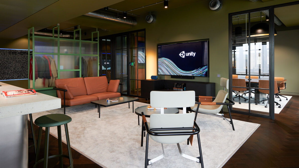
Different clients have different needs. Its important to understand brand story and business objectives before bringing a design to life. We must calibrate a new recipe, which ultimately means connecting the company, country and local culture.
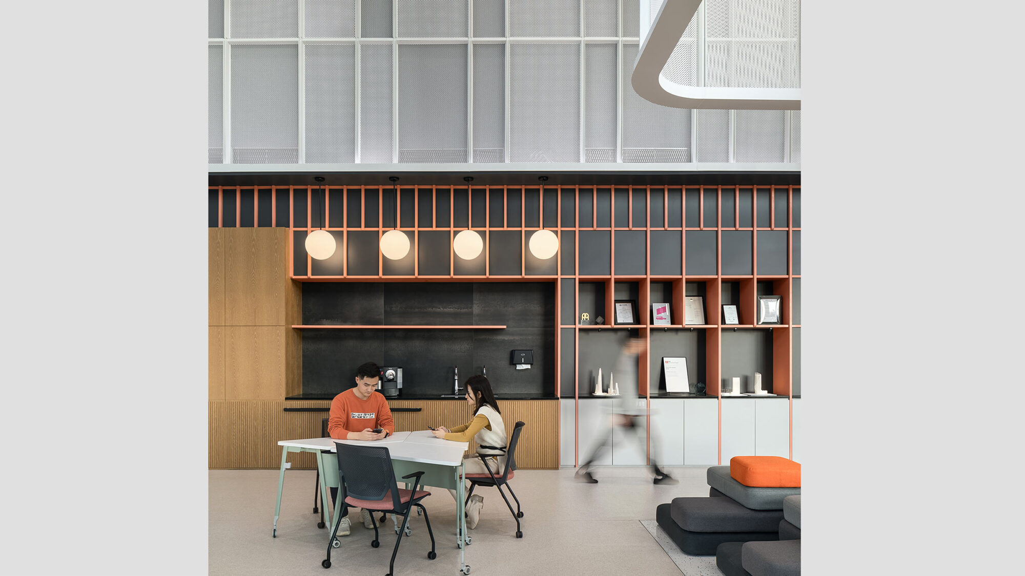
At a real-time game engine company’s Brighton office, employees are predominately desk-based, so selected tones are muted and calm. This, combined with an explosion of colour in the connective areas and social spaces supports interaction through dynamic contrast.
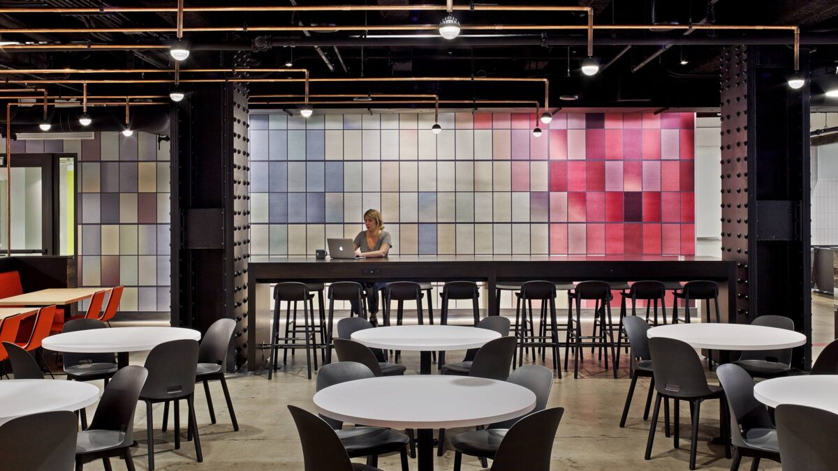
In our work on a fintech client’s new office in Paris, the tech scene has been gaining huge momentum and defining its own design trends. We took inspiration from the team’s favourite locations and local start-up scene. We also brought to life the desired brand culture in a connected new space. Incorporating café style furniture with deep, saturated tones, we were able to juxtapose textures and warmth without being brash. Addressing behaviour-based design, the workplace combines small neutral spaces with large bold moments for high energy and a unique identity.
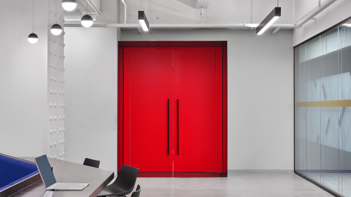
The design for another fintech client in London embraced a futuristic, timeless look-and-feel using tuned down metallics. This was also balanced with white, black and pops of colour. Selecting small details and bringing them out in a bold colourful way can be really stimulating.
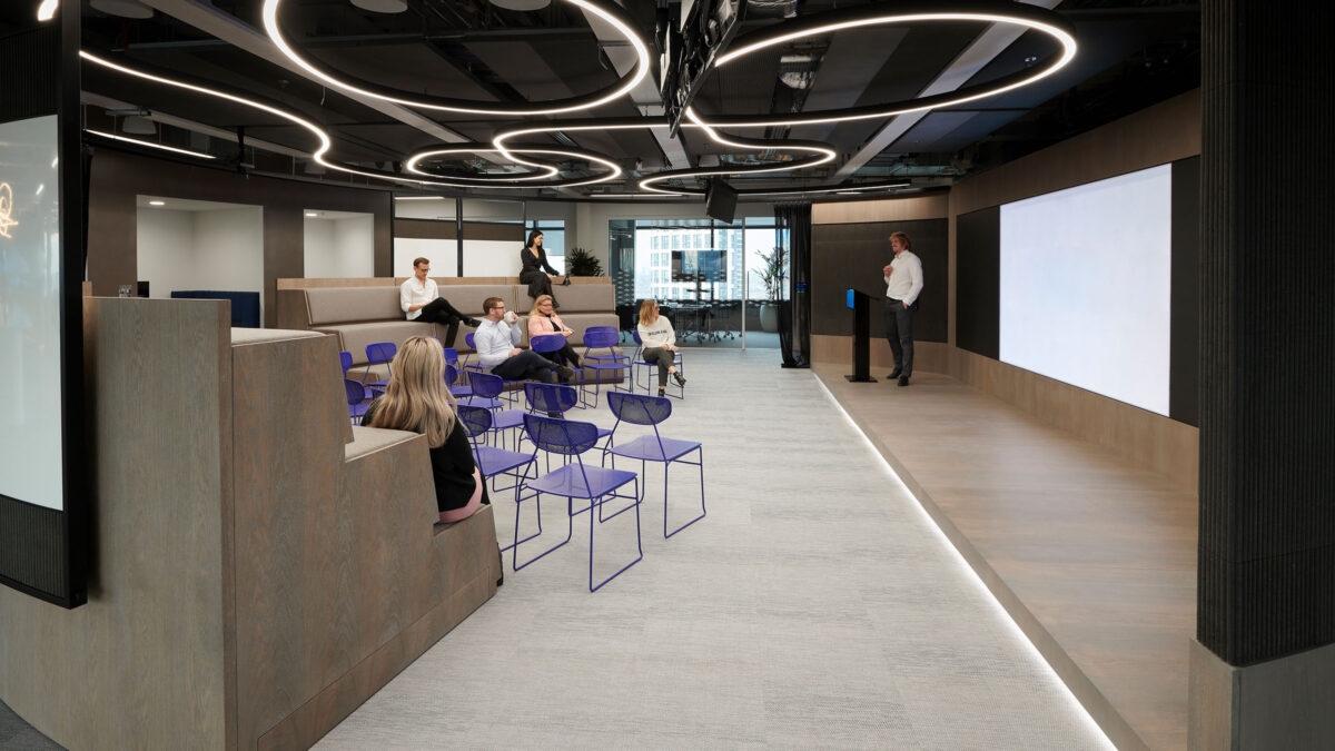
Colour guides behaviour and values in the workplace so clients choose different palettes for different purposes. Carefully selecting the right moment and emphasis can help encourage desired actions and build culture.
As designers, we need to go through the creative process, striving to find the right colour combination to meet the unique needs of the business. It’s complex. How do we bring focus to the brand? What are the neurodiversity considerations?
When leading a project, designers need to be clear and honest about how colours translate to champion the right decisions. Colour needs to be perceived in the space with the adjacent ambience. It will behave differently at different times of the day or year. This depends on how light reflects and combines with other materials. Therefore a detailed exploration of colour can deepen client relationships and appreciation of a space.
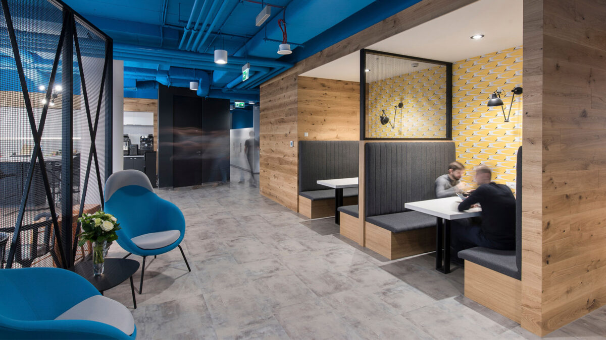
To sum up, office design is a complex process and colour is just one part of a carefully considered, holistic approach. By pushing the boundaries of colour and shifting preconceptions, we can continue to shape new experiences, behaviours and culture in the future workplace.
Senior Associate