
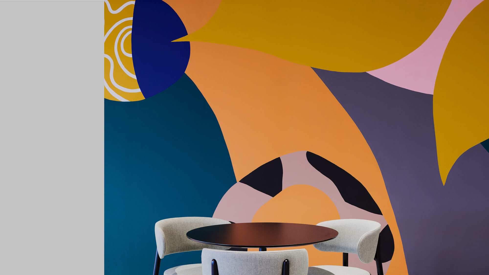
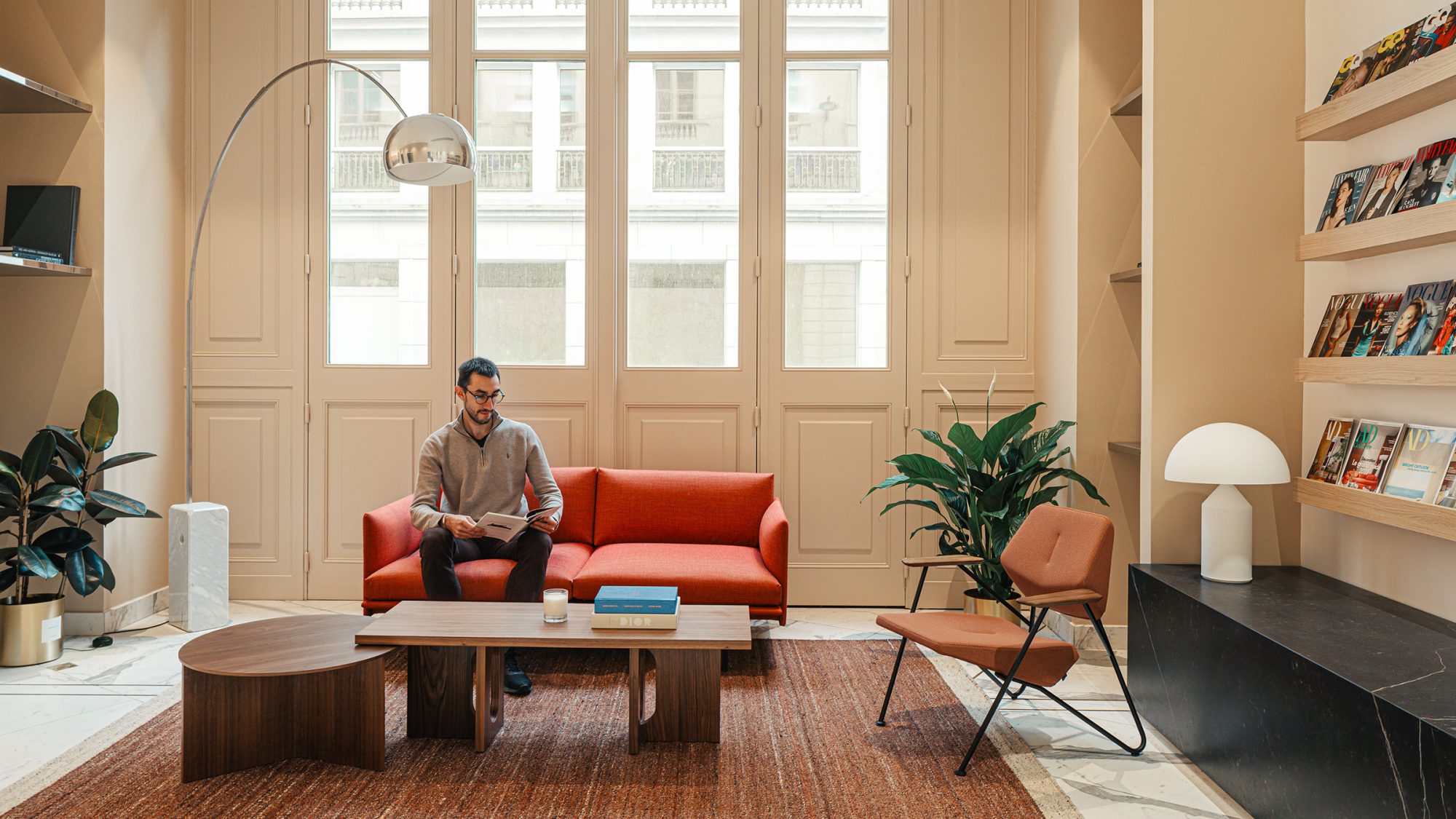
Condé Nast is one of the world’s most renowned companies in fashion, lifestyle and entertainment media. Continuing a global relationship, the firm engaged us in the building search and interior design of its new French office.
As featured in AD France, our design concept creates an elegant and cohesive atmosphere, embodying the essence of “la Maison Condé Nast.”
Condé Nast France’s adoption of a hybrid work model prompted a thorough review of its workplace. Our analysis revealed opportunities to improve space planning and reduce physical separation between teams. The office relocation was to decrease its overall size while optimising space utilisation.
Next, we advised the client on relocation options in a competitive real estate market, characterised by a 2% vacancy rate. We promptly evaluated potential locations, focusing on building suitability, possible technical challenges and the surrounding amenities. Ultimately, our choice was a Haussmann building in the strategically positioned 2nd Arrondissement.
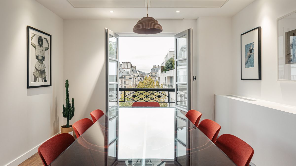
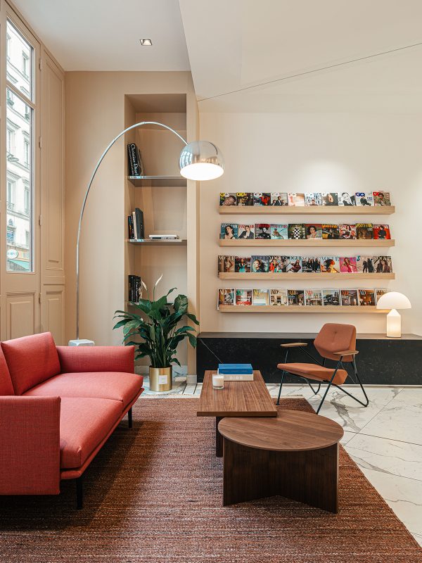
In contrast to the previous 1970s office, the traditional Haussmann architecture closely aligns with the brand’s timeless image. Additionally, the central location offers proximity to Paris’s vibrant commercial districts and historical landmarks with convenient transportation links for commuting.
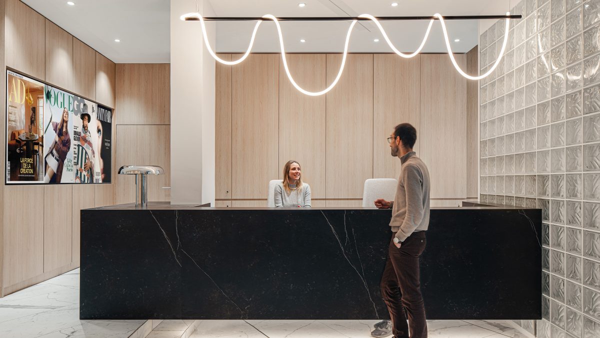
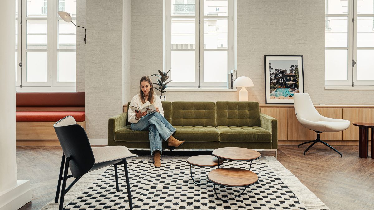
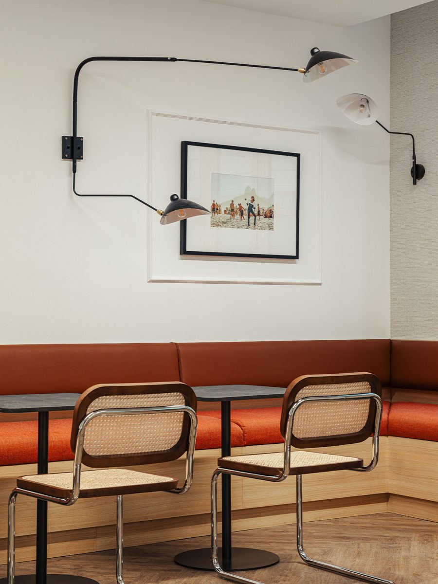
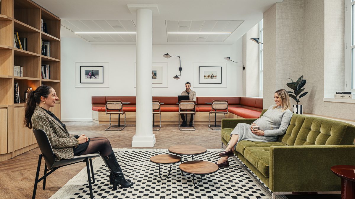
Our design concept, inspired by a fashion house, brings residential styling into a professional space. A prime example is the top floor workspace, designed in homage to ‘l’atelier mansardé’ (the attic workshop). Overall, ‘la Maison Condé Nast’ (the house of Condé Nast) is home to the editorial offices of AD, Vogue France, Vanity Fair and GQ magazines, as well as the commercial and cross-functional teams.
M Moser consistently impressed with its creative problem-solving. The team were collaborative and helpful in navigating the design development alongside our team.
Oliver Wehner, Project Manager - Global Real Estate, Condé Nast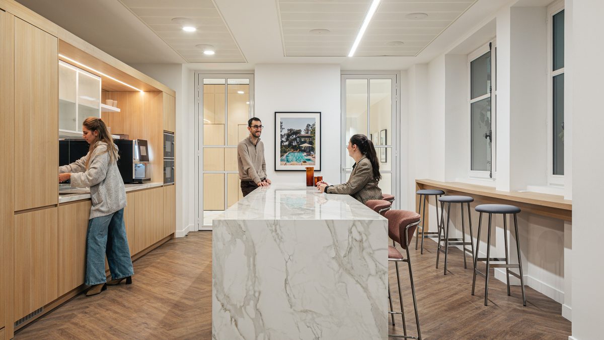
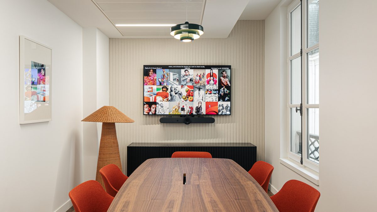
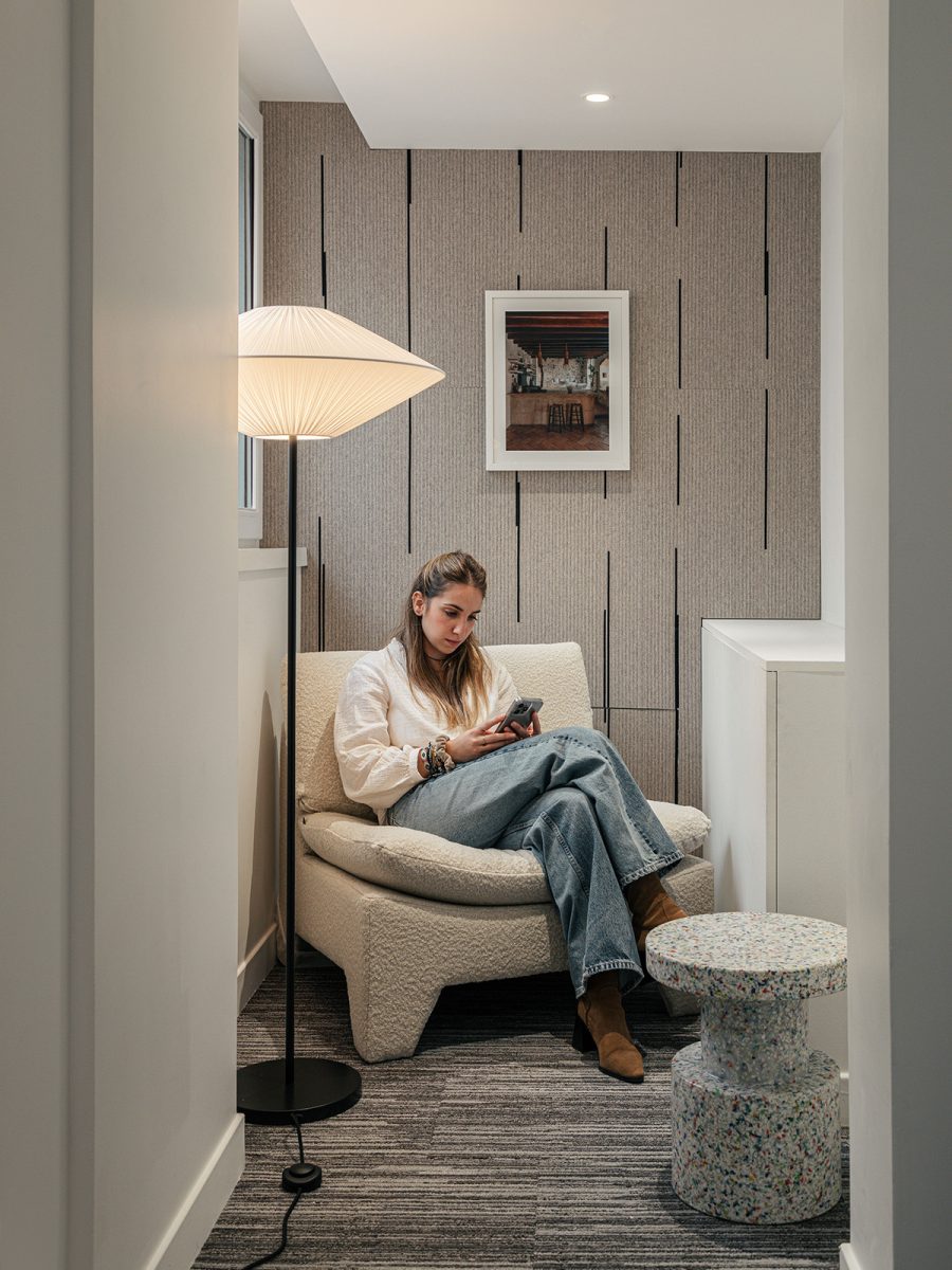
The office layout promotes creativity, steering clear of excessively designed or prescriptive space. Instead, the environment provides a canvas for creativity to flourish. The understated style reduces distractions and creates an open environment where people can work together effectively.
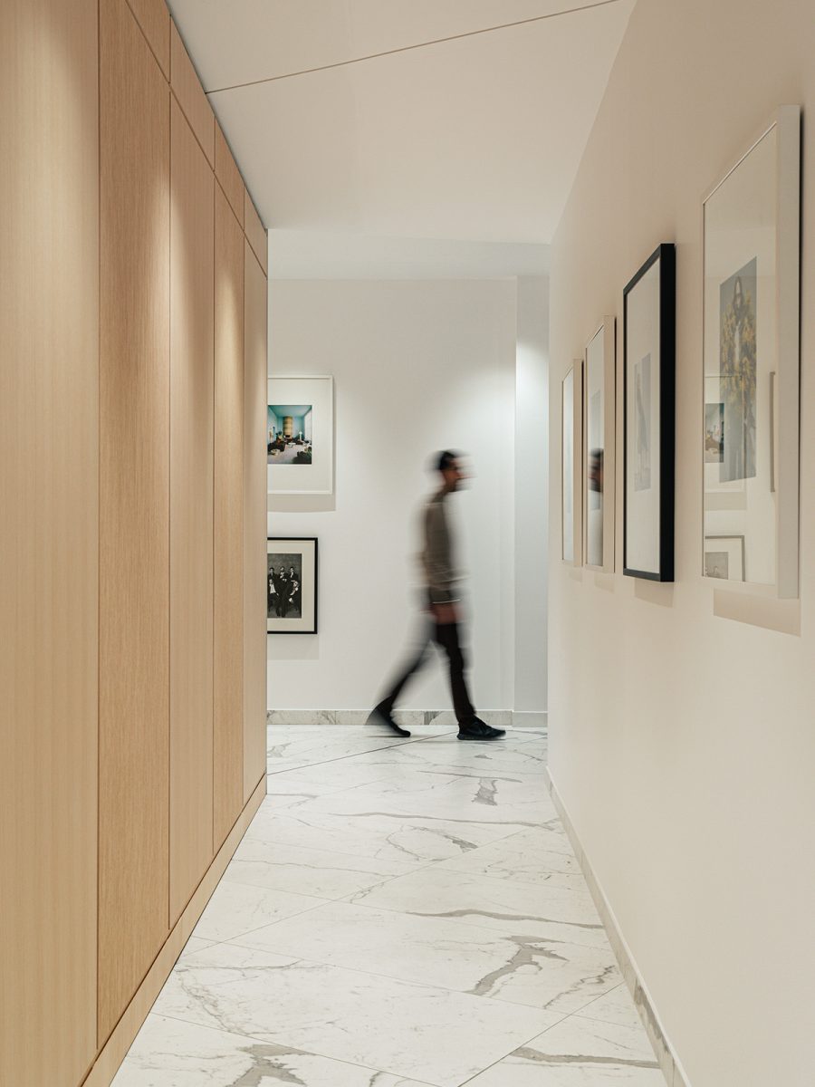
The ground floor’s visibility from the street level is a showcase of creativity. Inside, ‘Le vestibule’ (the gallery hallway) is a carefully curated display of iconic photography, making a powerful first impression.
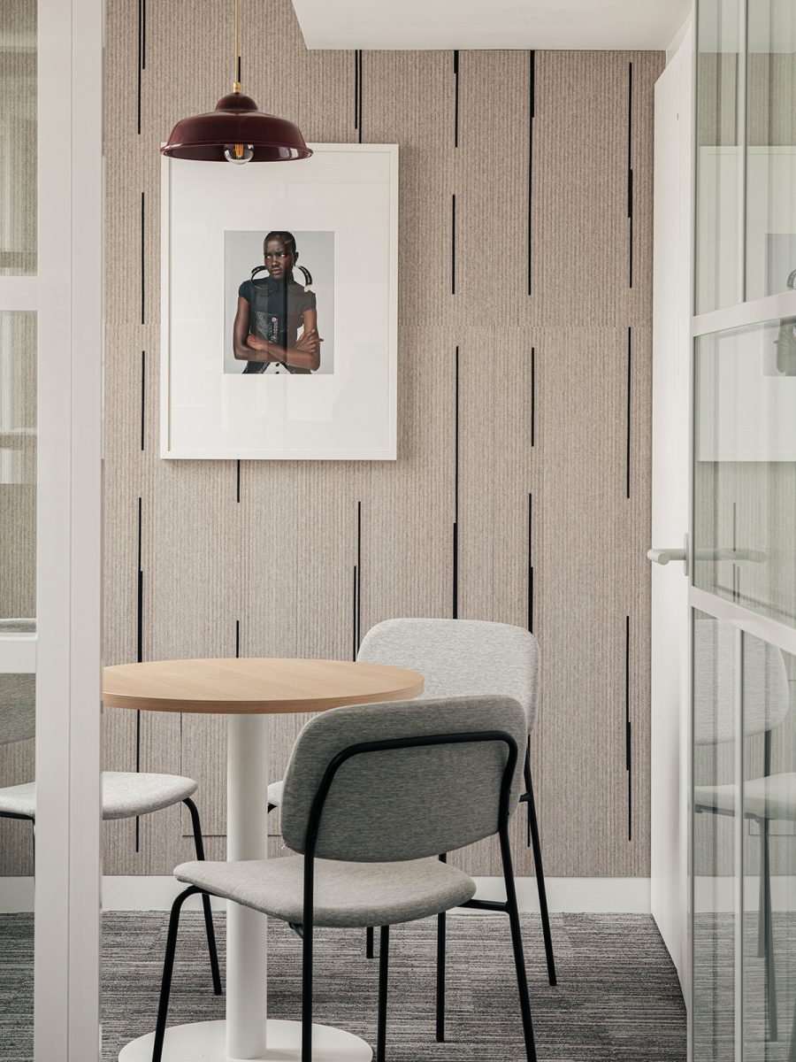
The design of the space fosters collaboration and interaction among teams. Notably, the ground floor features a central video suite, serving as a shared resource for the four editorial offices. Guests can immerse themselves in ‘le dressing’ (the fashion closet), an extensive archive of clothing, shoes and accessories used in photoshoots and media engagements.
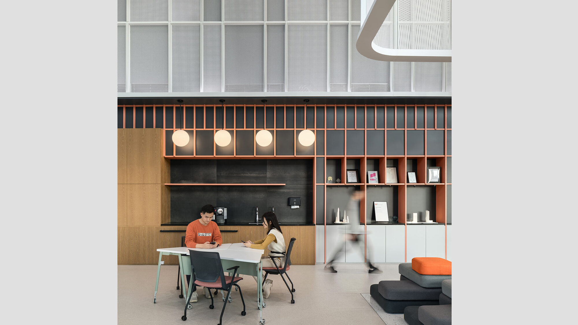
Similarly, the café and lounge area enhance the communal atmosphere, welcoming everyone. This area adjoins the expansive boardroom, allowing for transformation into a larger event space. Adjacent outdoor spaces support this communal zone, offering staff a retreat from their workstations.
In summary, the outcome is a workplace that meets the evolving needs of Condé Nast France and serves as a symbol of its enduring influence in the realms of media and fashion.
Reach out to explore how we can guide you through the entire journey of an office relocation – from meticulously selecting the right building to crafting a design that enhances your workplace culture.
2024Mix awards - Finalist for Project of the Year
Completed
2023
Paris
2,415 sq m / 26,000 sq ft
Chris Wharton