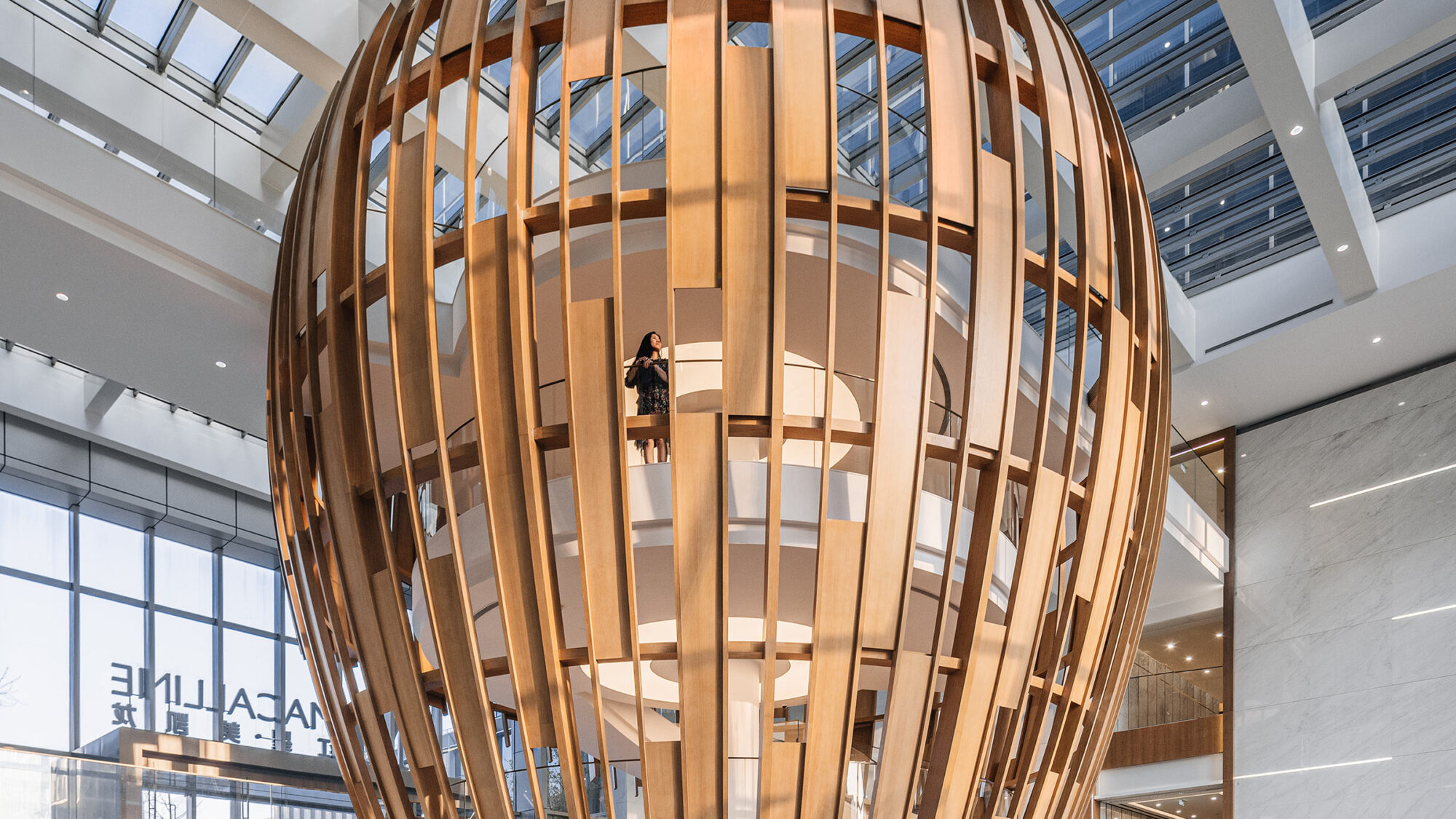

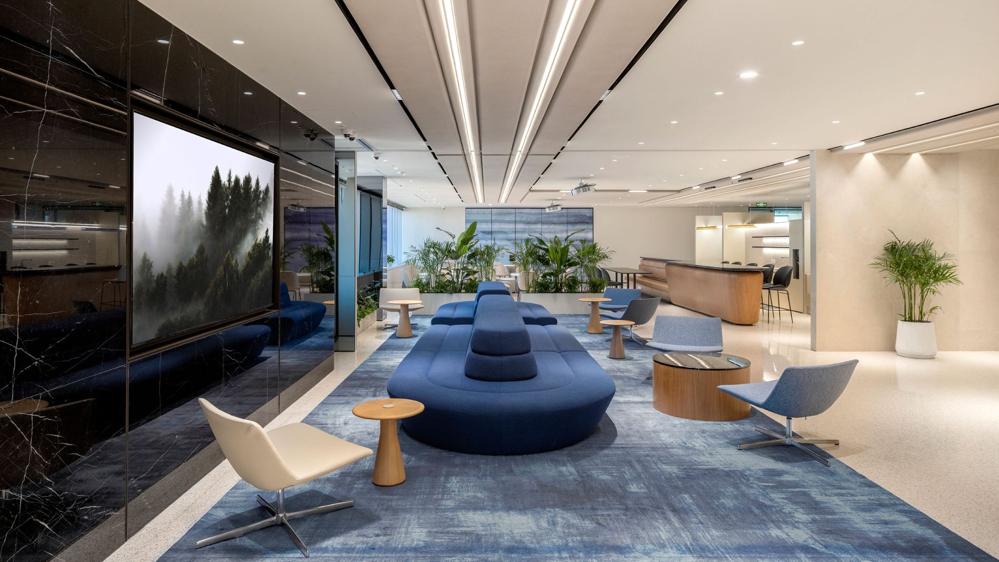
Continuing a long-standing collaboration that spans over a decade, this major Korean bank re-engaged us to support its Shanghai office relocation. Leveraging our global expertise in strategy, design, and construction, we delivered a workspace that balances brand, functionality and wellbeing. Our new design concept, ‘The path’, connects the company’s goal and expectations to create a transformative workplace supporting people, culture and future growth.
The initial brief focused on meeting the needs of all , managing relocation schedules, creating wellness areas and supporting a hard-working culture. While incorporating the brand identity, we saw an opportunity to take it further. Drawing on our extensive knowledge of the client’s business, we introduced ‘The path’ as a design concept, which became the visual identity for the space. The result is a professional and sophisticated workplace that embodies the organisation’s values.
Our design philosophy centres on tailored solutions for the professional end users. It’s about shaping an experience that resonates deeply with the client’s corporate culture and brand identity.
Jane Choi, Associate, M Moser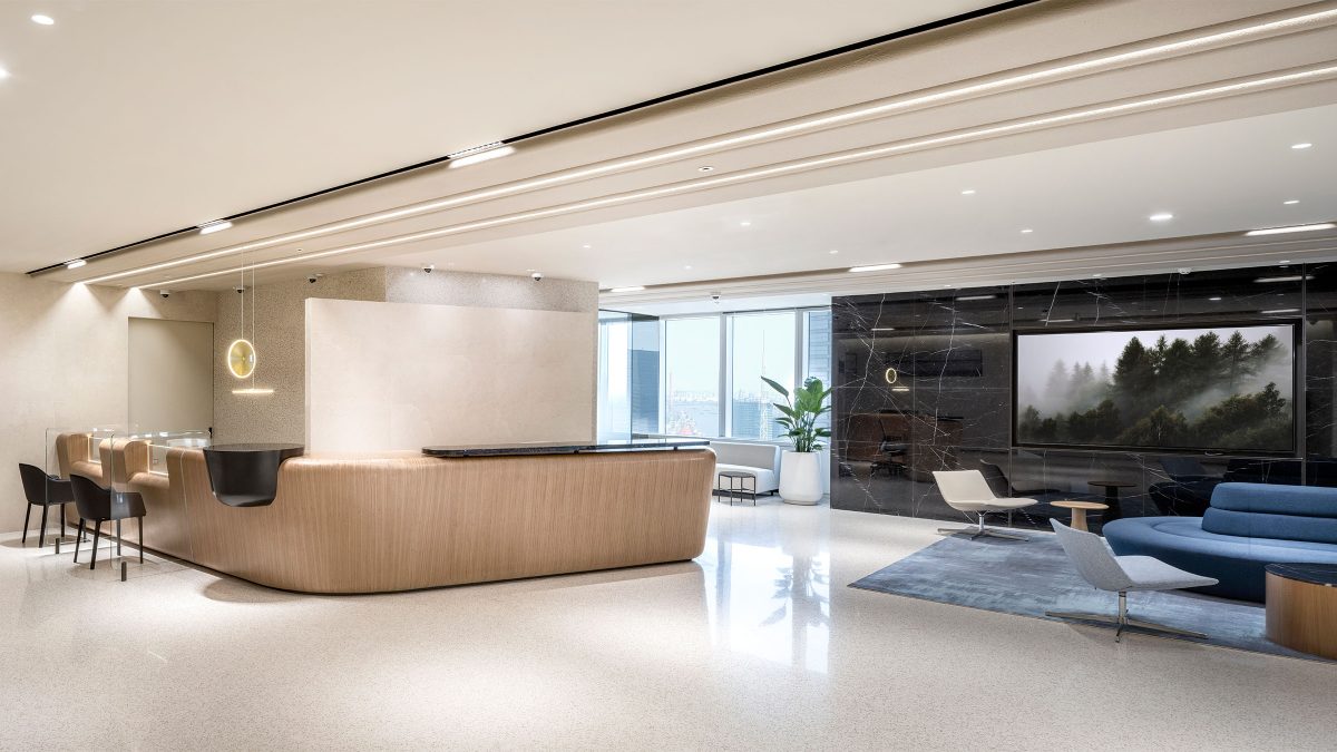
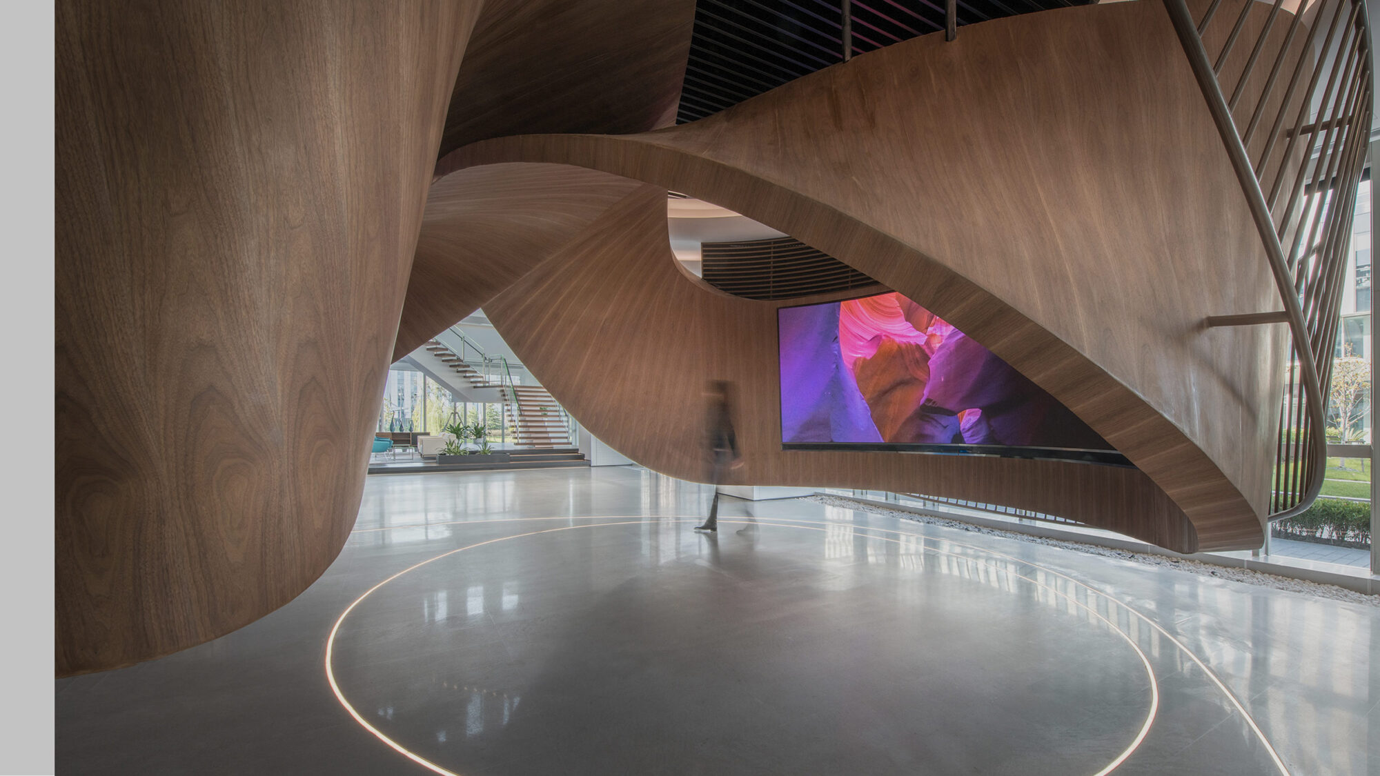
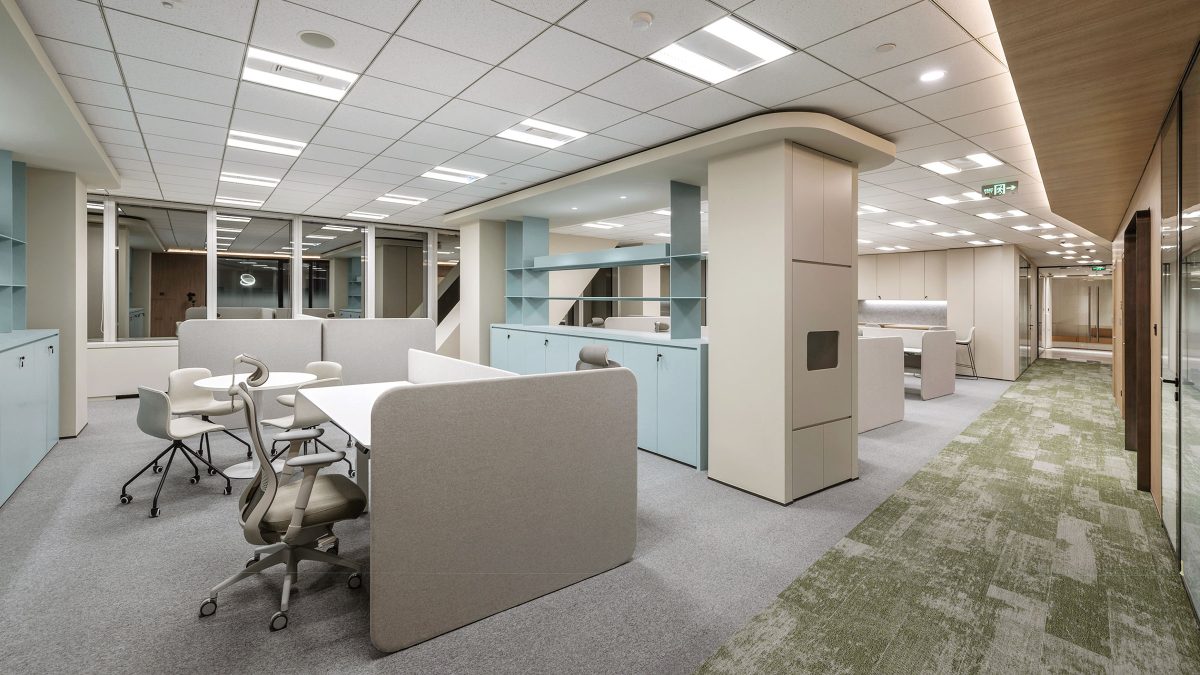
The client’s logo was inspired by a Möbius strip (a mathematical object that has a connected single-sided surface). This led us to centre on the ‘The path’ as a strong theme throughout the space. The linear language transforms into different forms and reflects this major Korean bank’s diagonal logo on the plan. This symbolises the eternal journey of the company. The concept is particularly evident in the reception ceiling and on the back-office floor.
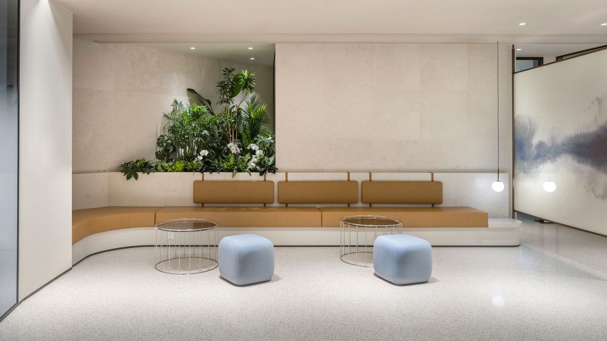
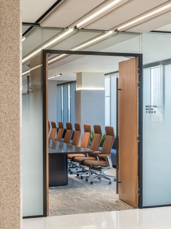
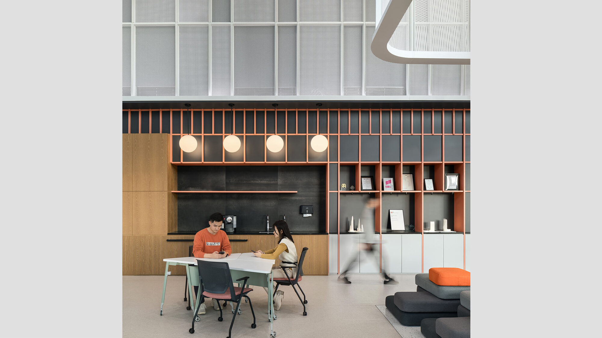
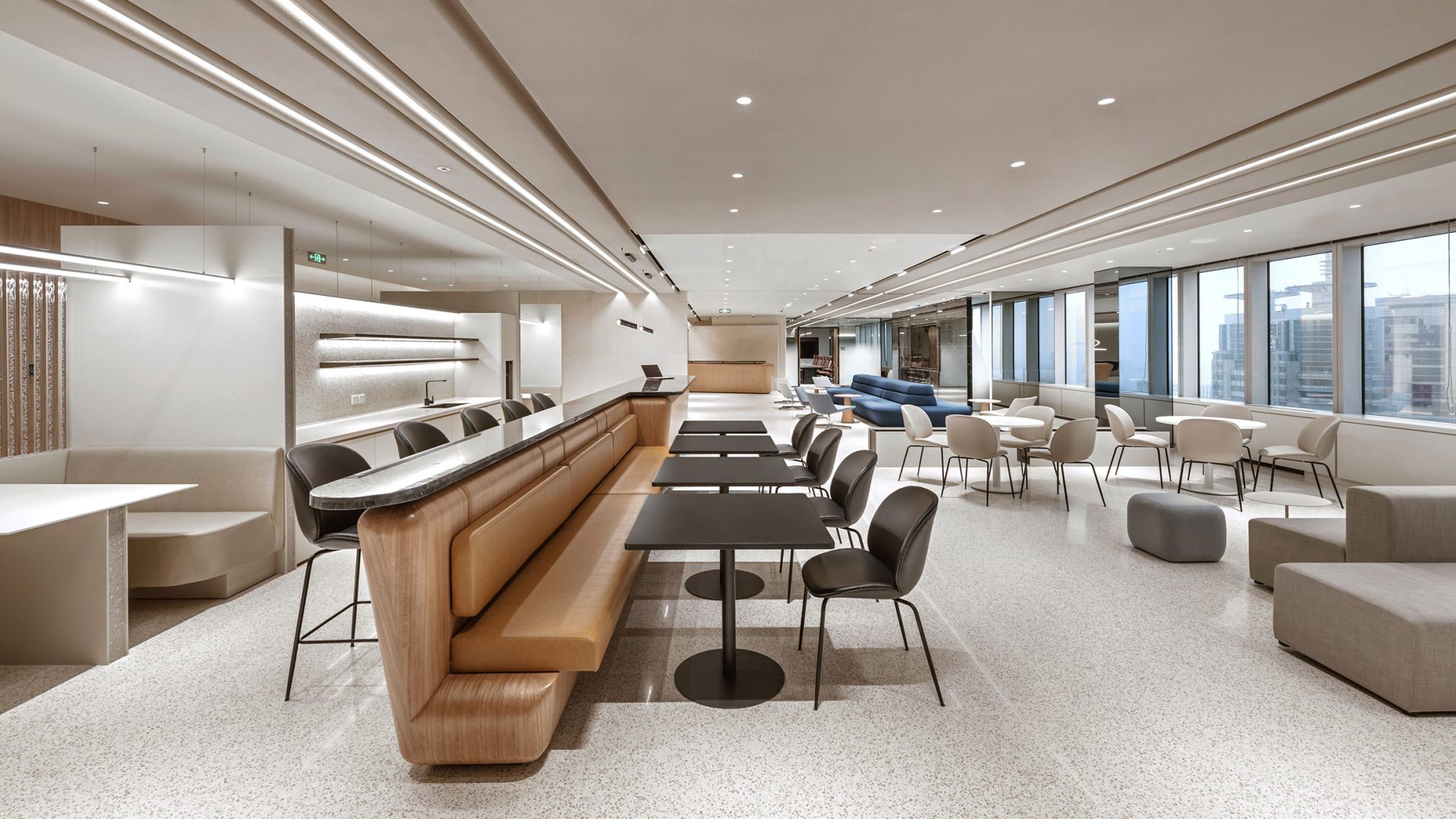
The layout promotes connectivity and exploration like a road linking different destinations. It encourages staff to move, interact, exchange ideas and innovate. Key spaces, including the café, town hall and library are situated along the primary path.
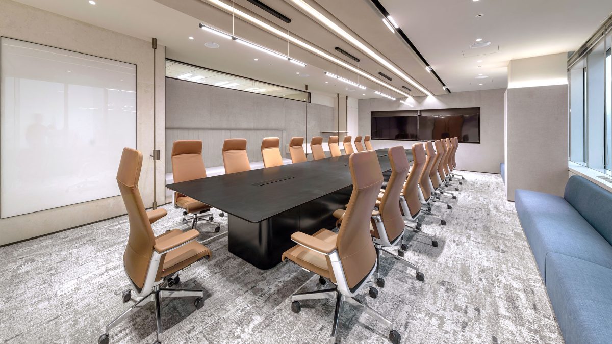
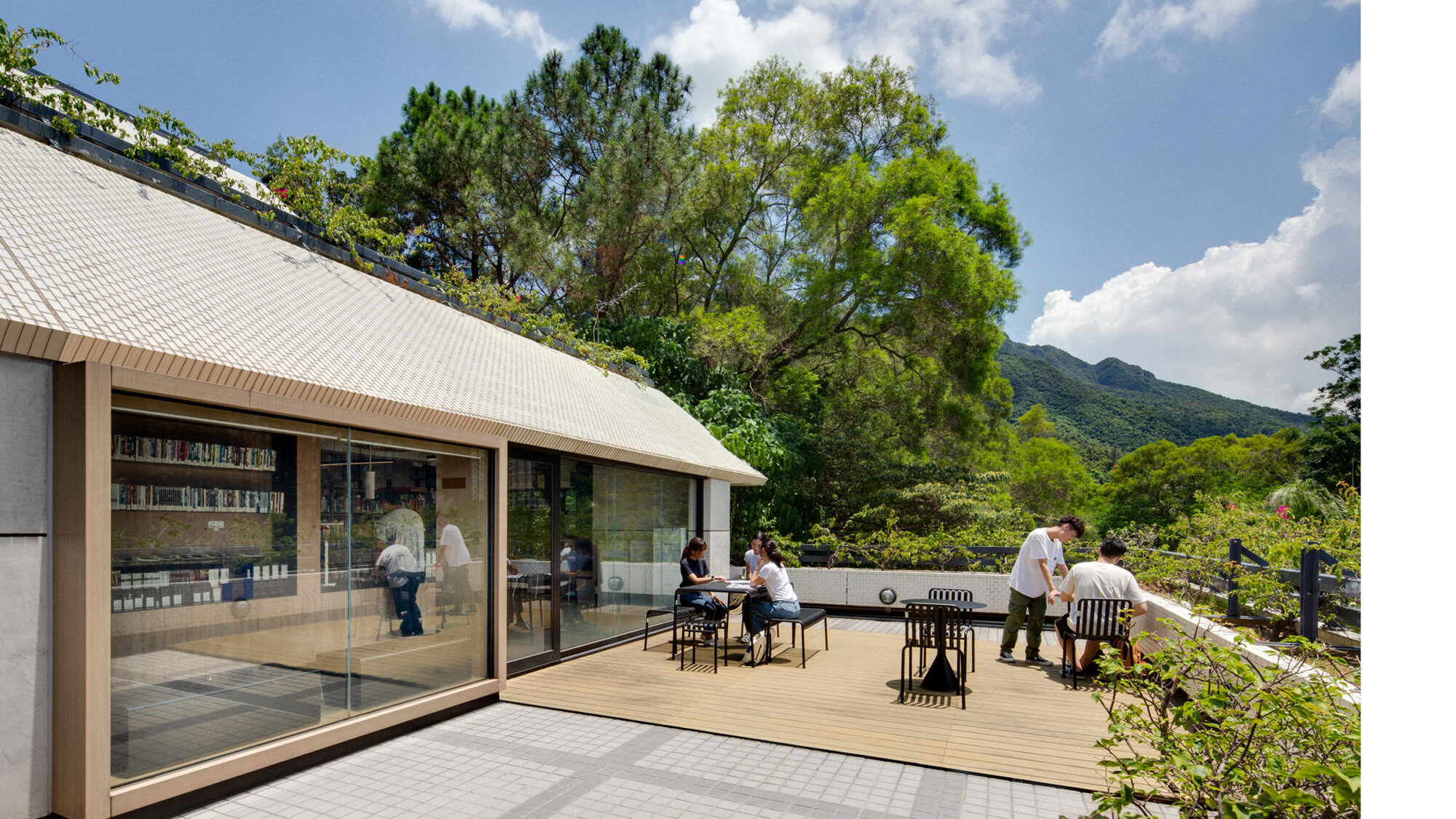
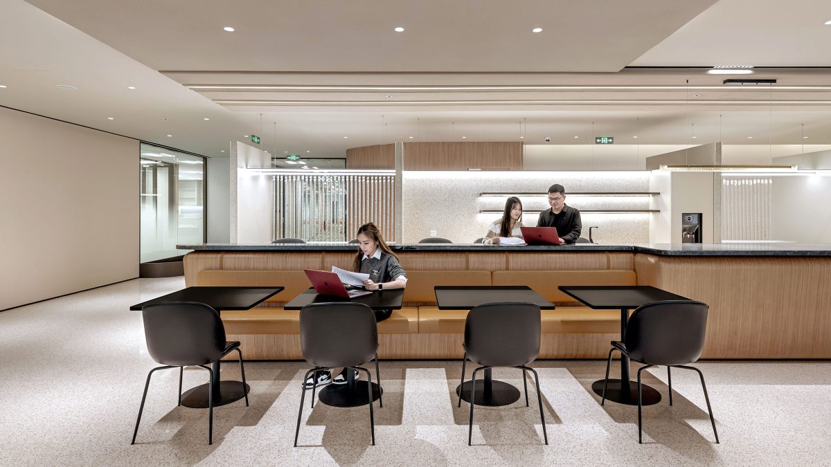
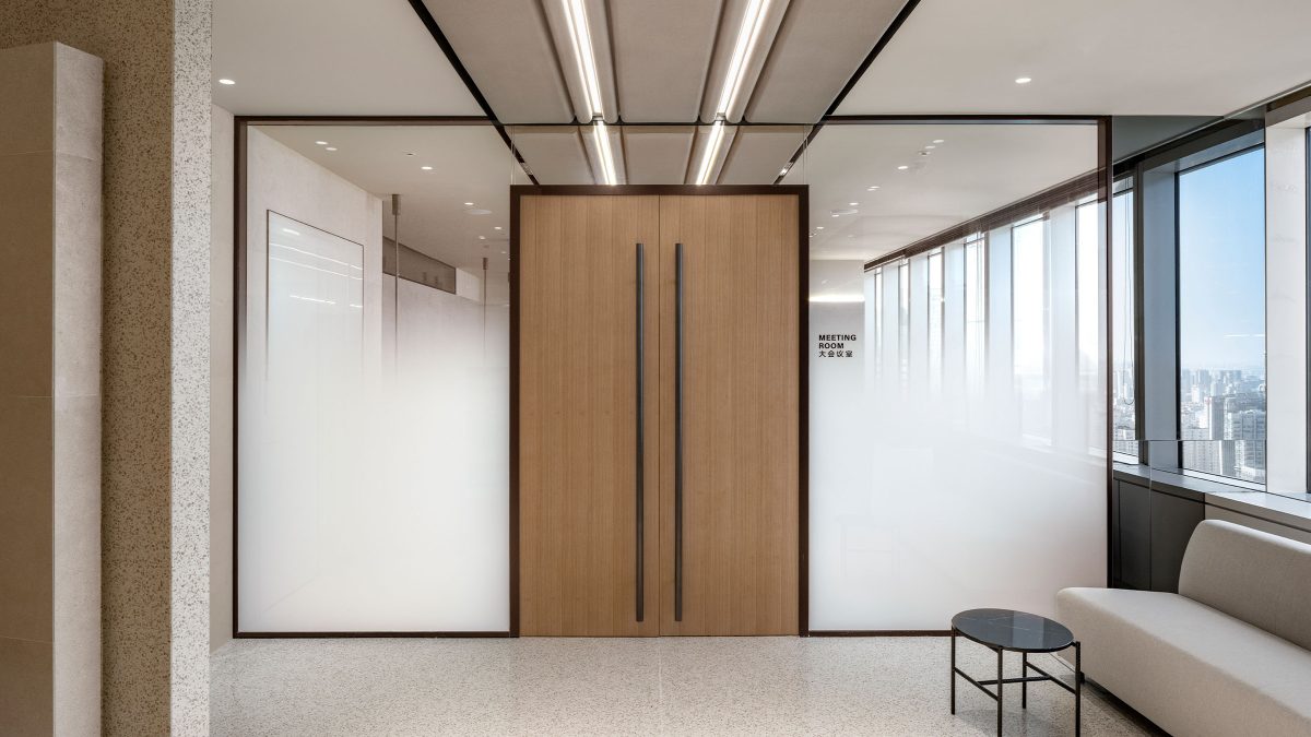
One of the project’s main goals was to prioritise wellbeing. This meant significantly reducing enclosed offices from the window area to the core, preventing the obstruction of natural light. The result is an environment where 95% of workstations benefit from daylight, as they are now located next to the windows. The 1,808 sq ft work café is designed to offer the best views. This highly multifunctional space sits next to the reception area with movable partitions for large-scale events.
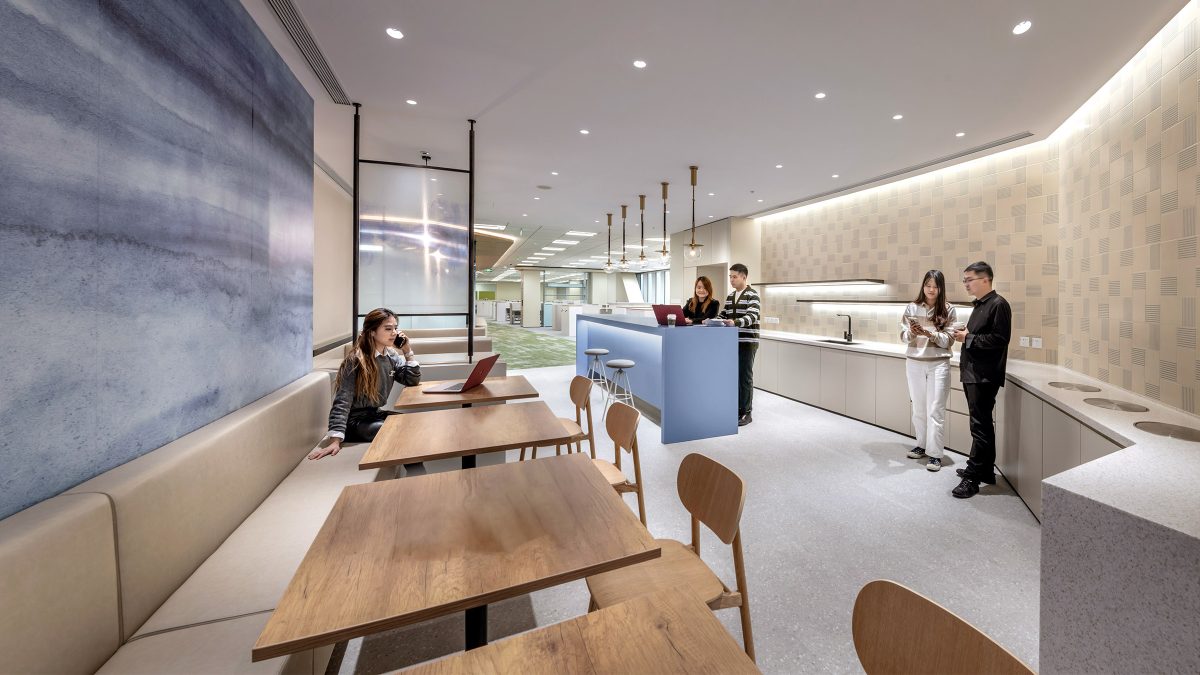
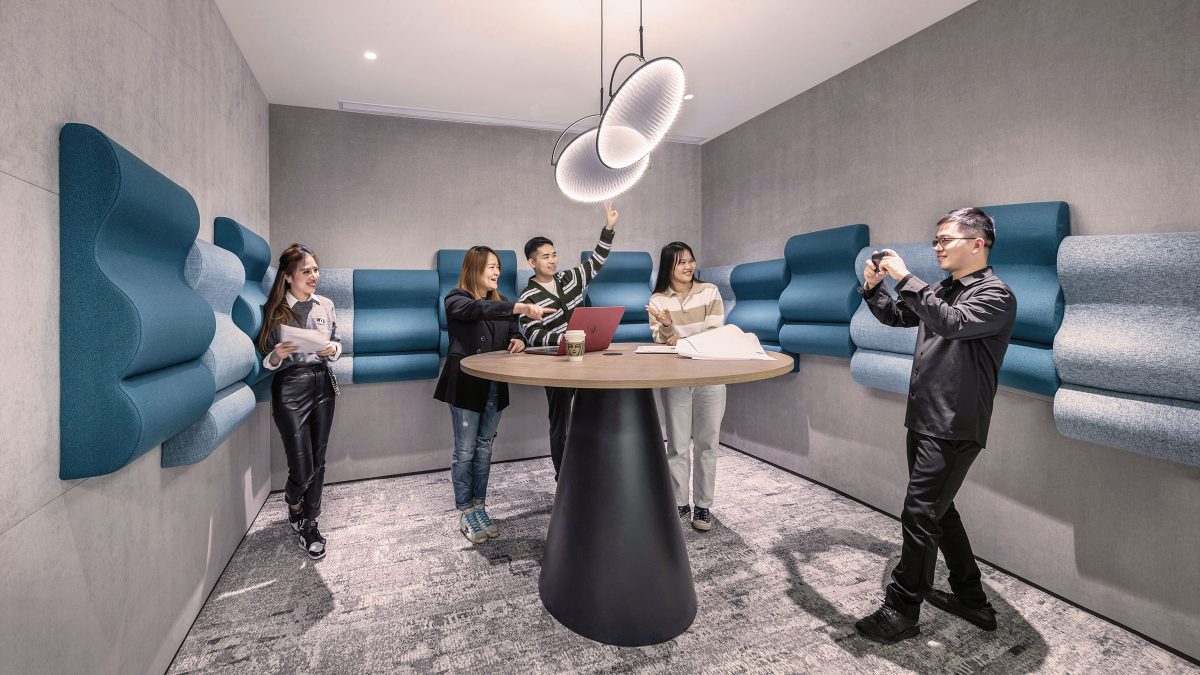
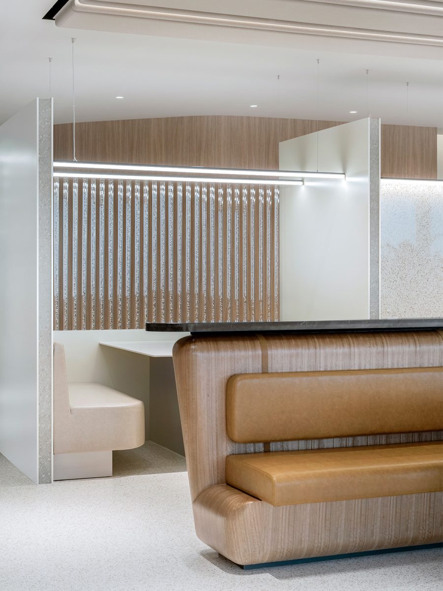
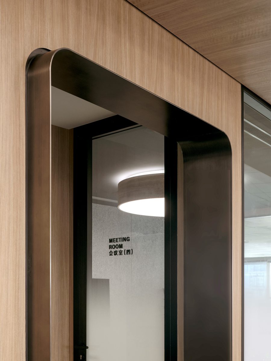
To further boost wellness, we introduced a number of amenities including a mother’s room, a library and focus booths with plush lounge chairs. Additionally, we created a nature-inspired atmosphere by incorporating materials such as wood, terrazzo and sandstone for a calming ambience. A blue colour palette is also used throughout to celebrate the brand.
Transforming more than just space, this workplace elevates corporate identity while nurturing collaboration and wellbeing to attract top talent. The project reaffirms our commitment to building human-centric spaces that support business goals.
Completed
2022
Shanghai
24757 sqft
Vitus Lau, Edward Shi