
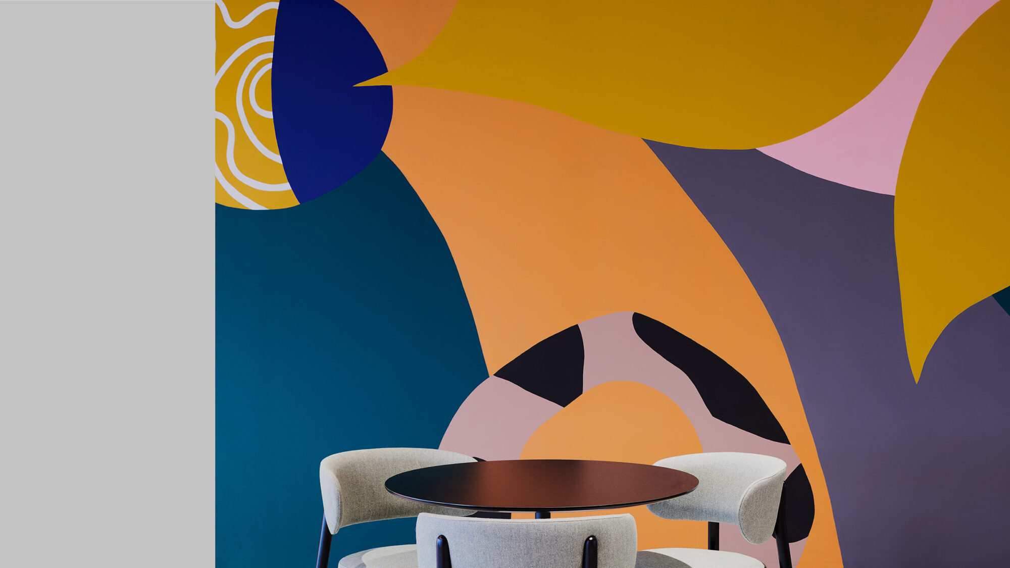
Match Group, a leading provider of dating services with a diverse portfolio of popular apps and websites, enlisted us to transform its Vancouver office space in The Stack. Much like its product philosophy, the project, titled Project H20, centres on facilitating valuable engagement within a brand-enriched work environment.
Our design integrates health and wellness, workplace strategy, interior design, architecture and brand experience to create a dynamic, hospitality-infused workplace experience. Fueling connections through innovative design, we’ve created a vibrant hub that reflects a spirited culture and supports meaningful interactions in every corner.
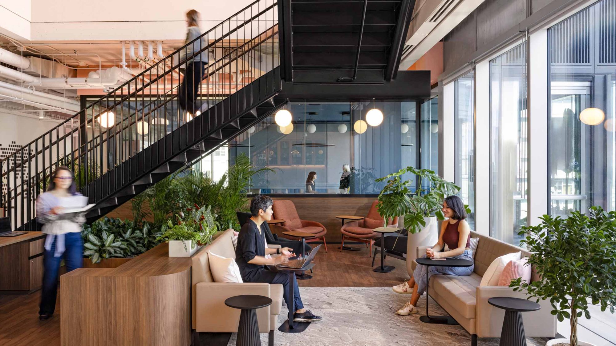
The larger Match Group team focused on performance and security, while the local team emphasised comfort and creating a home-like environment. This dual focus is reflected and harmonised throughout the workplace transformation. The comfort of hospitality and residential settings create a cosy and welcoming ambience within a bustling, dynamic environment.
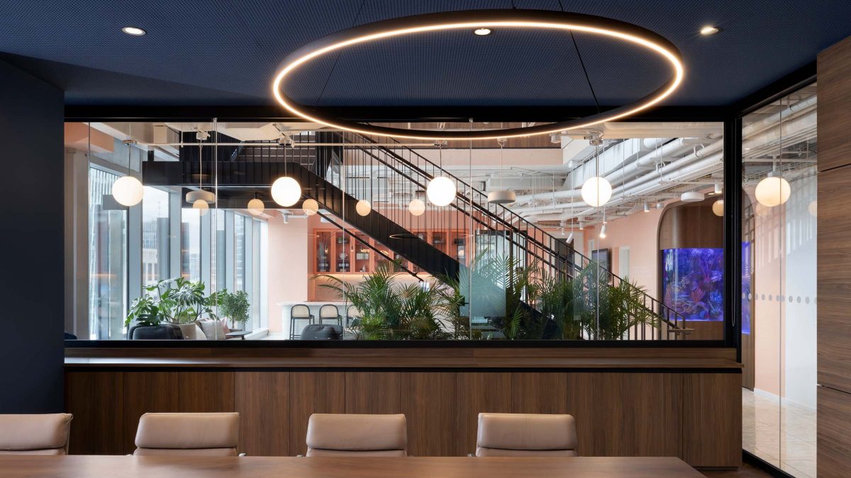
Drawing upon the expertise of our change management and workplace strategy teams, we collaborated with client teams and senior management. Together, we discovered new ways to enhance cross-team connections. This extensive analysis provided a deep understanding of the company’s core mission as it progresses to its next business phase.
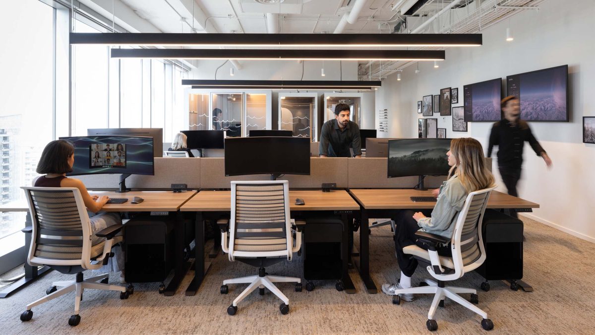
These studies also helped adapt the layout through a variety of settings that accommodate our client’s evolving work styles. Team members from each department can access collaborative areas, conduct meetings and use quick touchdown spots. Work settings can expand and contract over time to support different teams – providing the flexibility needed as the organisation evolves.
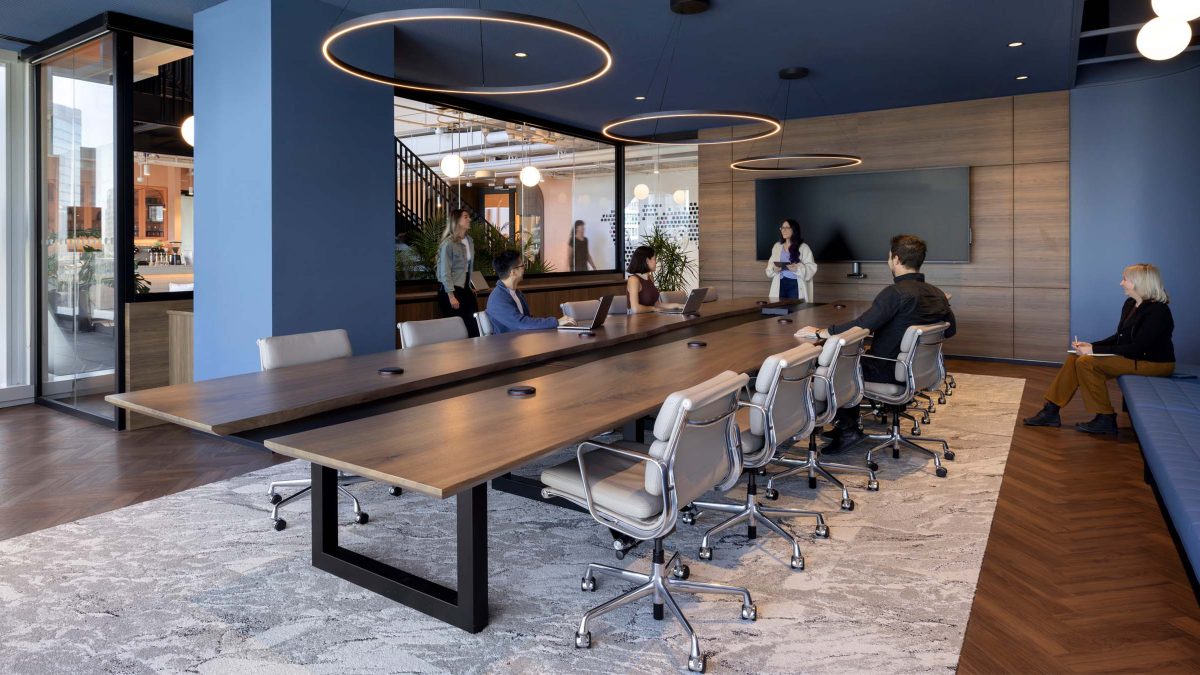
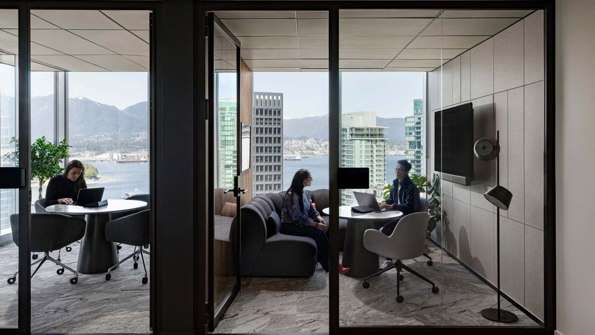 Equipped with state-of-the-art digital capabilities, the workplace ensures seamless in-person and remote hybrid meetings, supported by exceptional audio and visual.
 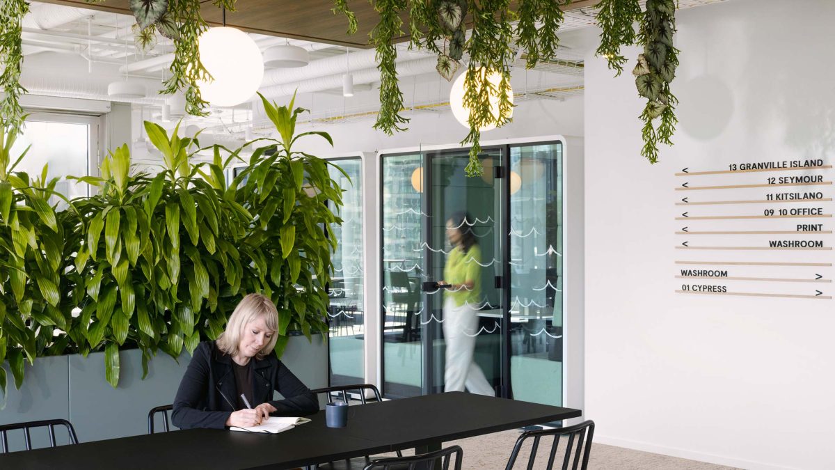 The floor plan functions as neighbourhoods with adjacent hotdesking areas, each optimised for various workstyles.
 Our design transformed the office into a dating journey – creating a sense of progression akin to a first date. Upon entering the space, visitors feel like they are ‘downloading the app’, becoming immersed in Match Group’s brand identity. From this touchpoint, our team thoughtfully divided each space into unique zones. Each zone corresponds to different dating stages, enhancing the overall brand experience.
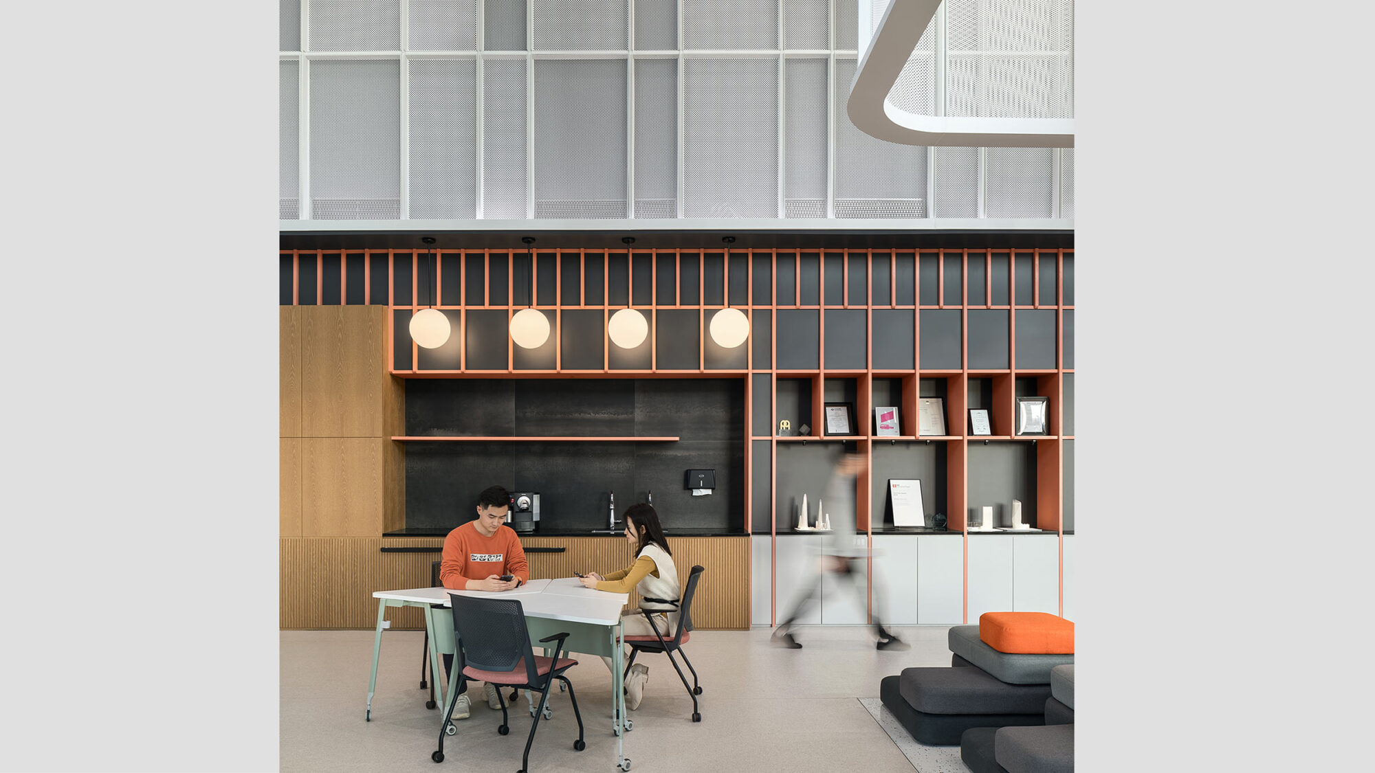
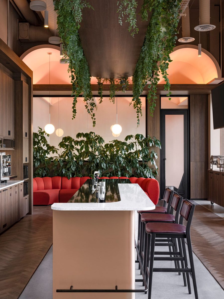
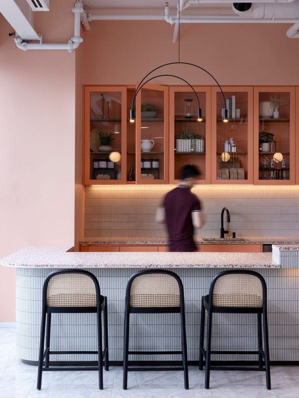
The 18th floor is geared towards hospitality and a finer dining experience. This large pantry’s design and layout are reminiscent of a dinner date, complete with moody lighting and a unique palette. Here, our team also made HVAC upgrades to accommodate larger group events.
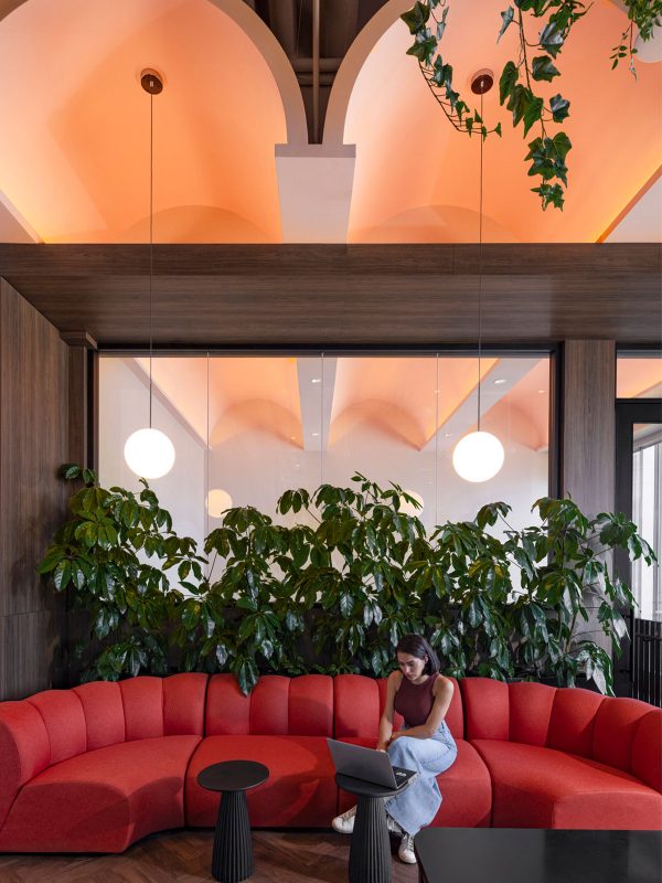
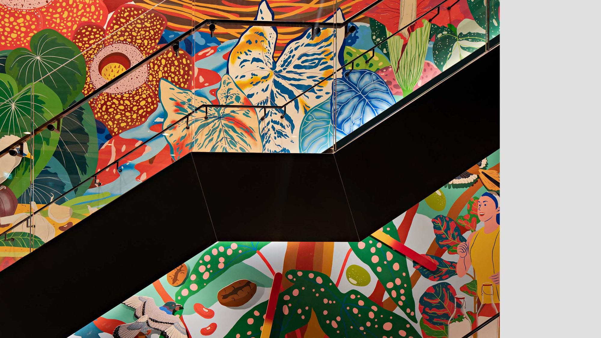
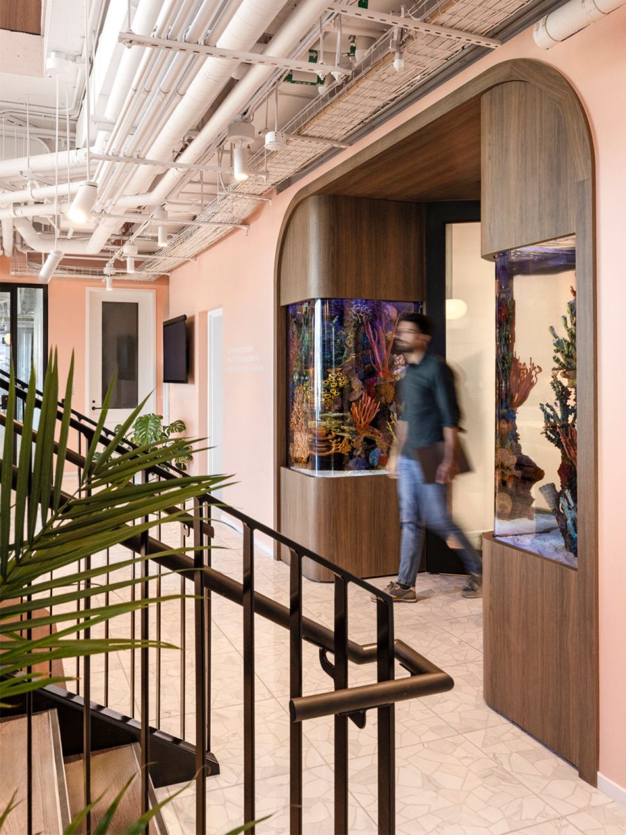
The office space has two captivating fish tanks on display, while vaulted ceilings feature exquisite arches. The playful and expressive environment engages the senses on multiple levels, creating a warm, inviting atmosphere. Signature colours throughout the space emphasise brand representation.
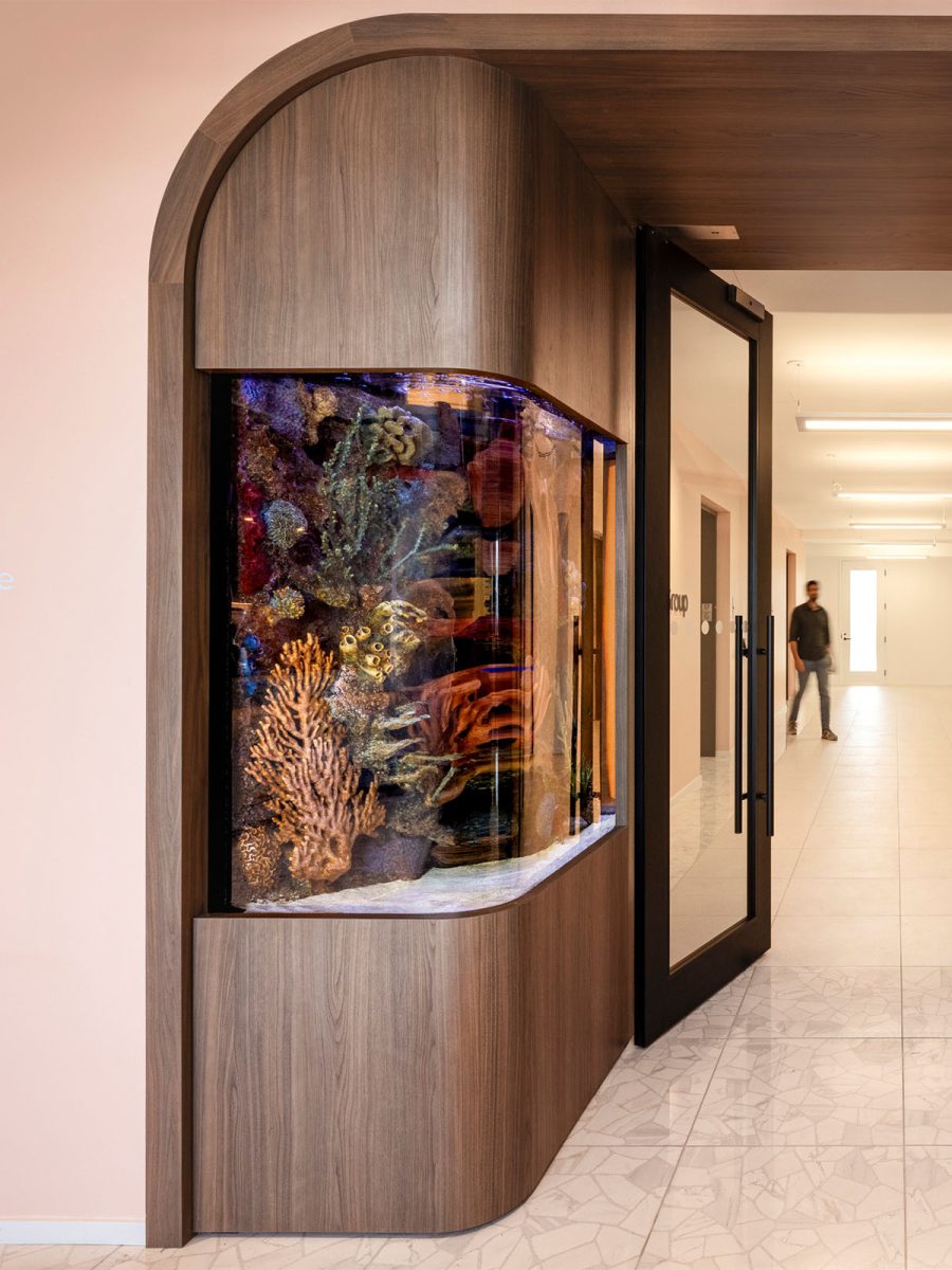
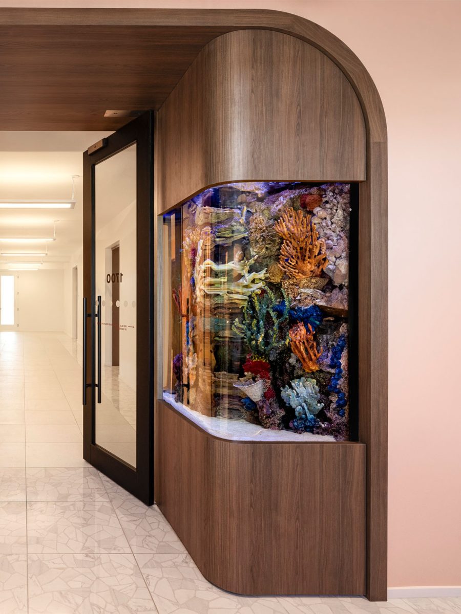
Our design captures the spirit of going on a first date, where self-expression is front and centre. It simultaneously envelops occupants in a comforting embrace – creating a workspace that feels like a warm hug, a home away from home.
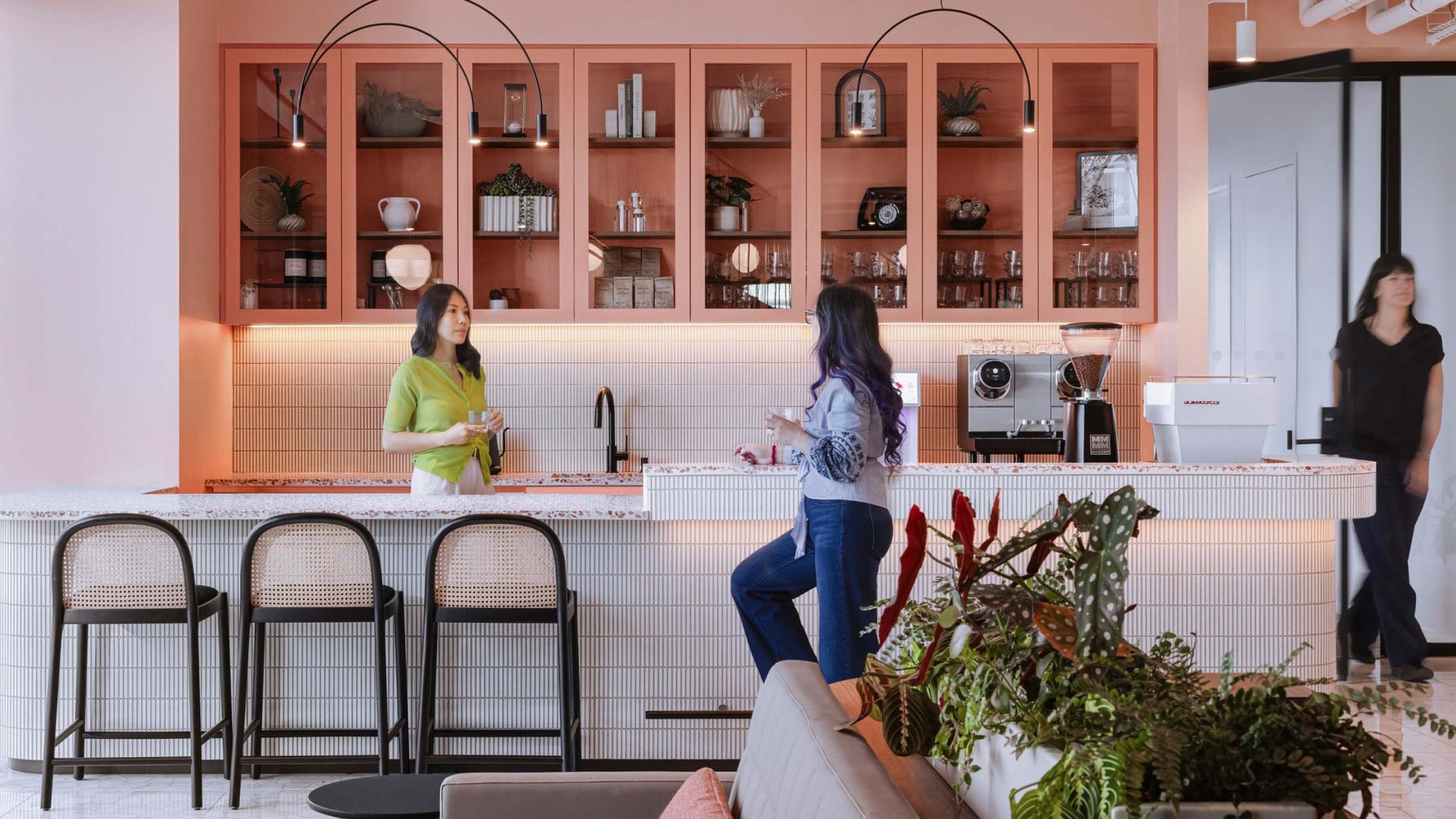
Alex Watkins, Associate Director, M Moser AssociatesCore values of inclusivity and community also guided our design. Various amenities, like the café, tea points and the large pantry, encourage lingering and connecting. They enhance a sense of togetherness and a positive return to work. Furthermore, the pantry features a generously sized island for catering and community activities.
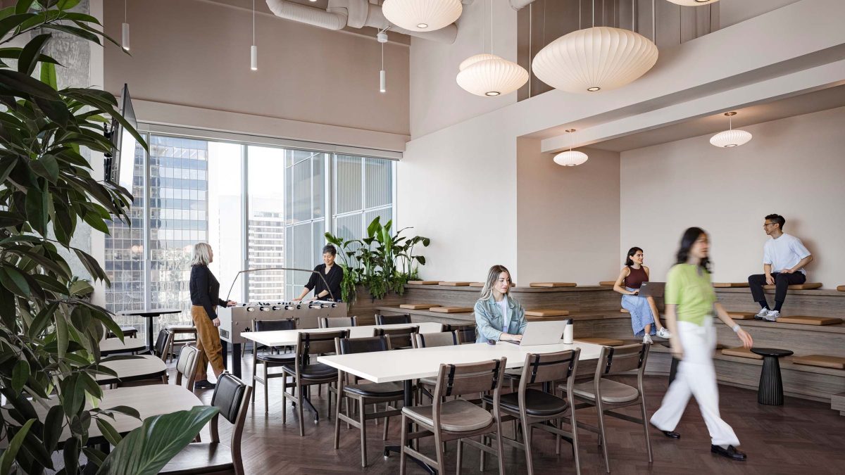 Tiered seating and large furniture settings accommodate large groups and ample space for interaction and entertaining.
 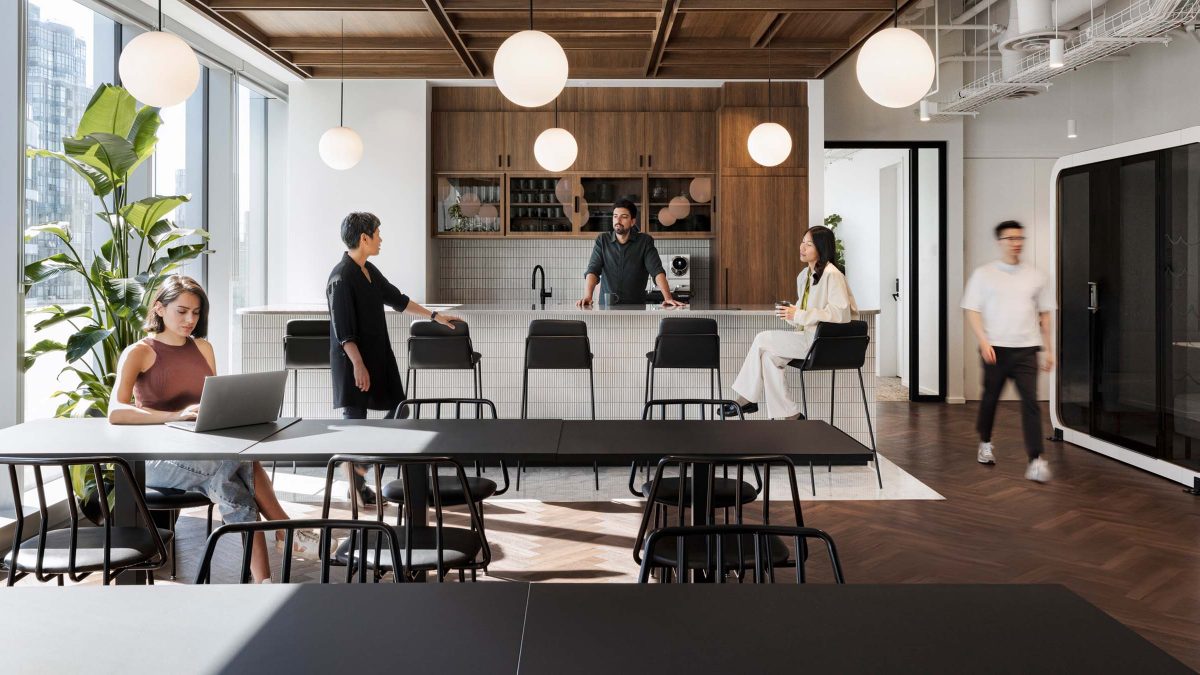 Large gathering spaces, technology and flexible seating options combine to create an office that is vibrant and welcoming for everyone.
 The building’s distinct architectural features played a role in our client’s choice of this space. It also provided the foundation for an extraordinary project.
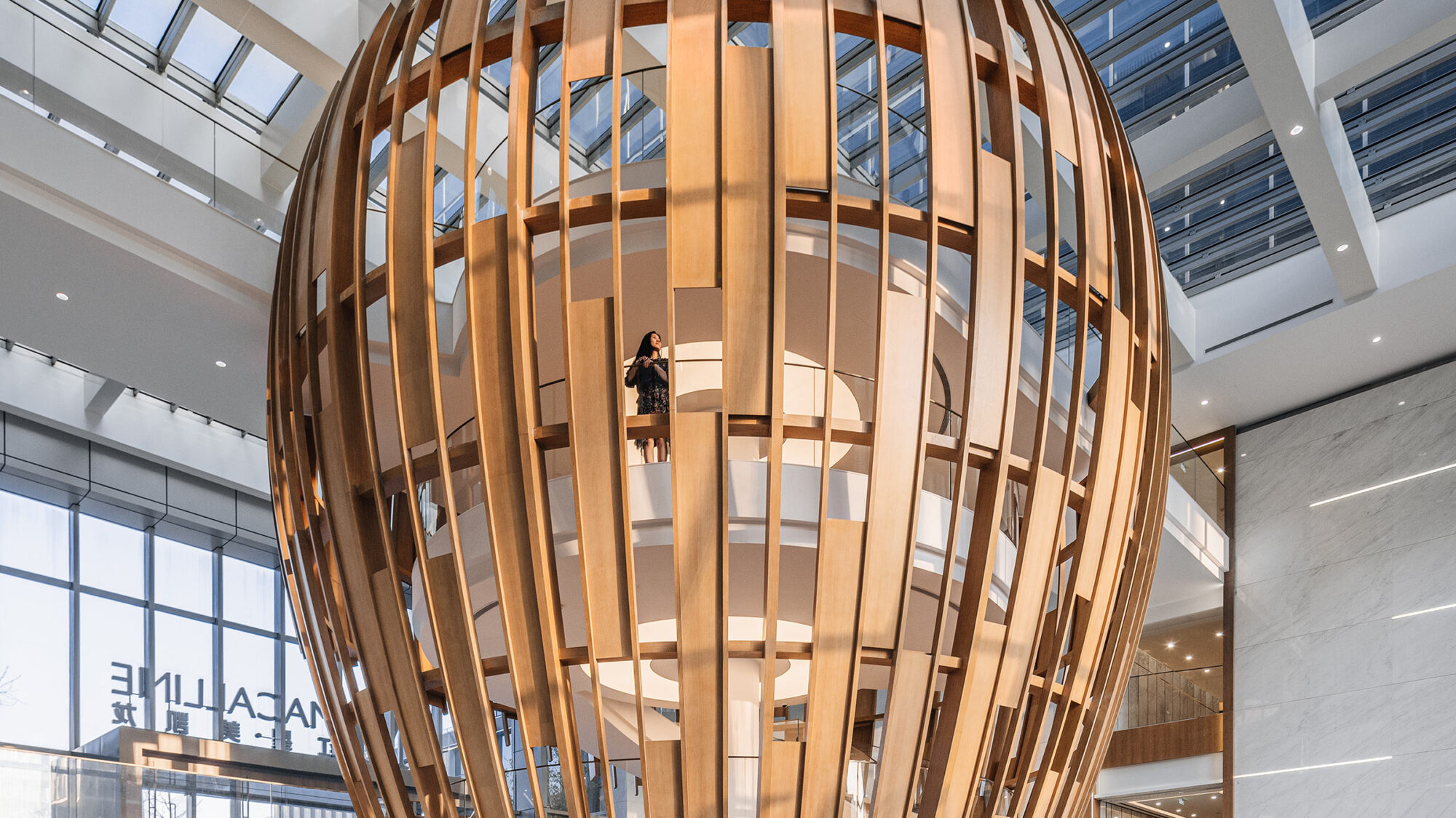
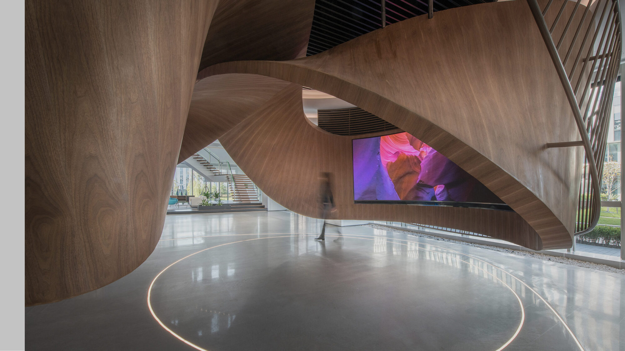
Initially, the project involved three floors interconnected by two staircases. However, we later adapted the design to 2.5 floors connected by one staircase. This fluctuating scope required a flexible approach to design. So, our team designed an L-shaped staircase to blend in with the existing architecture. The 2-floor staircase is a focal point in the triple-height atrium, leading to the double-height 18th floor. It adds functionality and serves as a visual centrepiece.
The project features budget-conscious furniture and materials that prioritise acoustic properties. Additionally, we incorporated sustainable elements like energy-efficient lighting and low-flow toilets and faucets to align with the client’s environmental initiatives. We used 3rd party-verified, red list free carpet in the open work area and enclosed rooms. GreenGuard gold-certified hardwood flooring and low VOC acoustic panelling make up the meeting rooms and offices. Furthermore, LEED-compliant concrete countertops can be found in the café.
During the project, our team collaborated closely with the client to navigate a rebranding process. We remained a steadfast partner, adapting to new directions.
This workplace transformation embodies an immersive design that aligns with the company’s values and inclusive identity. It supports its team and culture while providing a deeper product connection and a heightened sense of belonging.
Completed
2024
Vancouver, British Columbia
2,787 sq m / 30,000 sq ft
Ema Peter