
Adobe is one of the world’s largest and most diversified software companies. As an initial expansion of its New York City HQ in Times Square, Adobe wanted to draw on the vibrant energy of its urban surroundings. Inspired by Adobe’s workplace design principles of inclusivity, seamlessness and inspiring innovation, our architecture and interior design teams’ have provided a workplace journey with a splash of colour and comfort.
The office design is dynamic and colourful for Adobe New York’s 500 employees, representing its global sales and customer hub. Inspired by the concept of a prism, colour responds to workers’ needs and behaviours. This space captures a full spectrum of environments that enable different creative processes while also capturing the energy of New York City.
Our design encompasses the construction and build-out of the 18th, 19th and 20th floors and design services for the remodel of the 17th floor. All the remodelled floors tie in concisely with Adobe’s Building Management System.
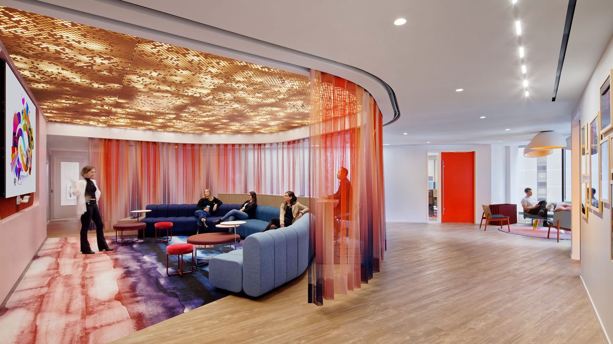
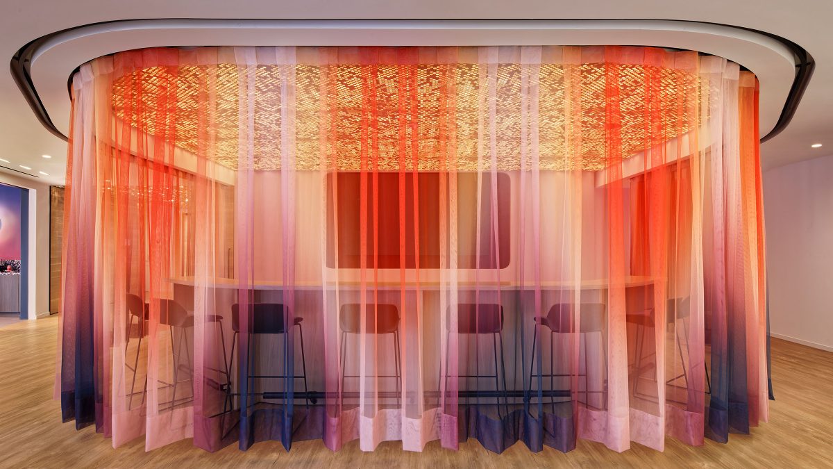
Our team designed a Customer Experience Centre on the 20th floor to accommodate the hundreds of employees representing the company’s enterprise sales teams. As a conference environment, this floor caters to client-facing partners and all facets of customer support and enablement. This floor incorporates many custom design details that allow the space to function as both a workplace and a hospitality experience. For example, a fully operable dual curtain system can open to create a presentation space or retract into a storage closet. This presentation area, or ‘Campfire’ as nicknamed by the client, also features an acoustic ceiling with a custom perforated pattern and customisable dynamic lighting.
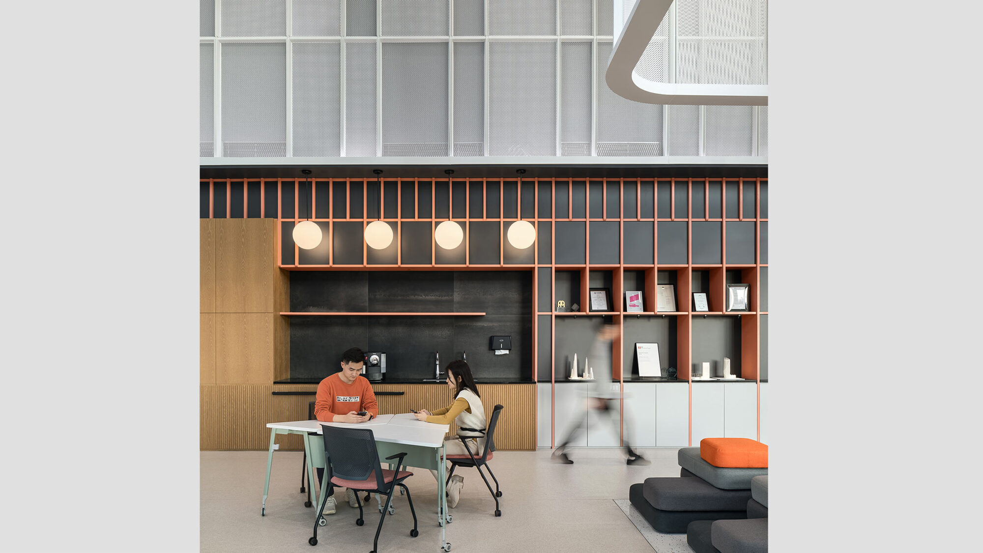
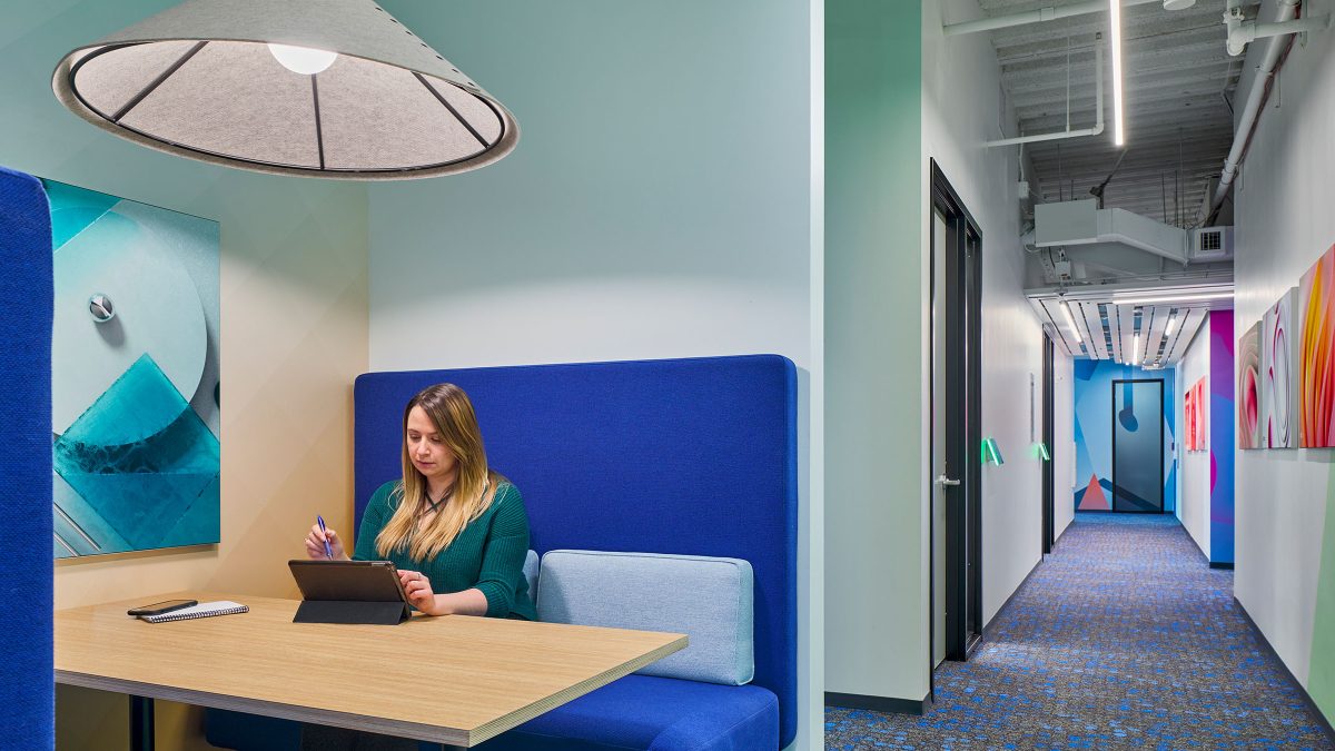
Representing Adobe’s workstyles, our team created spaces that give employees a choice of where and how they work. Whether that be in an open, collaborative space or private focus areas. Dedicated workstation designs help to promote a healthy work environment that enhances the wellbeing of its employees by incorporating biophilic and sustainable elements.
Importantly, the space reflects Adobe by building the brand right into the architecture and design elements.
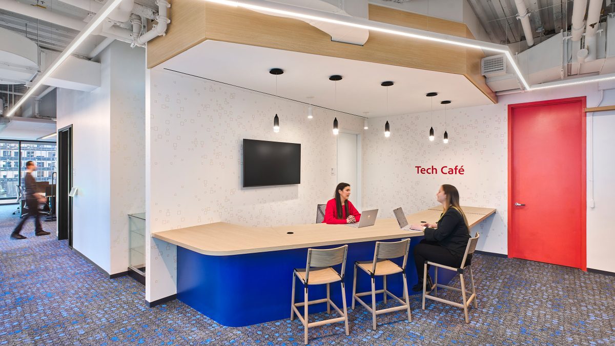
Speciality destinations on each floor enhance the employee journey. The spaces include a tech bar, library and adventure room geared towards photography.
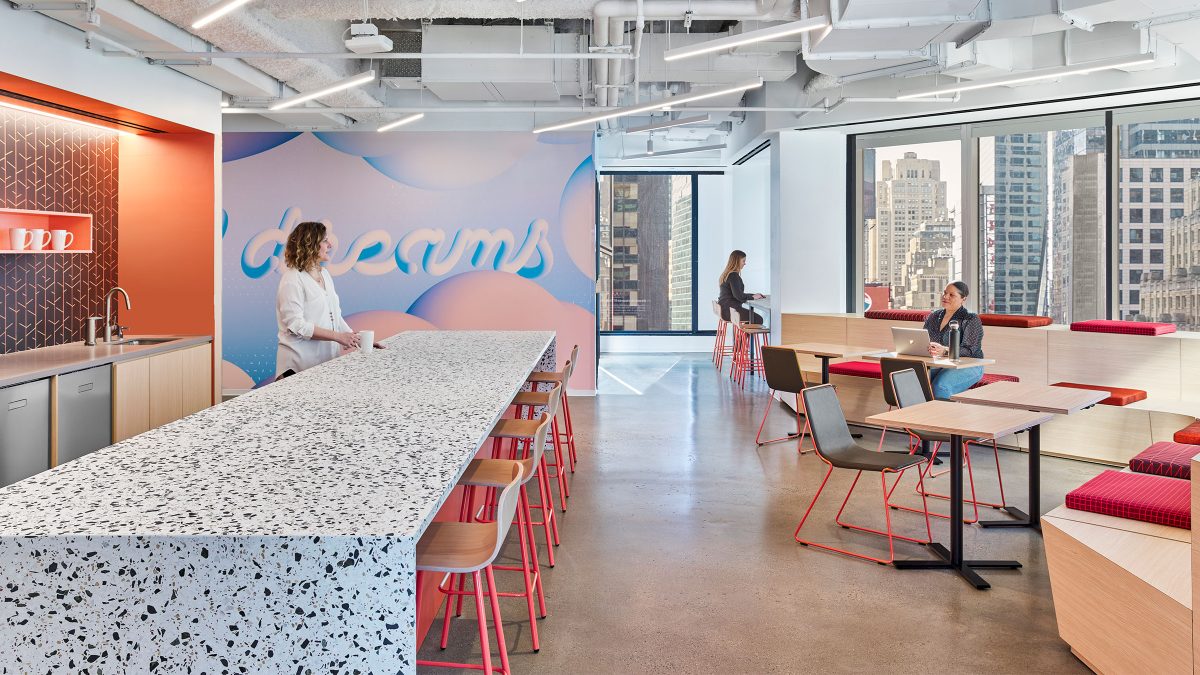
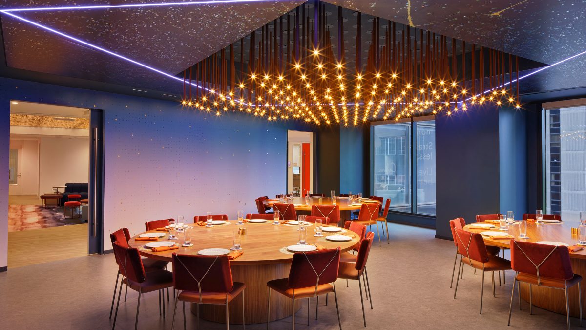
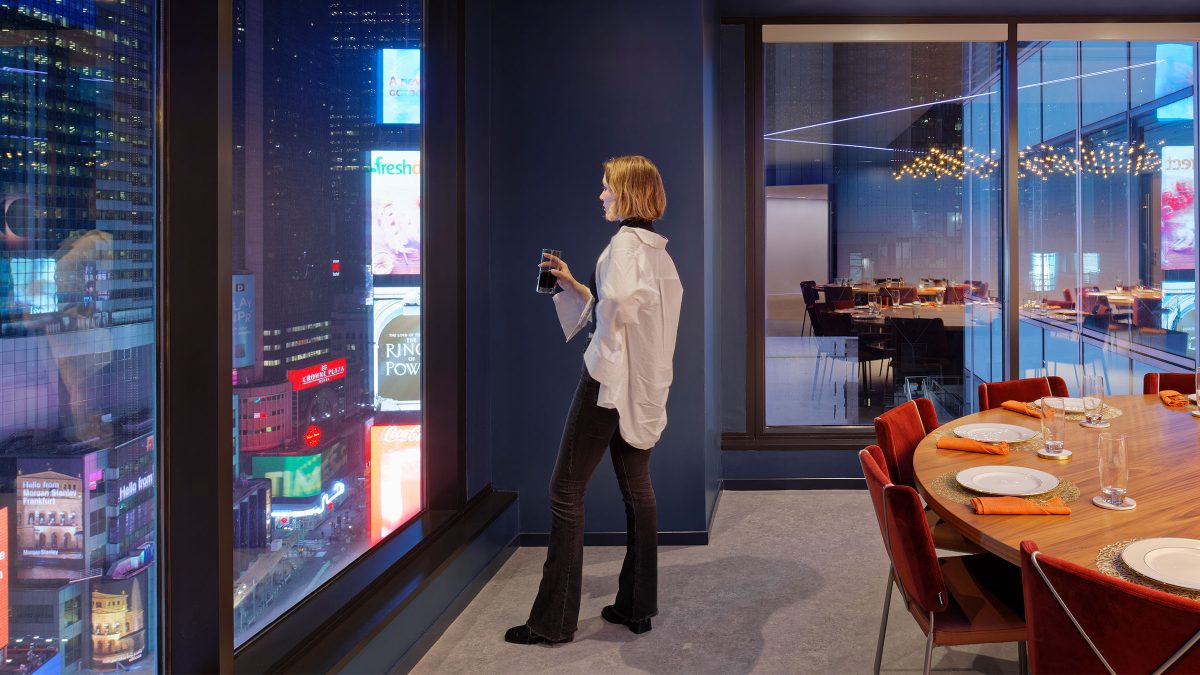
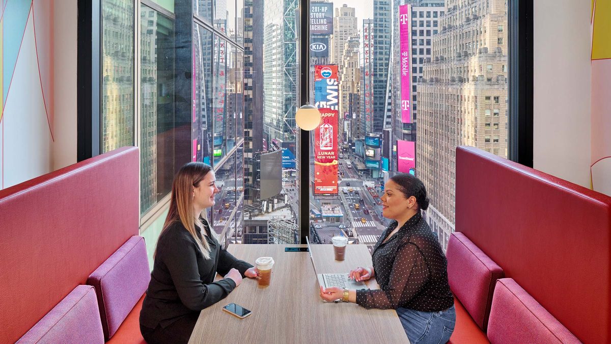
A central hub functions as both a café and an all-hands space for hosting large, scaled gatherings. Locating the hub along the entire west perimeter of the building maximises natural daylight. Likewise, it benefits from sweeping views of Times Square. Additionally, it provides viewing space for the infamous New Year’s Eve Ball Drop and other happenings.
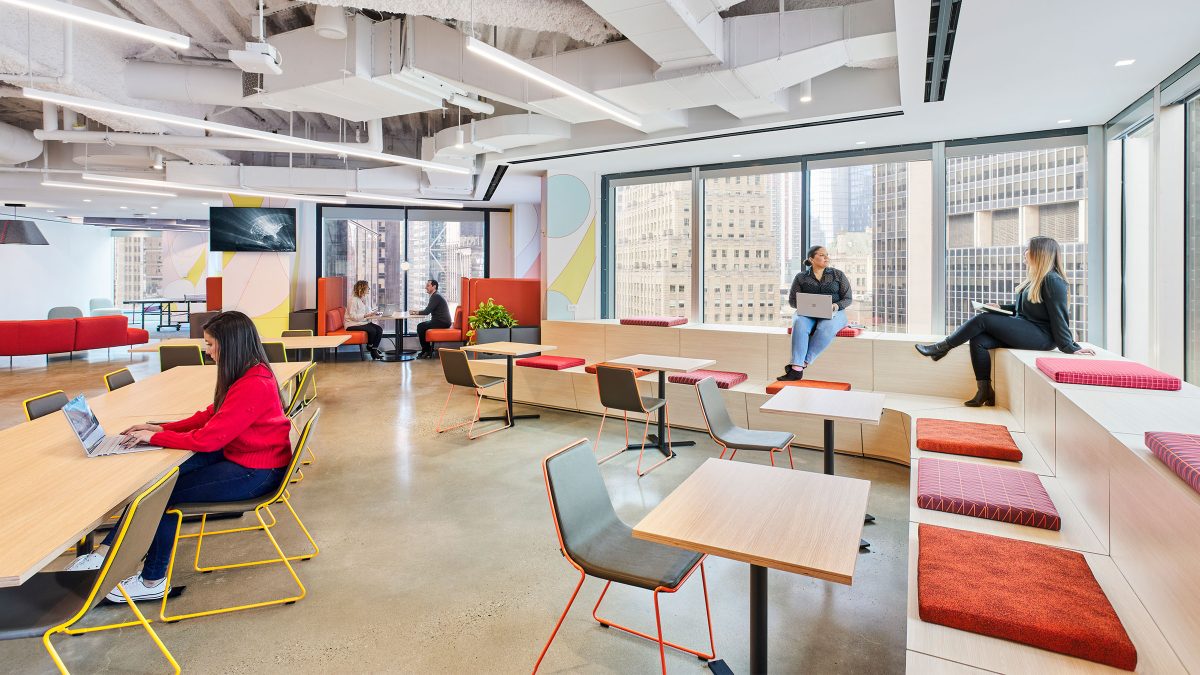
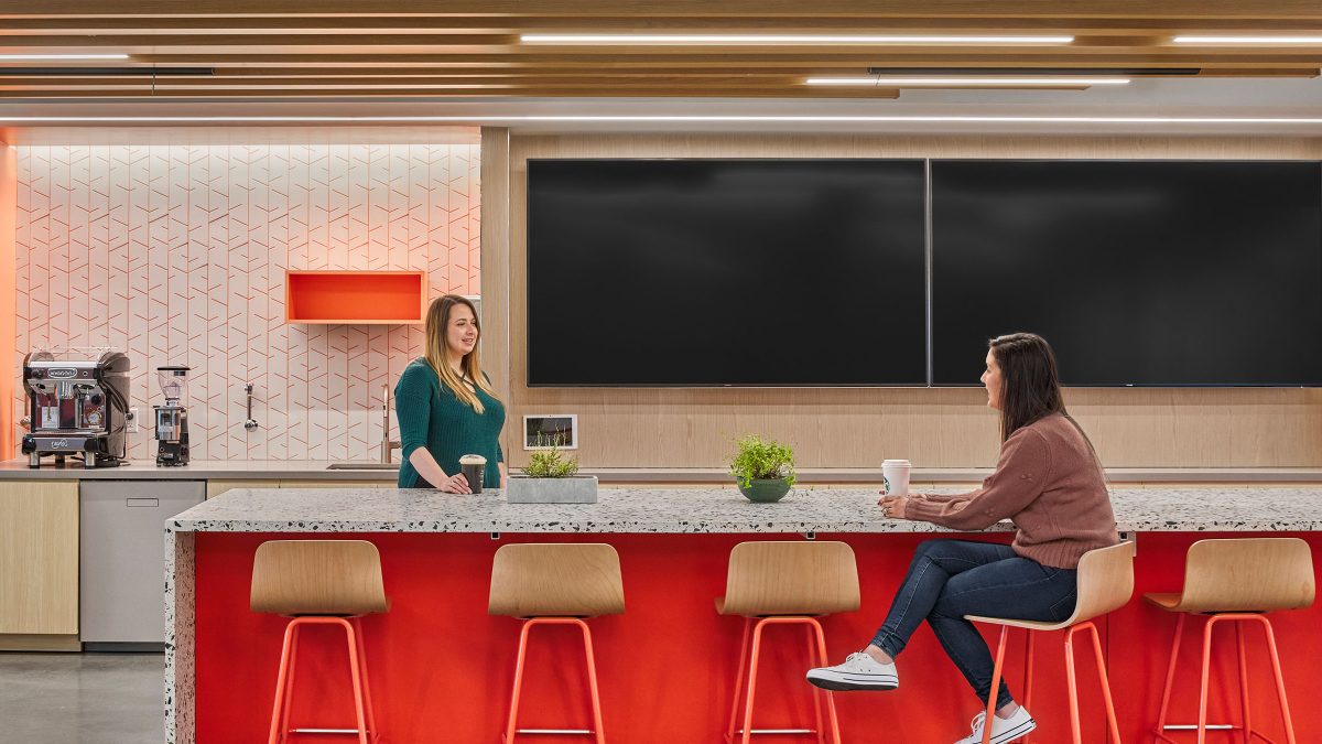
A prism dynamically refracts and reflects light. The workplace design mirrors the vibrant energy of Times Square just outside. Inside, a human-centred office design prioritises diverse staff needs with a range of different spaces to activate the workplace.
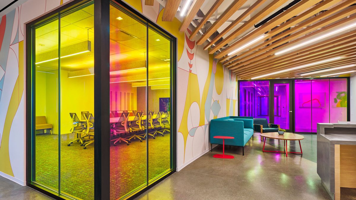
We know colour affects our behaviour, perception, performance and wellbeing. So, we worked closely with Adobe to develop a colour journey through the HQ stack. By analysing the desired behaviours, we chose the spectrum of colour best suited for each type of space.
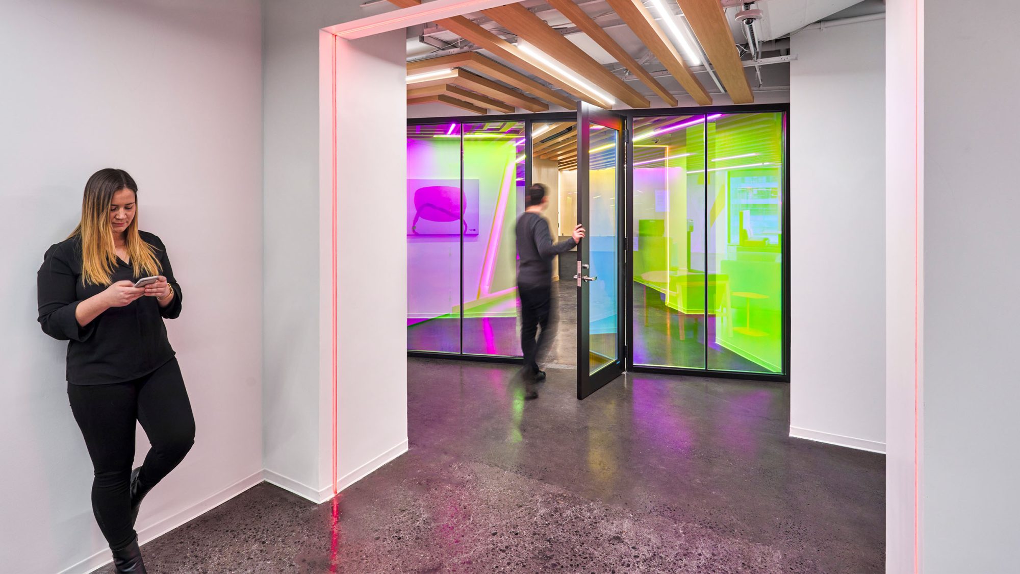
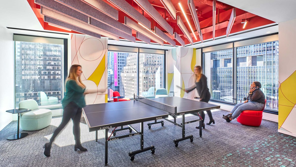
On arrival, visitors see a colourful glass film leading into a reception, hub and connected games room. Warmer tones of bright yellow, orange and Adobe red accents, mixed with playful stone and tile patterns, define the higher energy zones.
Meanwhile, cooler tones offset the vibrancy to encourage focused, heads-down work. Subtle colour pops through organic carpet patterns and dynamic paint angles in blue, green and teal hues offer a gentle pull into zoned neighbourhoods and collaboration areas.
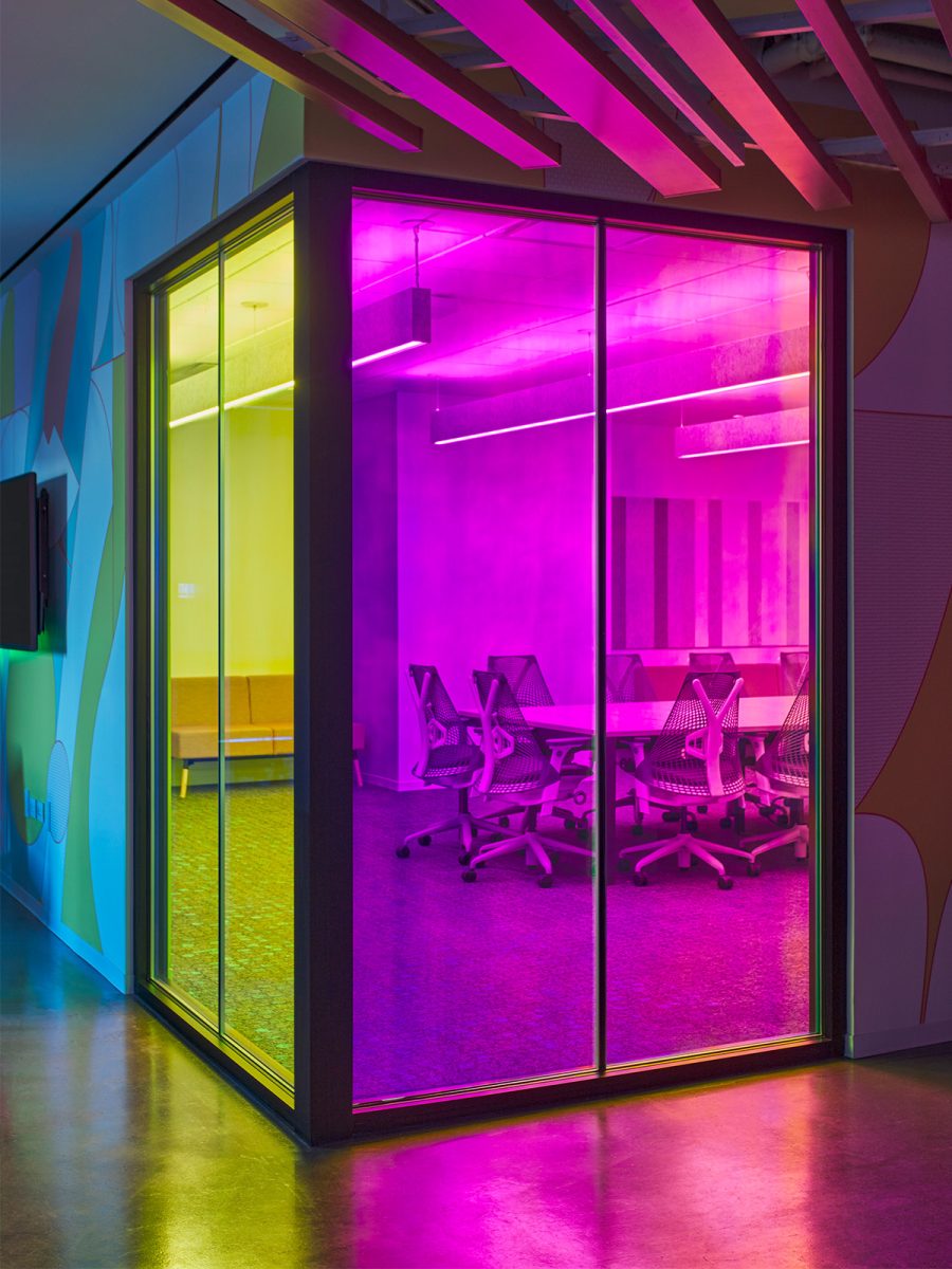
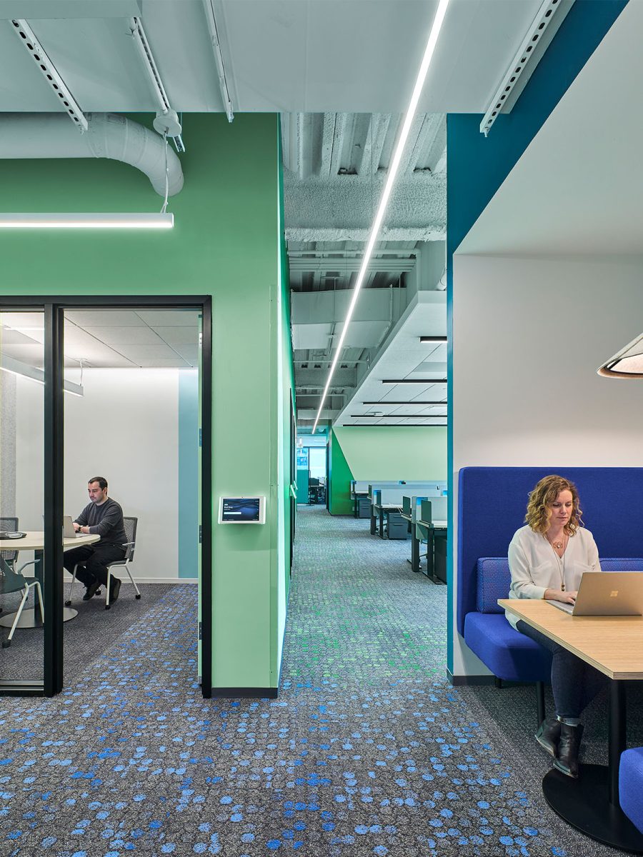
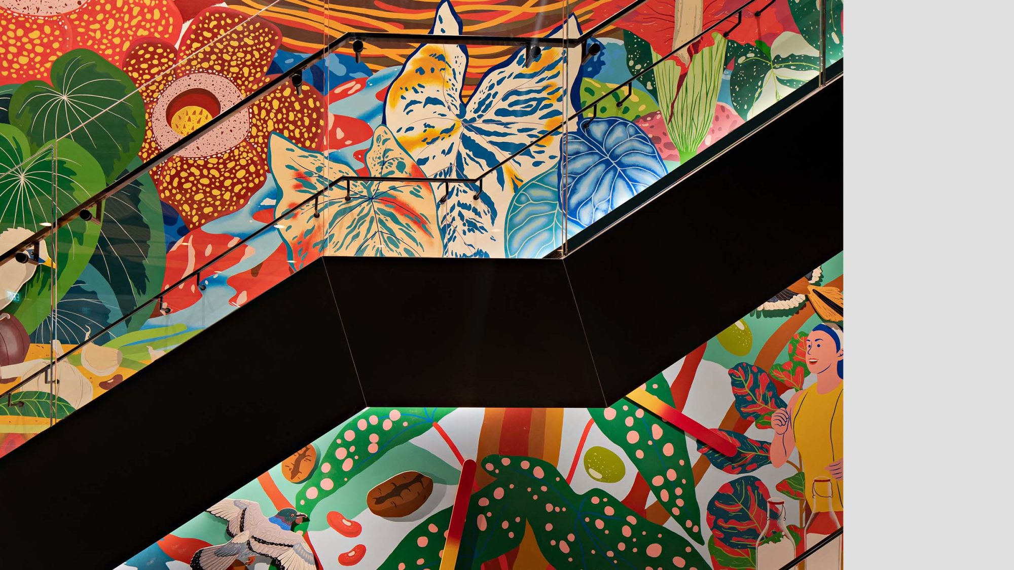
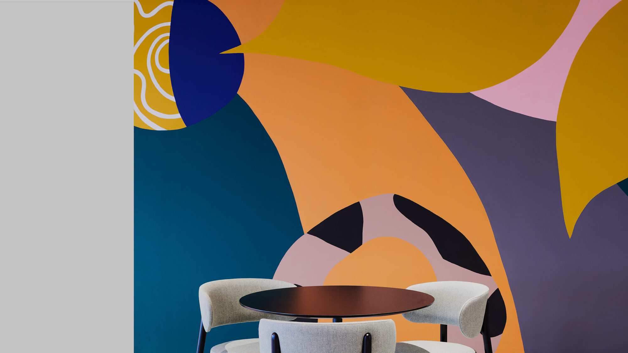
Colours and patterns inspired by Adobe platforms, including Adobe ‘A’-inspired paint angles, help tell the story of Adobe’s brand identity. In addition, directional ceiling slats in the main corridors and elevator lobbies lead the eye to newly branded internal staircases. The staircases enhance wellness by encouraging employees to move vertically.
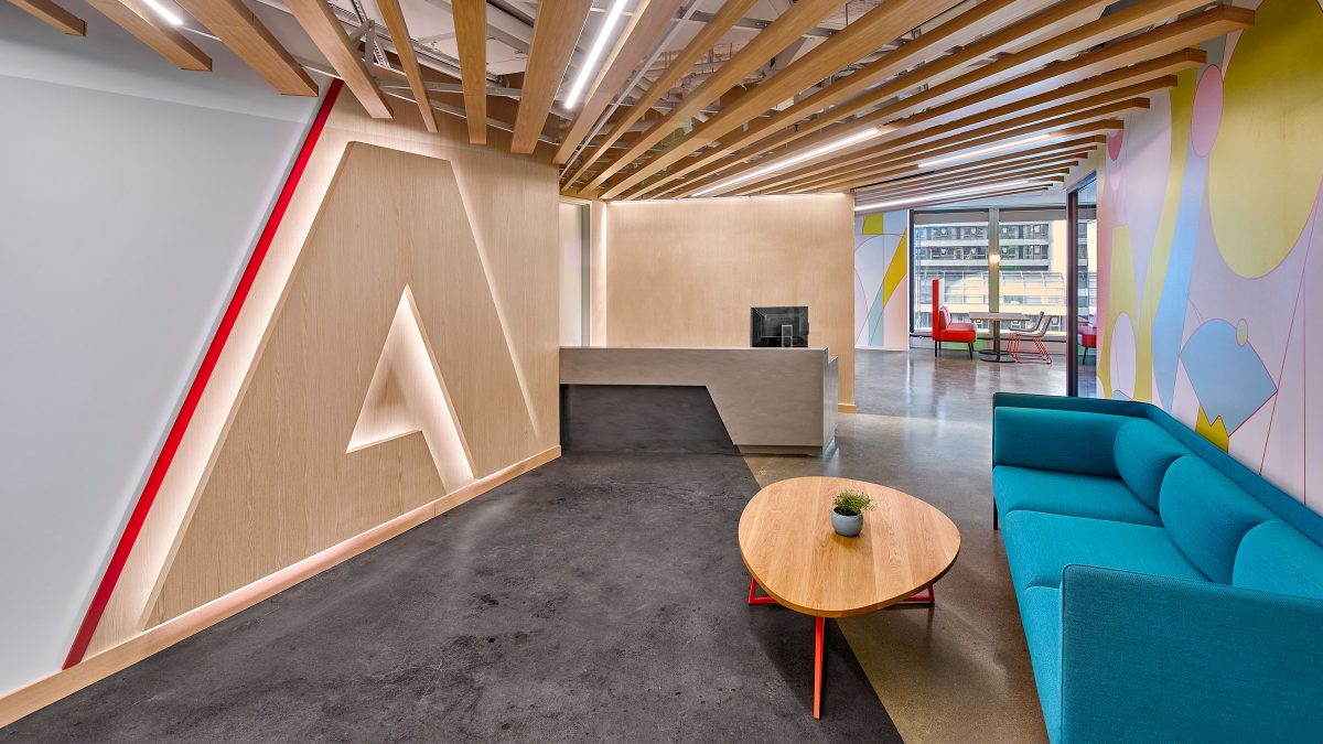
Adjacent to the staircases, business-driven destinations entice employees and build a curated client journey. Adobe artwork, conceptualised by M Moser, tells an inspiring story about the brand. Furthermore, it locates the office regionally by highlighting New York City landmarks.
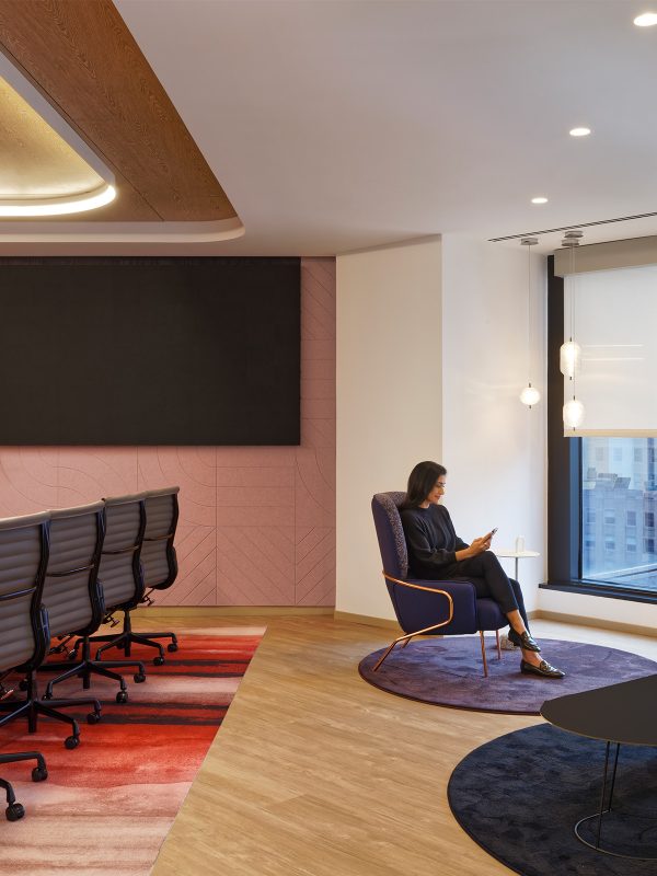
Our office design for Adobe encourages chance encounters, cross-collaboration and direct exposure to the work of fellow Adobe teams. Consequently, it creates a sense of community and belonging for staff and visitors.
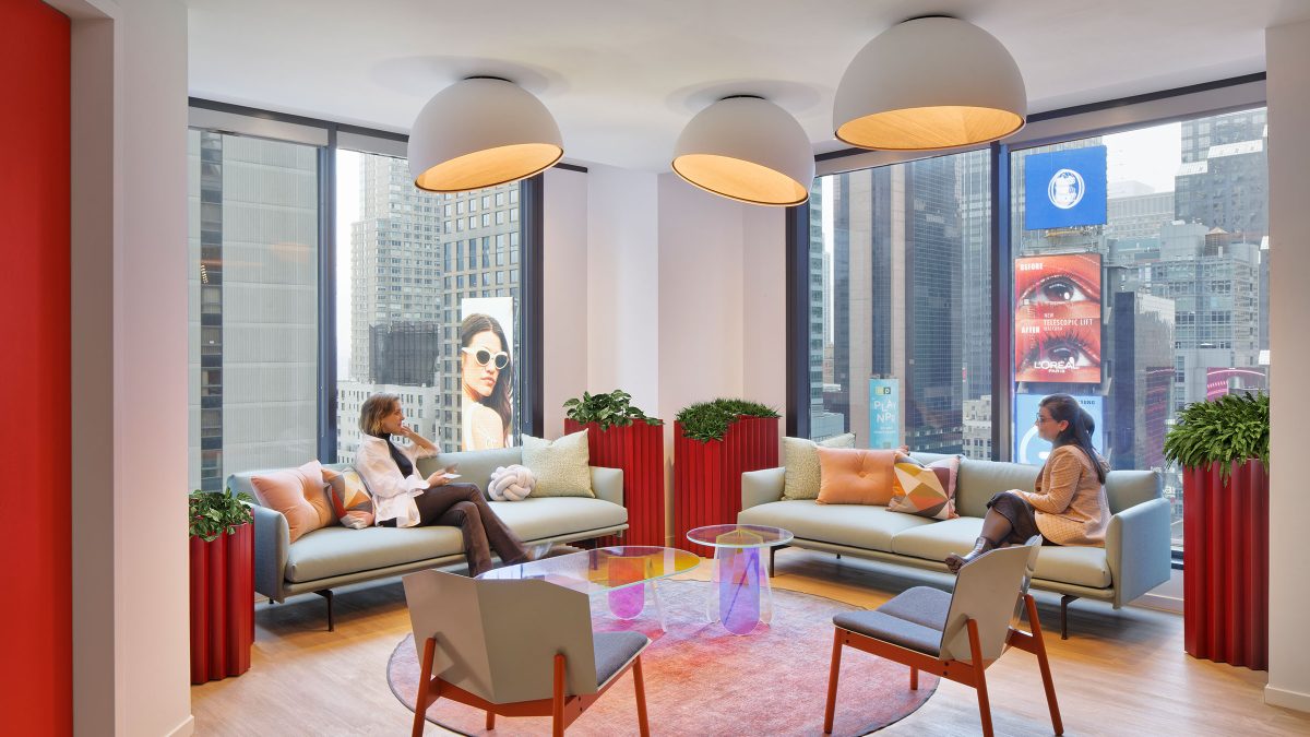
From the crossroads of the world to the crossroads of Adobe, we’ve created an energetic workplace with purpose.
Project Management Associate, M Moser AssociatesAs a phased project that continues the design aesthetic and functionality created during previous phases, Adobe’s new floors bring a stronger sense of workplace identity and a unified experience. As Adobe continues revolutionising how the world engages with ideas and information, its New York destinations pride themselves on the vibrant and energetic vibe to help create a fun and dynamic work environment.
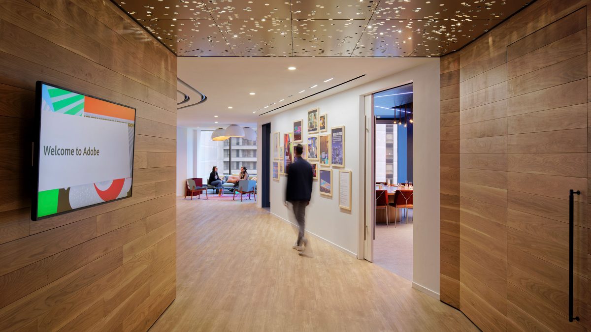
In the upcoming phases of this project, our New York team will continue to use design to integrate the Adobe community, and its locations, into one fully connected New York City campus.
Completed
2021
Times Square, New York City
81,972 sq ft
Aaron Thompson