

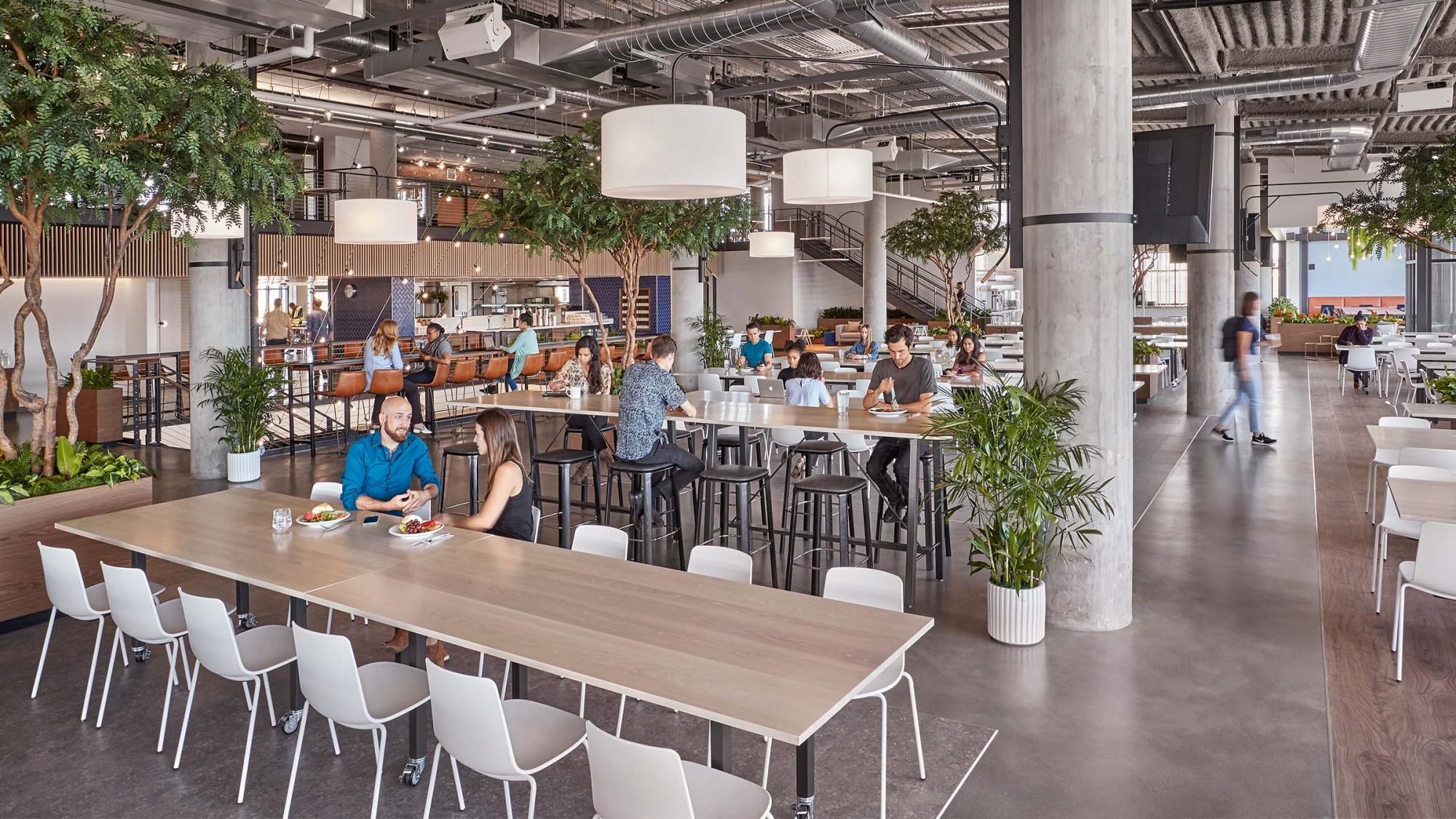
How do you scale a company’s culture through design? This was the core question posed for this office design. Our Bay Area client’s exponential growth had led to concerns around compromised quality and lower employee morale.
We undertook extensive studies to avoid losing key aspects of the company culture, success drivers and identity. Ultimately, this was to determine how employees needed to work, and how to keep them motivated and inspired.
We employed several overlapping architectural, design and workplace strategies. This enabled us to gracefully scale this Bay Area firm from 200 people in multiple buildings to 1,800 people in a 320,000 sq ft headquarters.
Strengthening the business, building culture and supporting new ways of working were essential objectives in the architectural programming. The design pays homage to this client’s humble, modest beginnings while leaning into its energised, collaborative, and connected nature.
As the interior architect, our teams led the concept and design for repositioning the atrium and interiors. To achieve client goals, we led the effort in collaboration with external partners and project stakeholders. Above all, we shifted the path of the building from a structural point of view – transforming it into something unique.
Partnering through a series of workshops with the developer, engineers and the core and shell architect, we translated the client’s vision for the new space. We considered the culture it wanted to preserve and what it wanted to reinvent. Importantly, this brief formed the strategic basis for the design and how it could move into the future. The base building needed significant reconfiguration to accommodate the new seven-story atrium and full-service kitchen on the 6th floor. All of which required a complex permitting process led by M Moser.
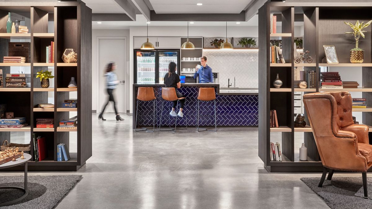
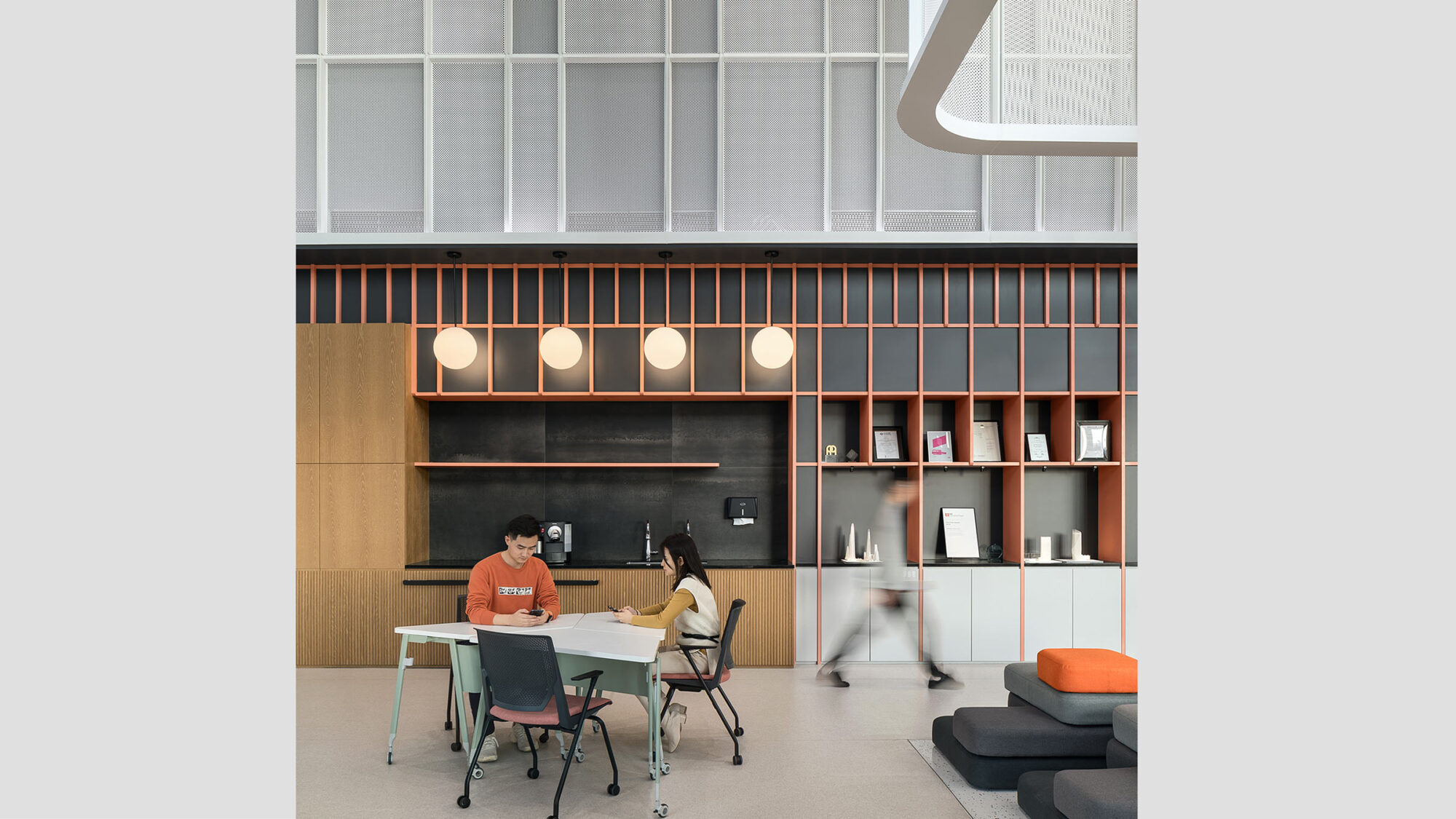
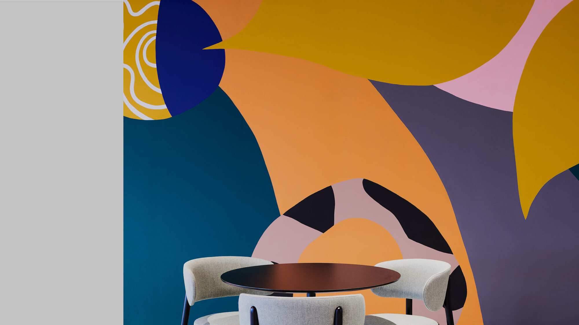
After identifying food and ‘cafe walks’ as a big part of the culture, we created a parallel. We made memorable destinations from the company’s previous San Francisco neighbourhood on each floor. These destinations reference coffee shops from the old location while encouraging employees to inhabit their building similarly. Consequently, every floor represents a unique community and focuses on nurturing connections between people. Each community feeds into the next, establishing environments with room for individuality within the larger collective.
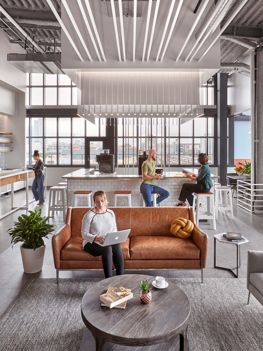
Meanwhile, community and programmatic elements stretch the user experience from floor to floor. Our design interventions reinforce the company’s neighbourhood-based feel while keeping visibility open and connected. Conference and meeting rooms occupy the floor’s perimeter to create continuity at the core of each floor. We divided the floor space by working with the building’s perimeter and staggering the conference rooms. As a result, lounges, booths and phone rooms appear in clusters instead of traditional walled-off perimeter rooms to create a more organic feel. Consequently, this strategy breaks up the space without blocking visibility.
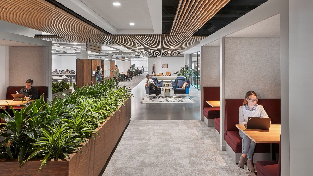
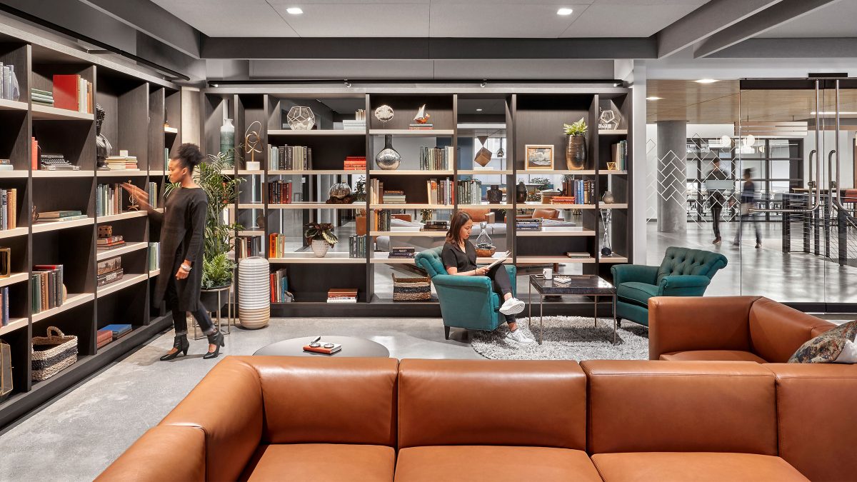
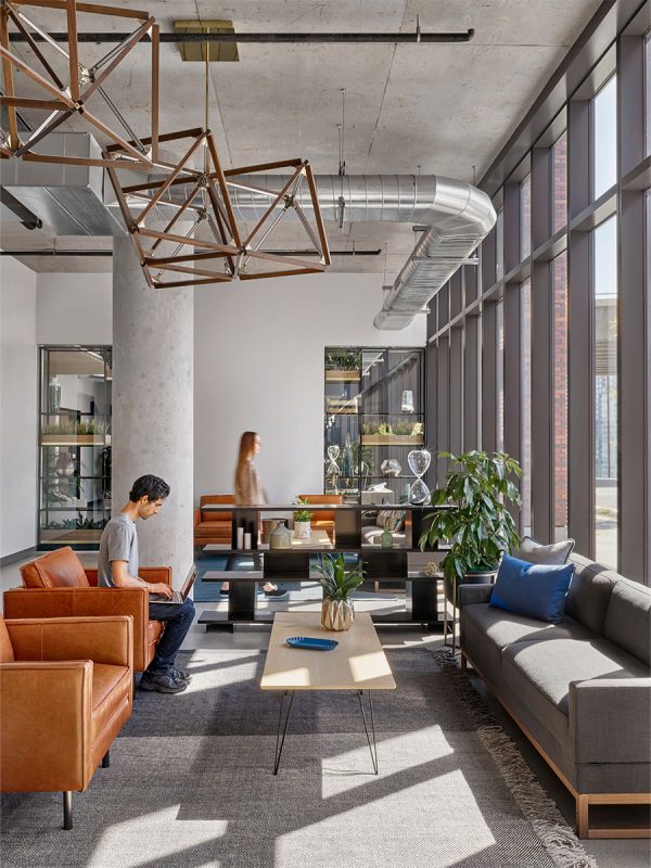
Our design team studied the materials, finishes and details. Additionally, they considered daylight, acoustics and other environmental factors to capture the intrinsic nature of the new space. Equally, the overarching aesthetic takes cues from residential and hospitality environments to reinforce a feeling of home and belonging.
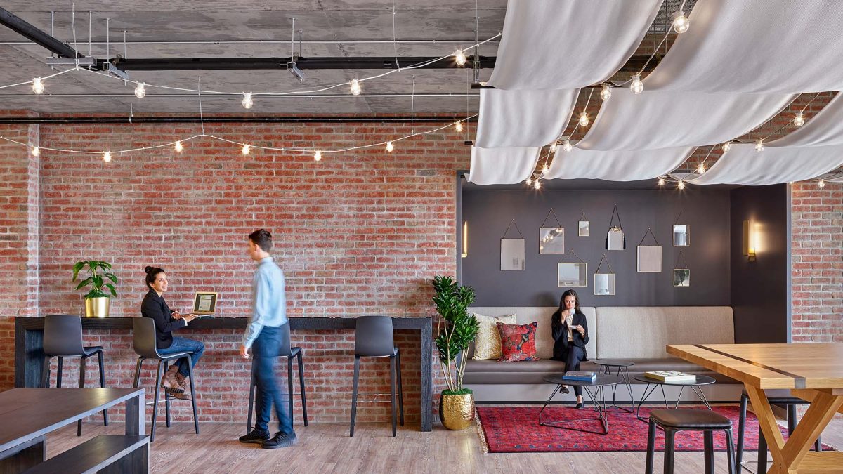
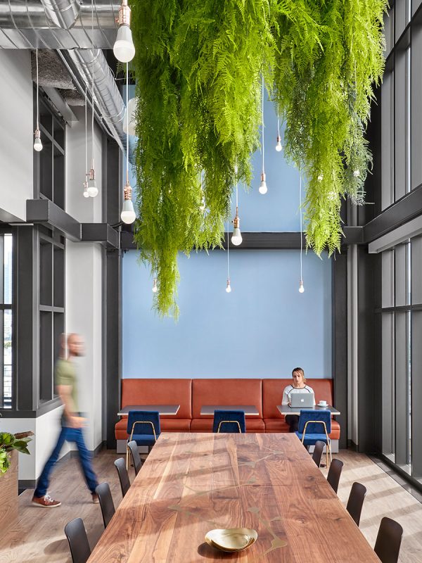
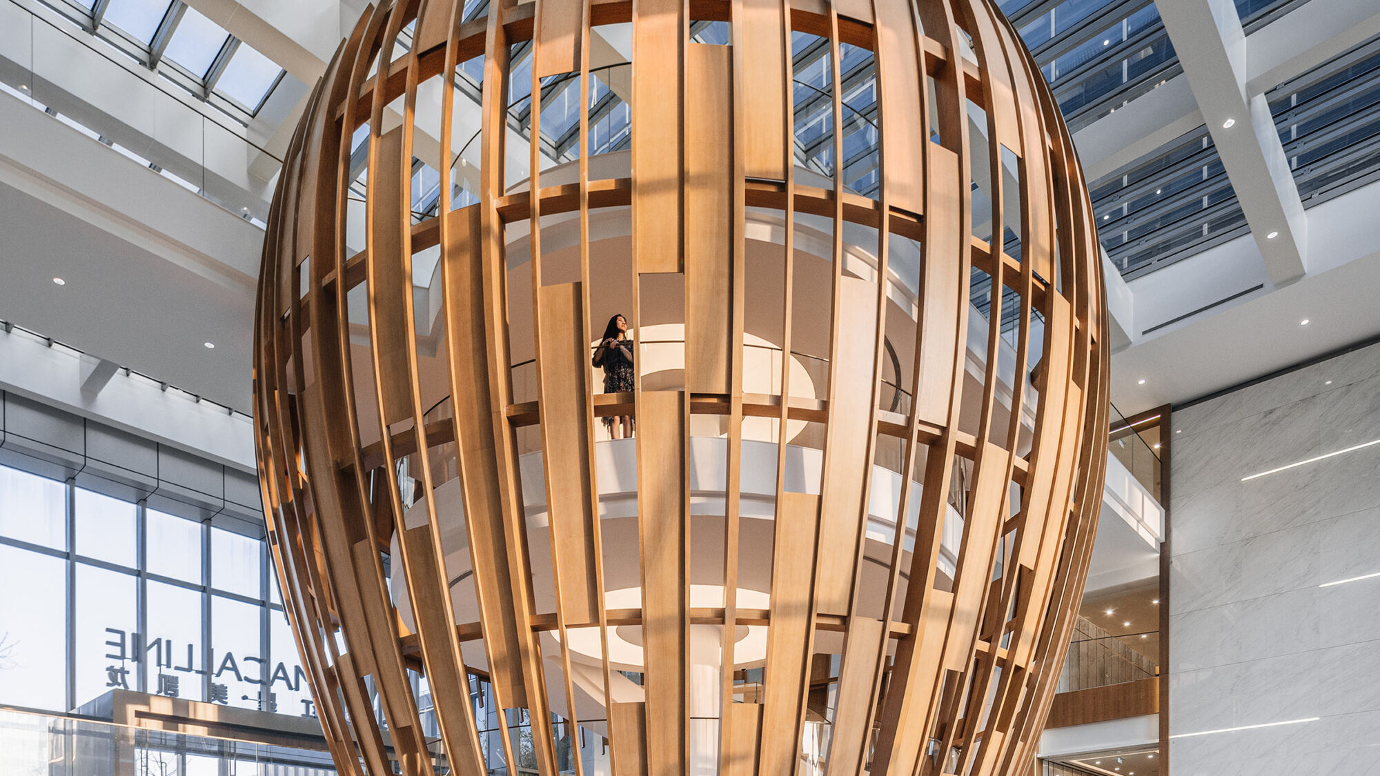
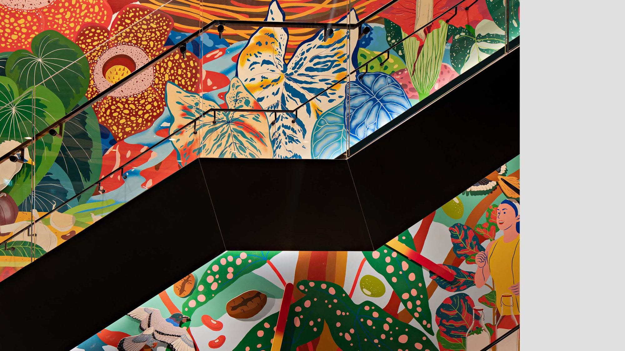
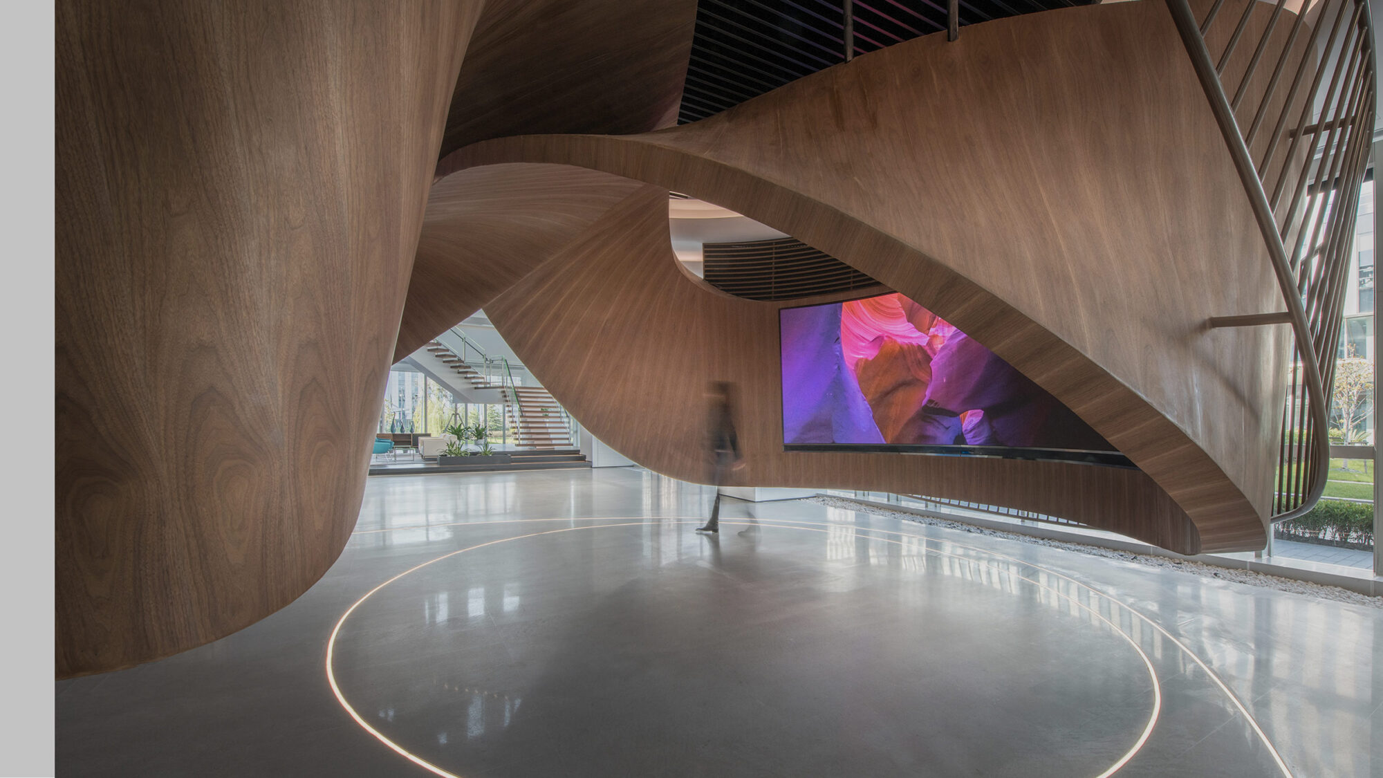
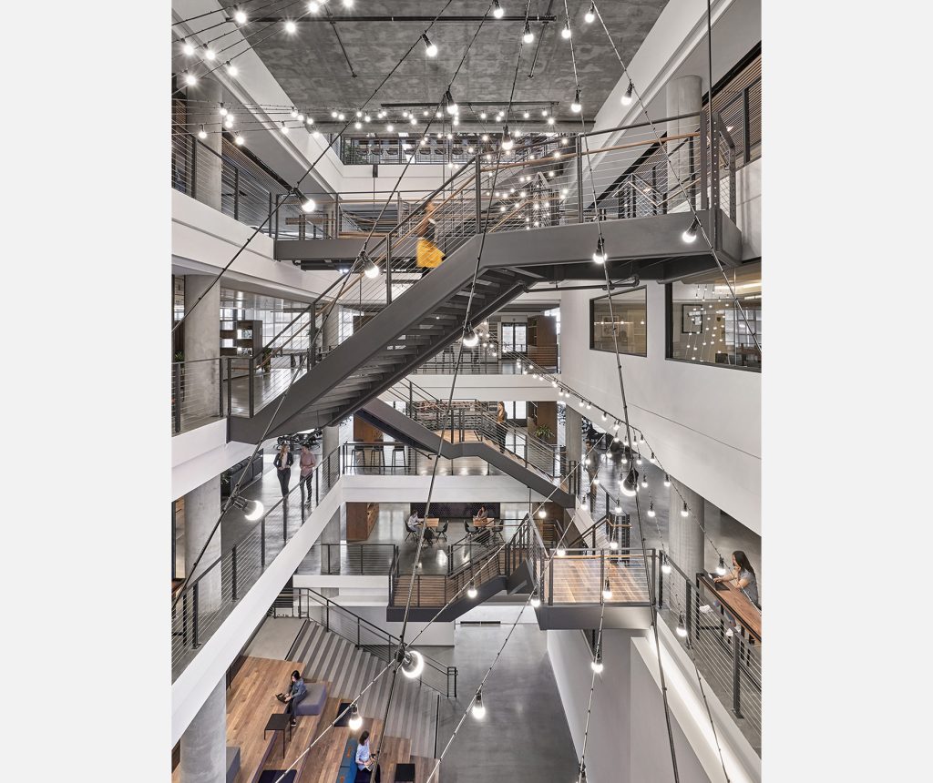
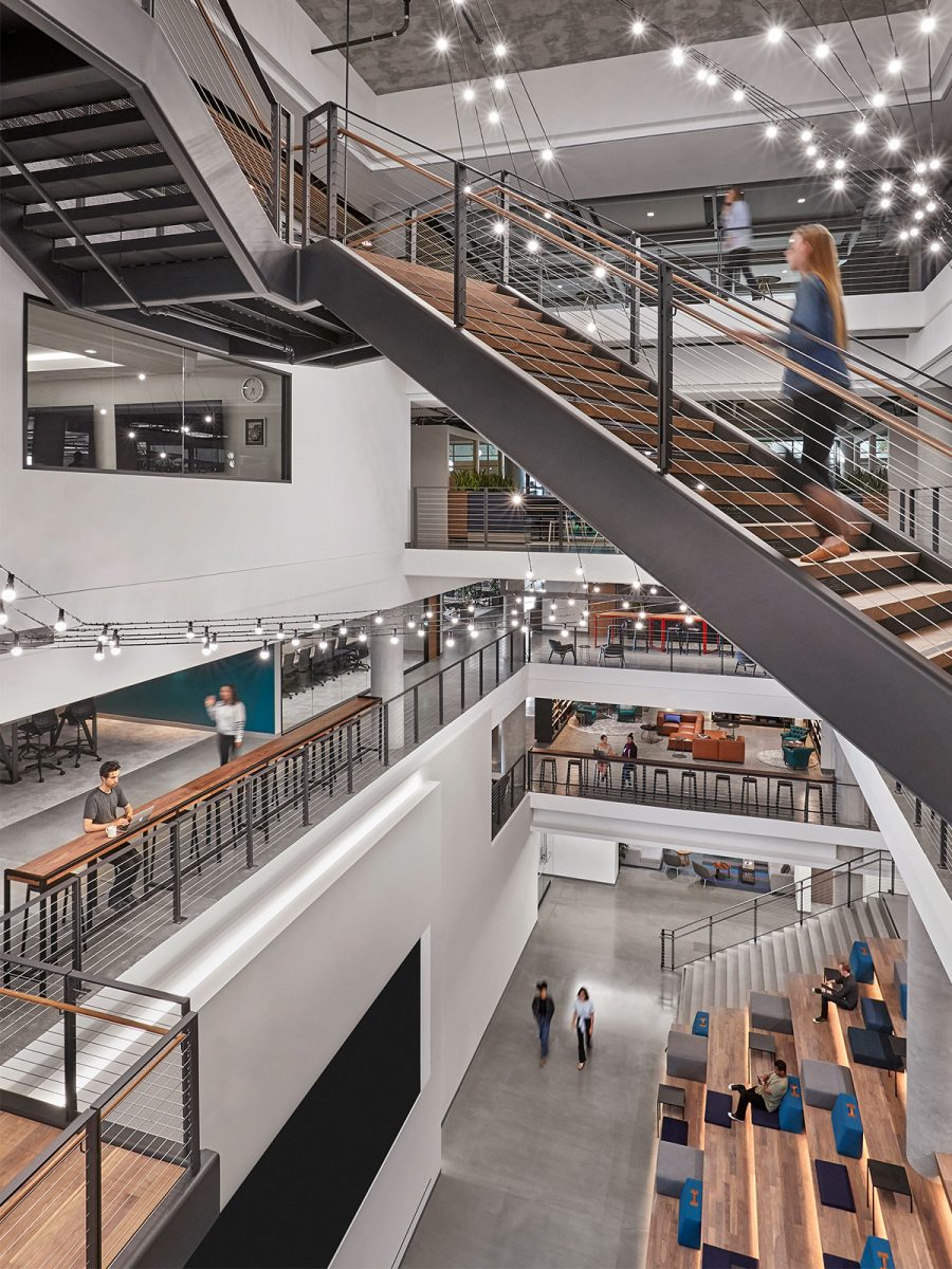
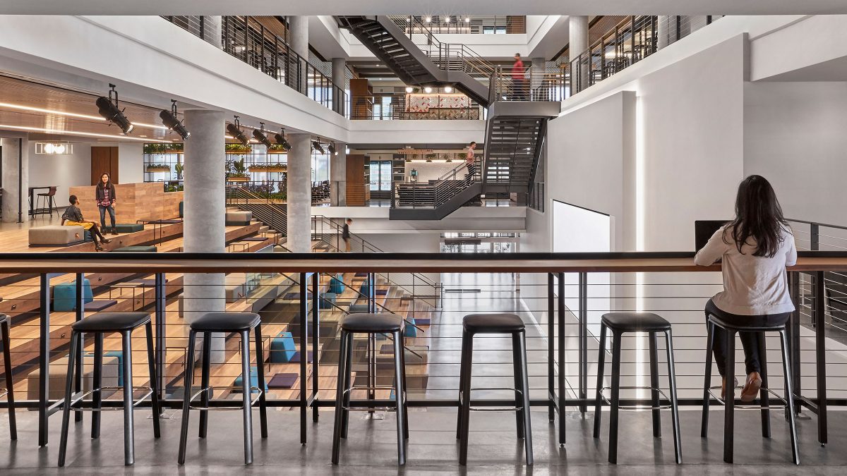
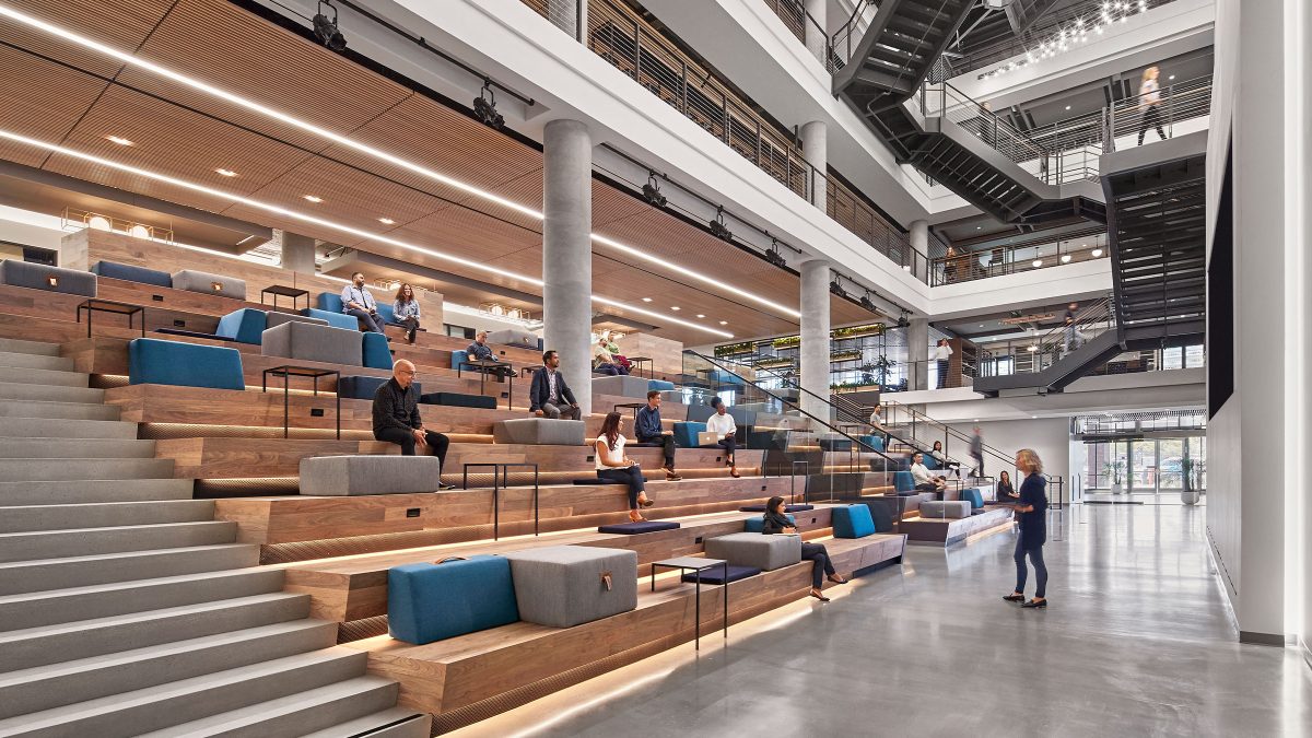
Our process began with demonstrating how the seven-story building could transform from separate floor plates and stairways into one unified workspace. As a result, the addition of the atrium, a six-story centre of activity, acts as a central artery connected by stairways. This distinct design allows all seven floors to be visually connected and uniquely branded. Hospitality and residential-focused amenities throughout the space help maintain the company’s tactile and home-like atmosphere.
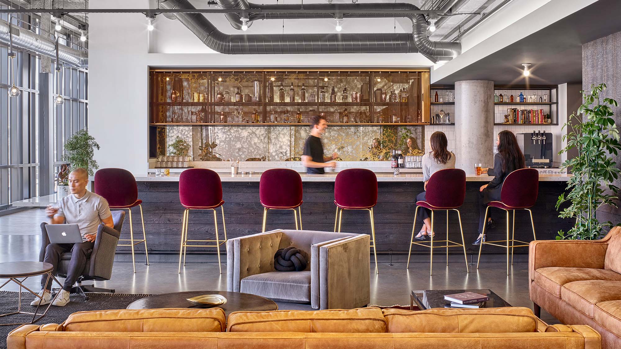
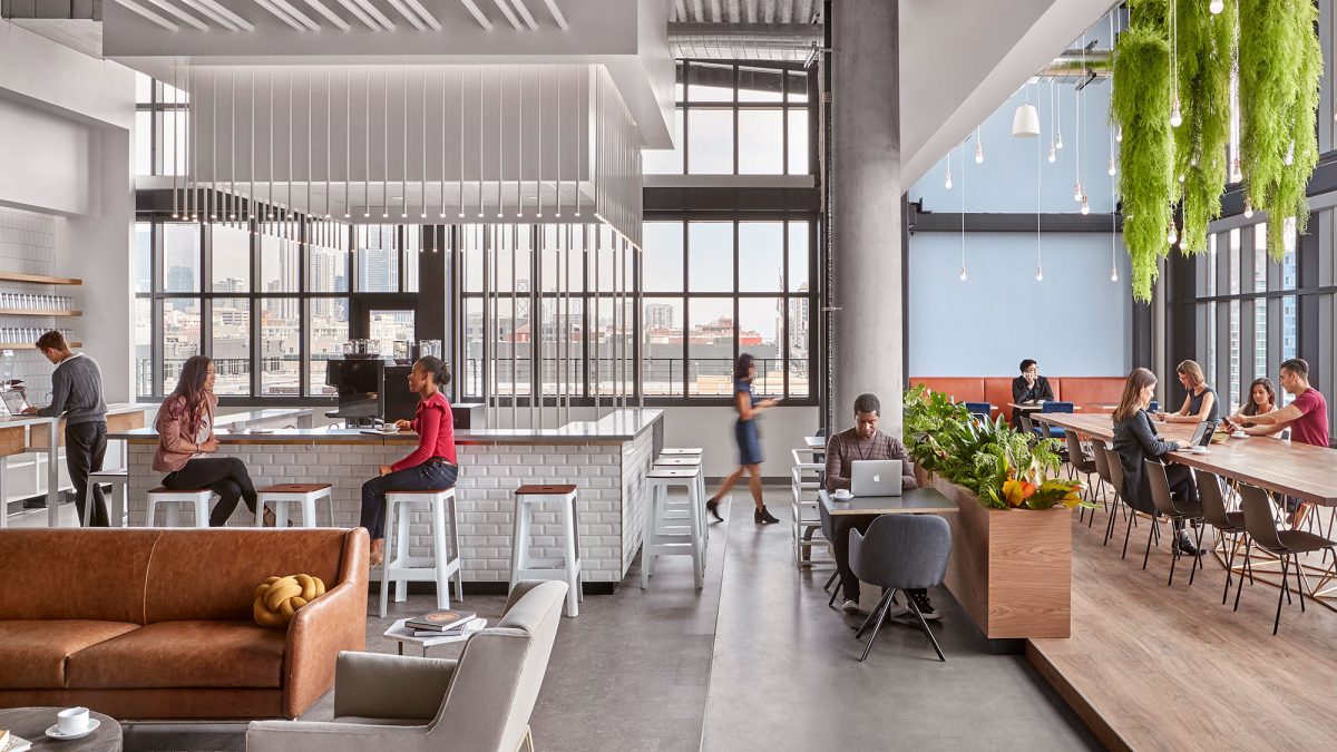
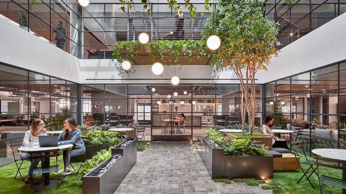
Our team conducted significant due diligence to create the central atrium that slices through six of the building’s seven floors. To summarise, the atrium design forms a spine of connectivity throughout the building. Connecting stairs and ‘nodes’ such as cafés and libraries provide opportunities for employee interaction.
Accordingly, permitting the proposed modifications required a collaborative vision of how people, fire and smoke might travel through the building. M Moser led several expediters and code consultants to help to navigate the permitting and variance process to completion.
Along with our partner engineers, we used detailed models to simulate how occupants would move through the building. The models were used to demonstrate peak flow rates. They ensured the stairways and atrium were designed correctly for their intended use: as a centre of cultural activity. Additionally, we studied the stairway and bridges for vibration, impact noise and people flow. We aimed to optimise the intended synergistic goals and create stable and safe platforms.
The atrium’s design utilises an innovative smoke control system, including operable louvres on the façade and enhanced mechanical and air intake systems. Additionally, we have incorporated a unique low-velocity fire exhaust venting system. Furthermore, concealed fabric smoke curtains deploy in the event of a fire.
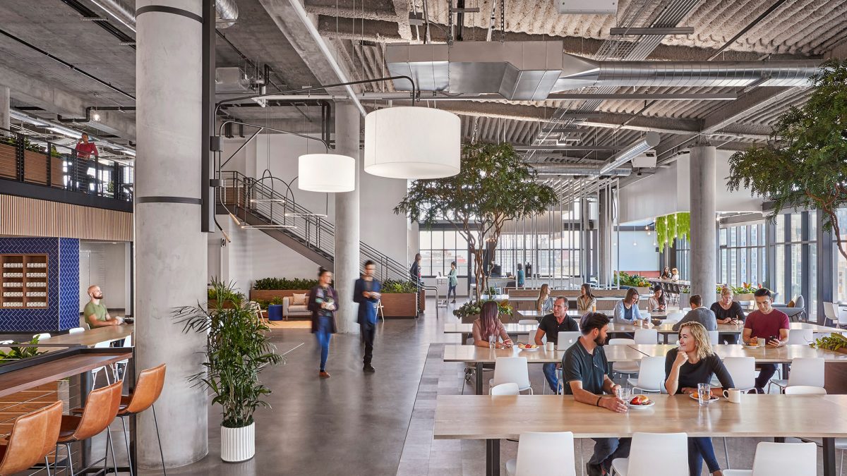
For this office design in San Francisco, the open atrium space creates views across multiple levels, increasing the staff’s awareness of each other. The experience culminates in areas above and below, including numerous cafés and a roof terrace.
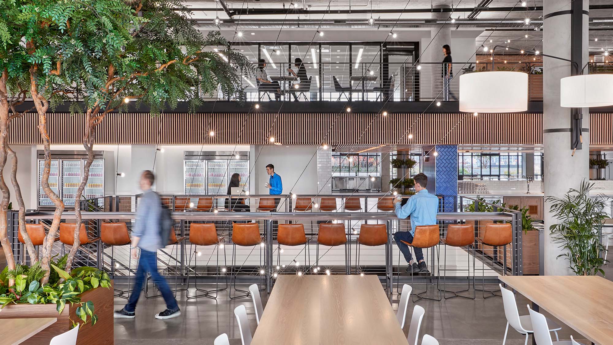
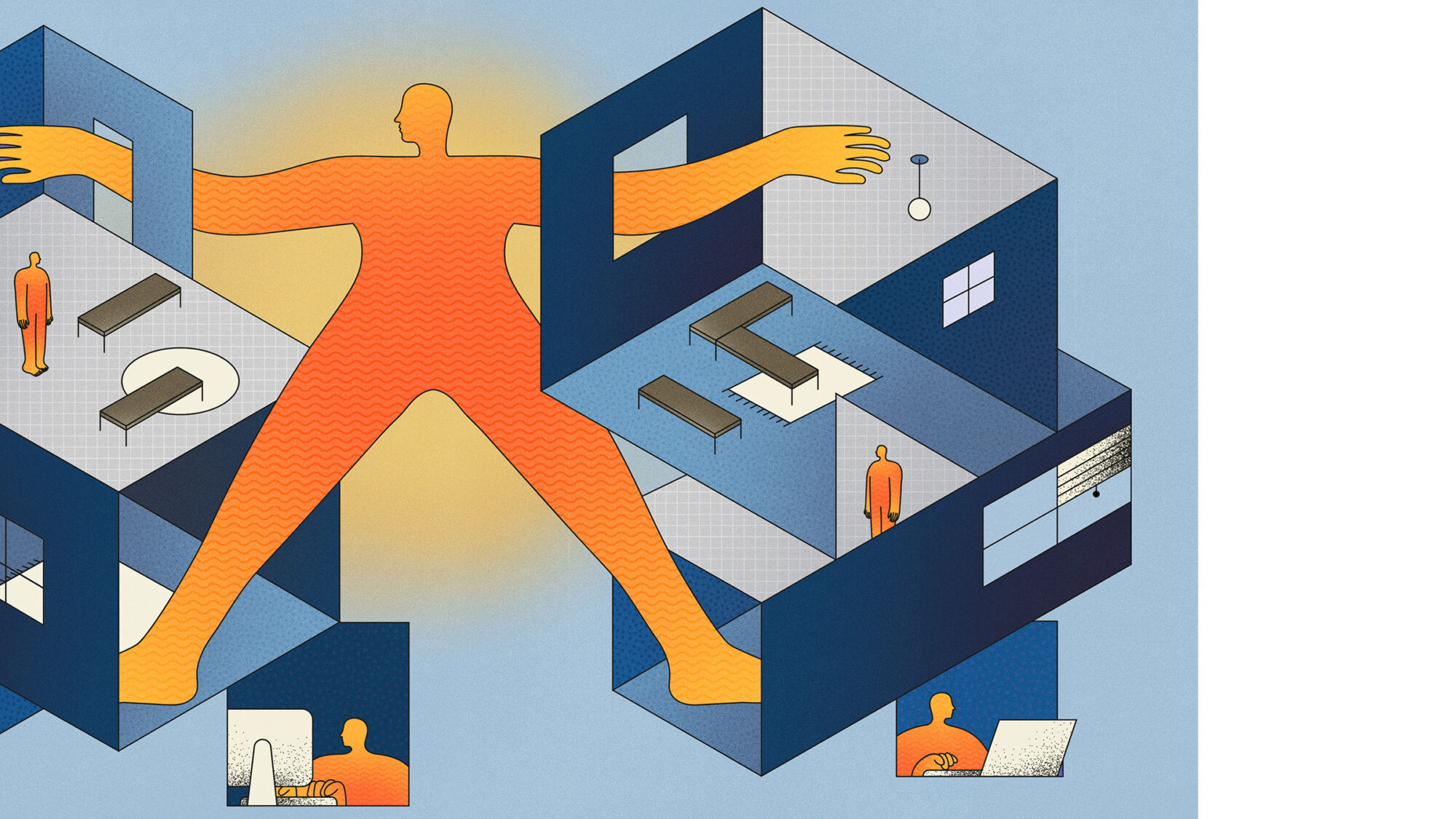
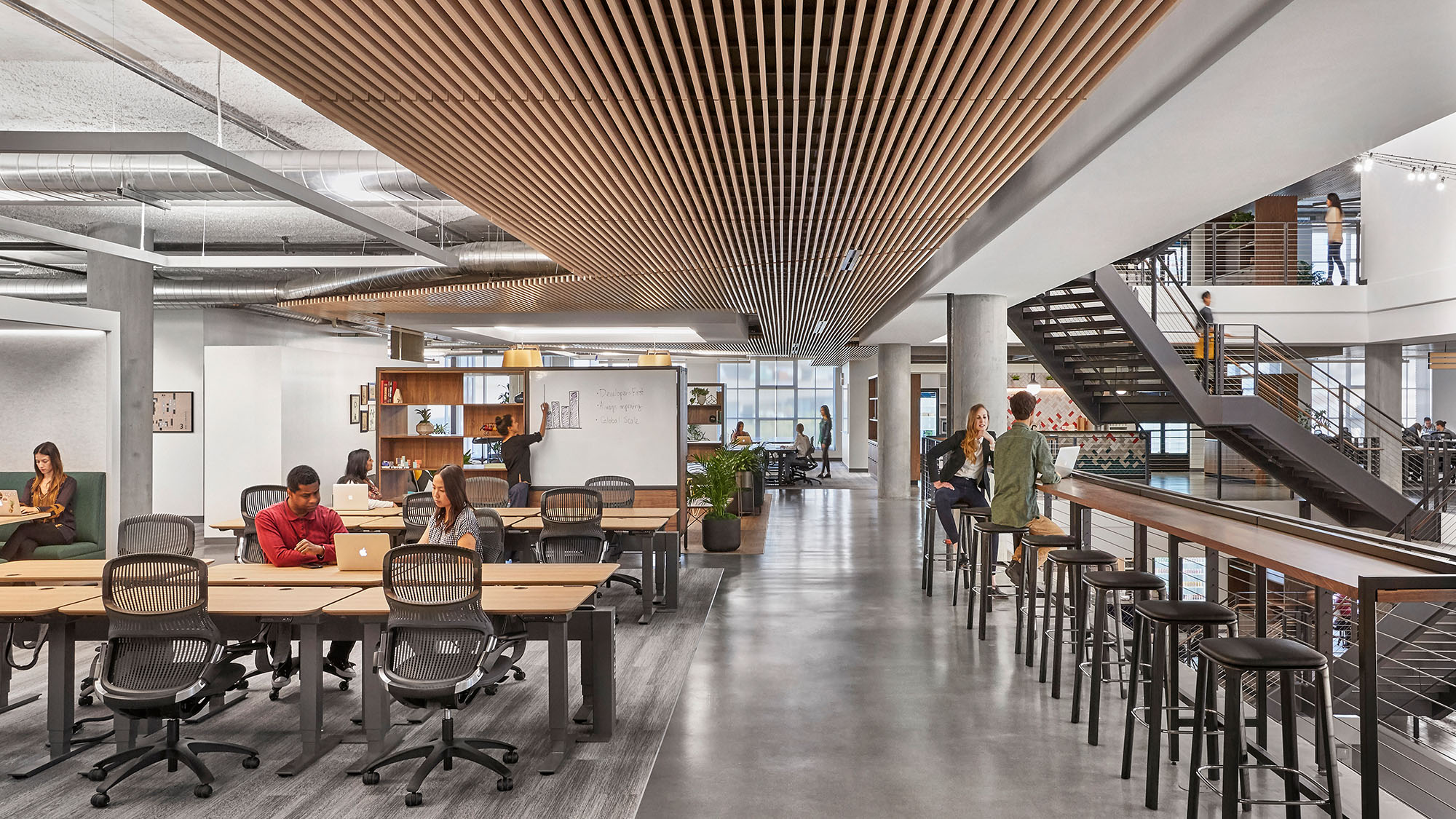
Initial studies revealed that employees were at their desks on average 25% of the time. They also strongly preferred working in communal spaces. Moving beyond traditional work zones, we introduced more modular, collaborative options for employees. Furthermore, a variety of enclosed collaboration and concentration options are available. Likewise, there are other settings to encourage flexibility and variety to meet changing needs.
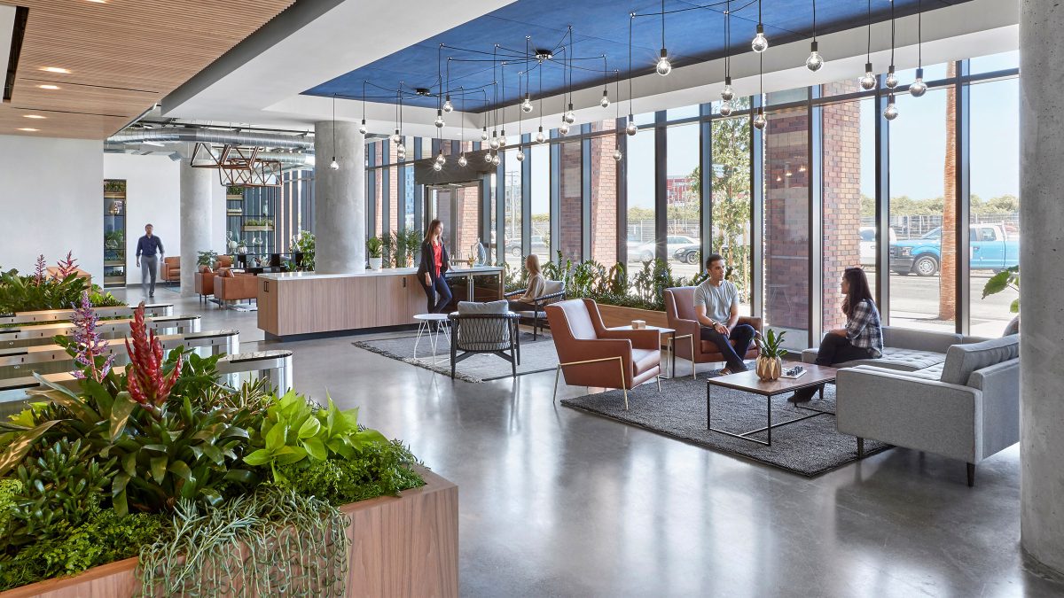

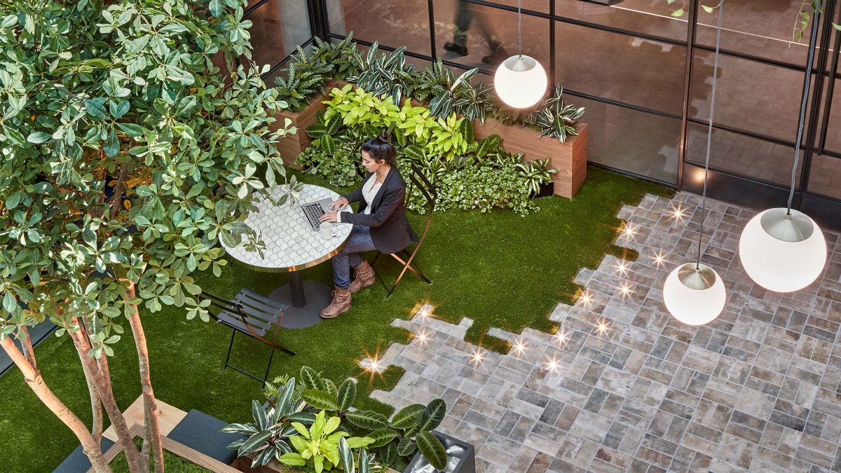
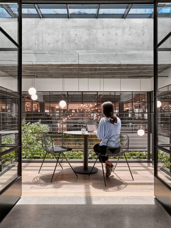
In contrast to the dramatic centrepieces, unique places like the secret garden exist. This area serves as a quiet respite for small groups and individuals. This interior garden began as the opening for the crane during construction. Instead of infilling the gaps, we left the space open on two floors as an oasis for calm and focused work. The material selection reinforces this spatial concept – with simple materials overlaid to create a layered and exquisitely detailed look and feel.
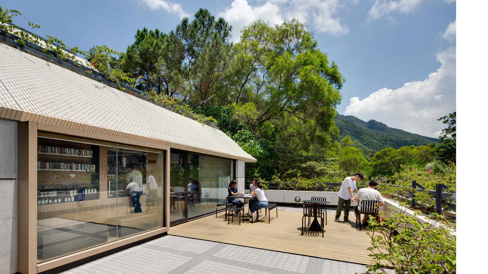
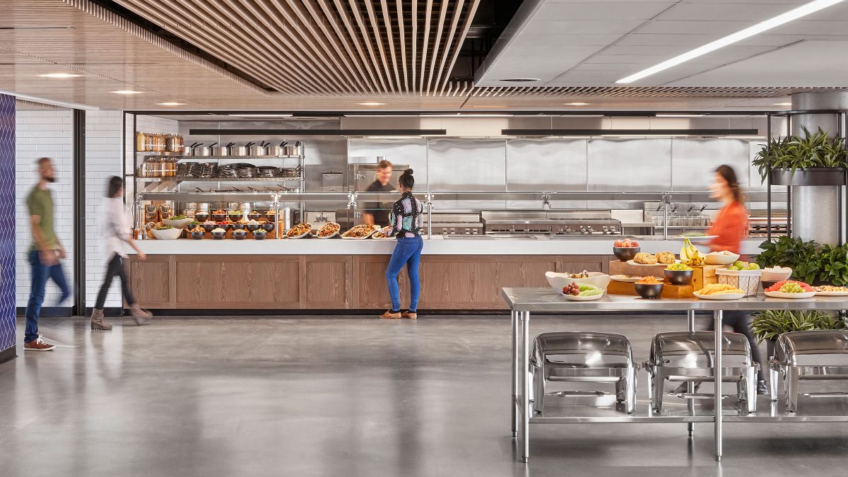
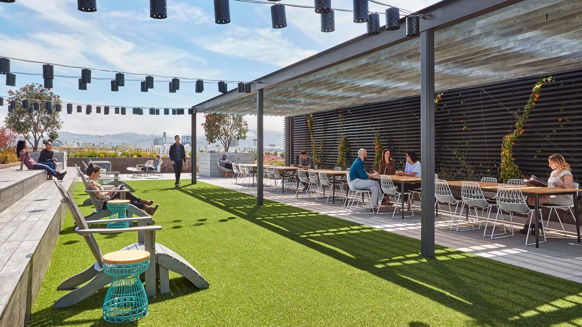
The large dining, cafe, training and amenity spaces draw the community up through the floors, allowing for spontaneous interactions. We worked with the client on designing a multi-use roof terrace. Here, staff of all departments and floors come together to share, connect and build community. This terrace also caters to larger outdoor events with a fireplace, wet bar and lounge seating.
Overall, our architectural office design in San Francisco enhances company culture and sets a global workplace standard. Beyond this flagship space, M Moser has continued to collaborate on projects around the world with the client. We integrate our practical knowledge and apply learnings to refine ambitions and team communications.
Completed
2019
San Francisco
320,000 sq ft
Garrett Rowland