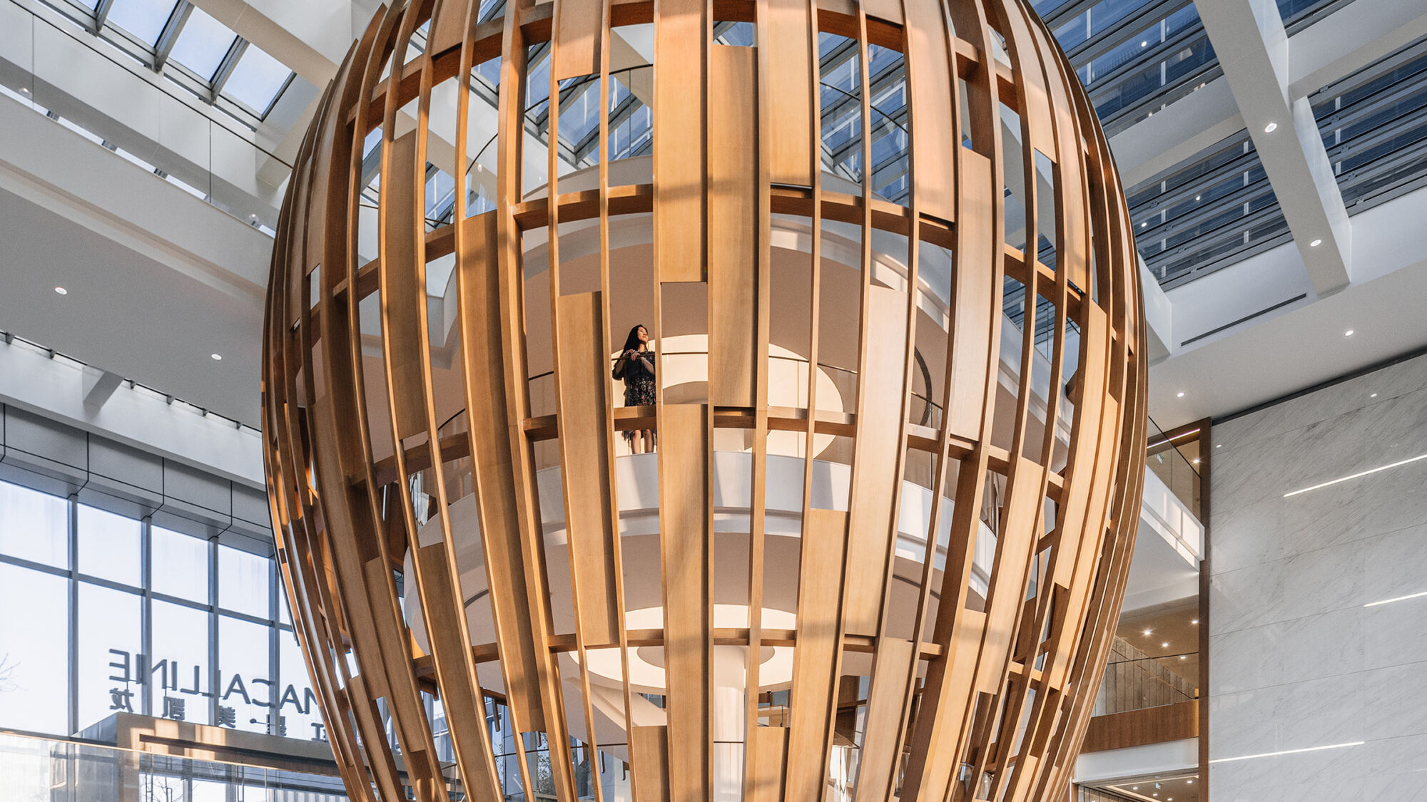


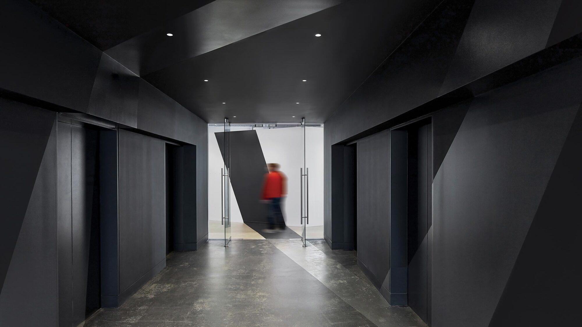
Saatchi & Saatchi is a global communications and advertising network. For its New York office, the agency needed to consolidate multiple business units into a single floor, united by a new design that was edgy, modern and reflective of the creative brand. We assisted Saatchi & Saatchi with evaluations of densification strategy and creating a new open floor plan office that provided a series of collaborative spaces.
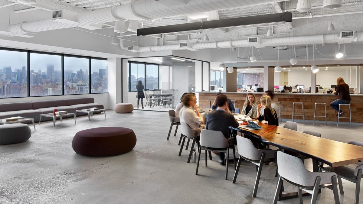
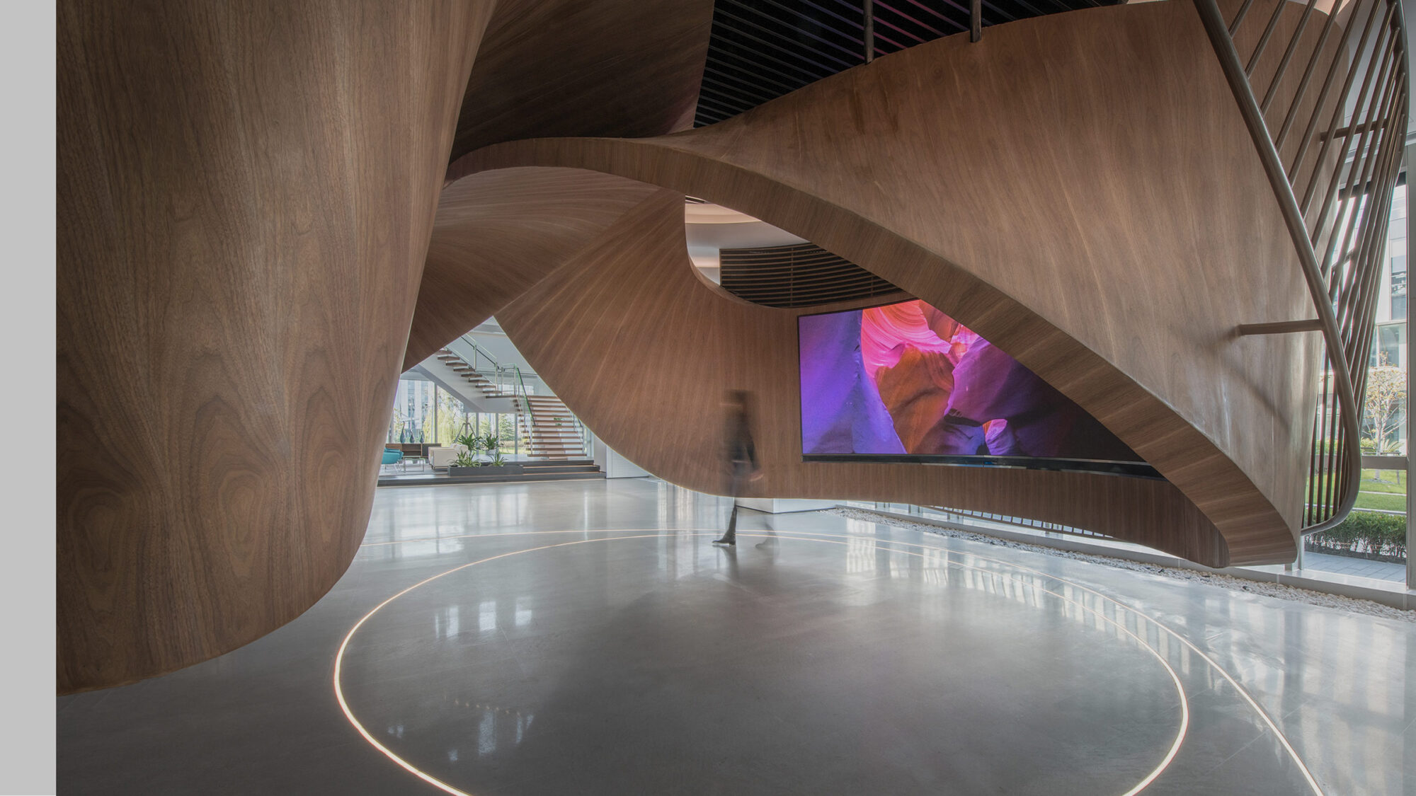
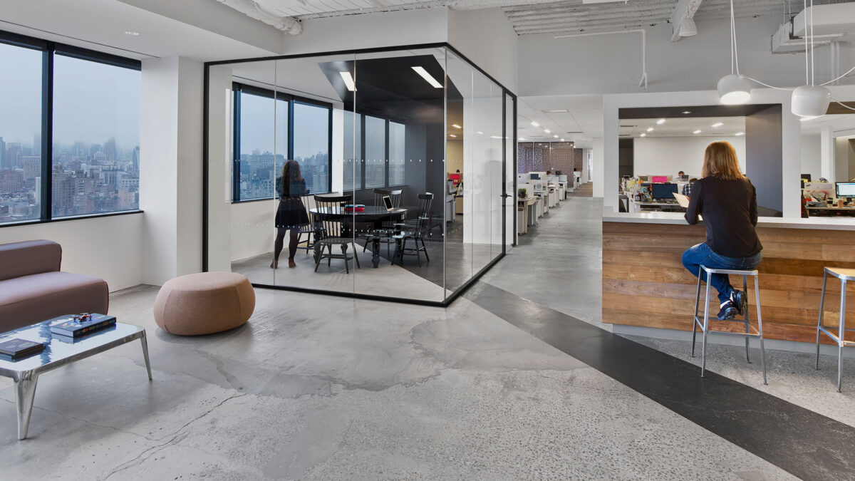
The overall goal for the new space was to bring teams together in a way reflective of Saatchi & Saatchi’s creative brand. It needed to feel modern and innovative. To achieve office densification and flatten the hierarchy, we removed all executive offices and moved the C-suite into a new, open-plan workspace.
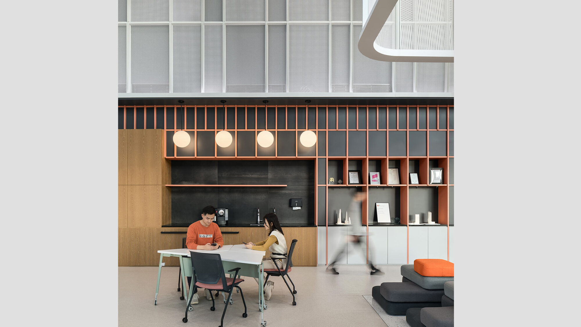
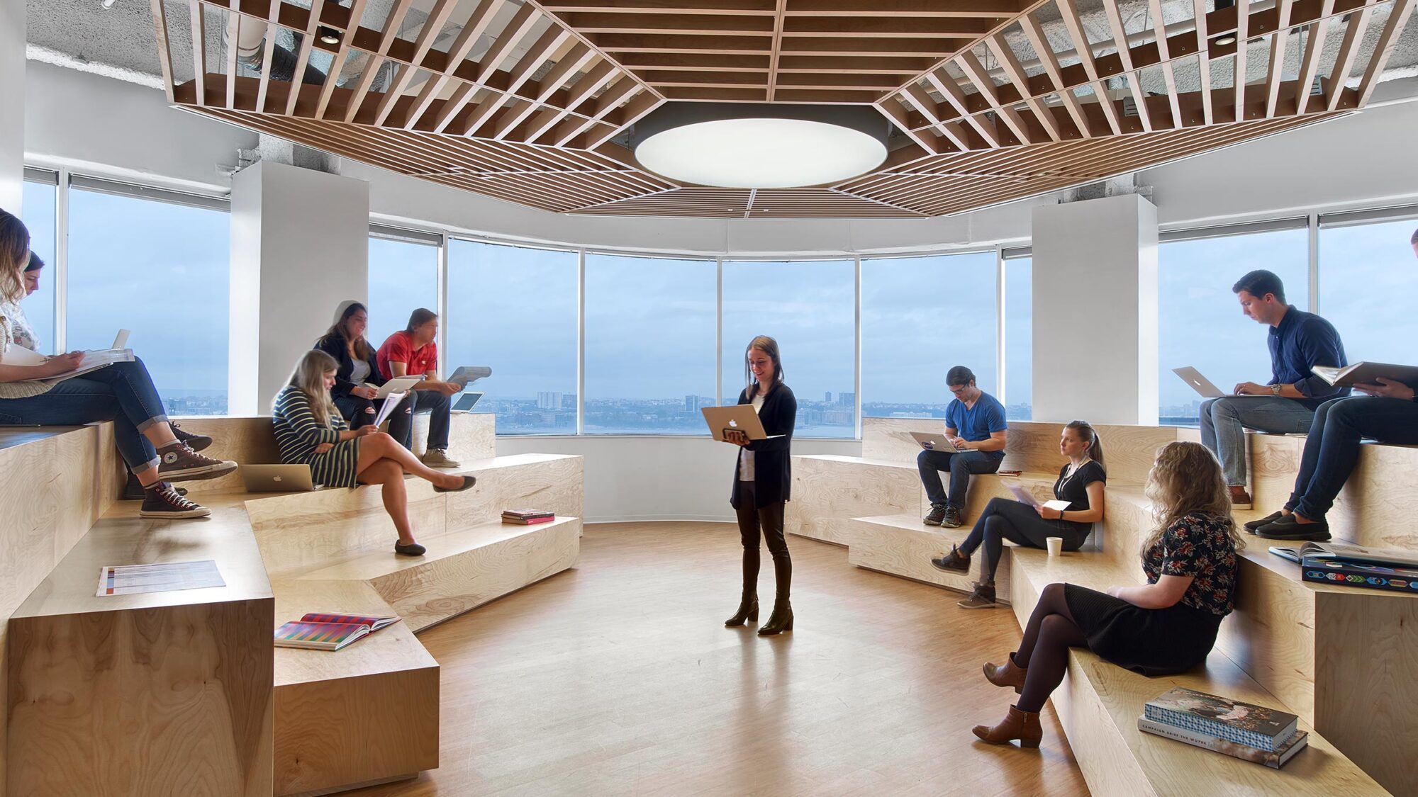
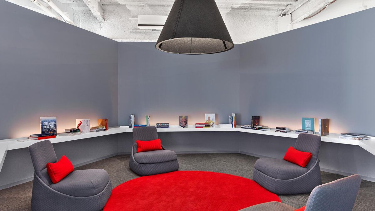
A variety of breakout spaces and circulation areas inspire staff to work and interact casually and in creative ways. Shared conference rooms and meeting areas are dispersed along the perimeter to balance the layout, while providing acoustic privacy.
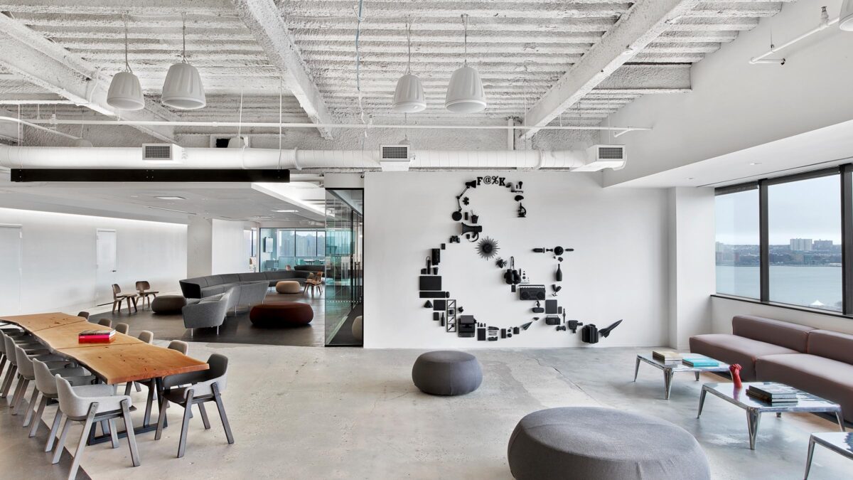
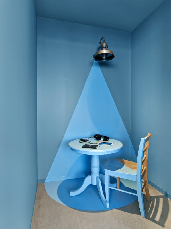
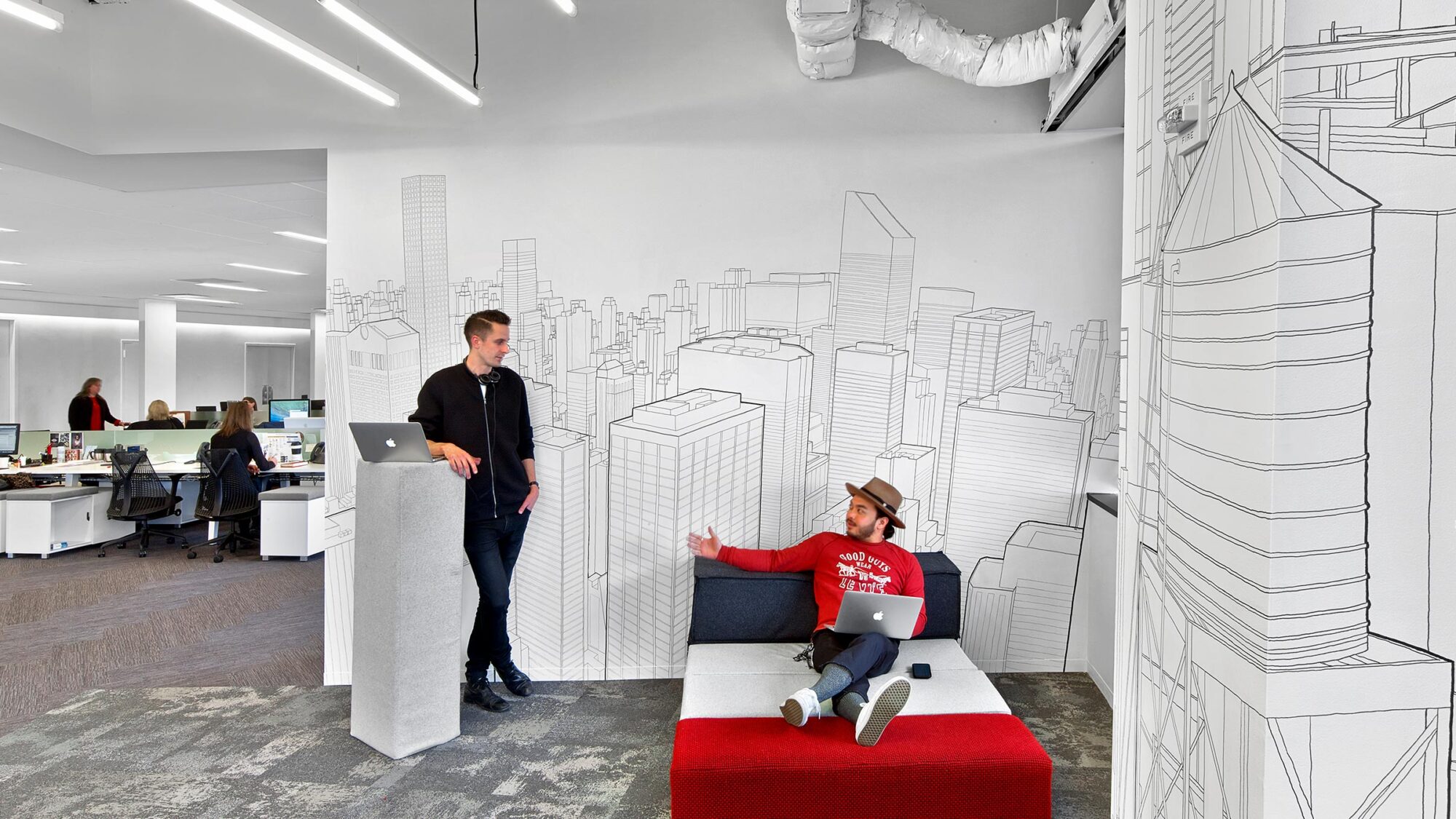

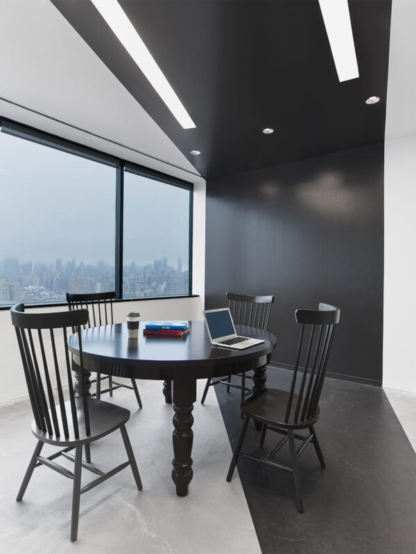
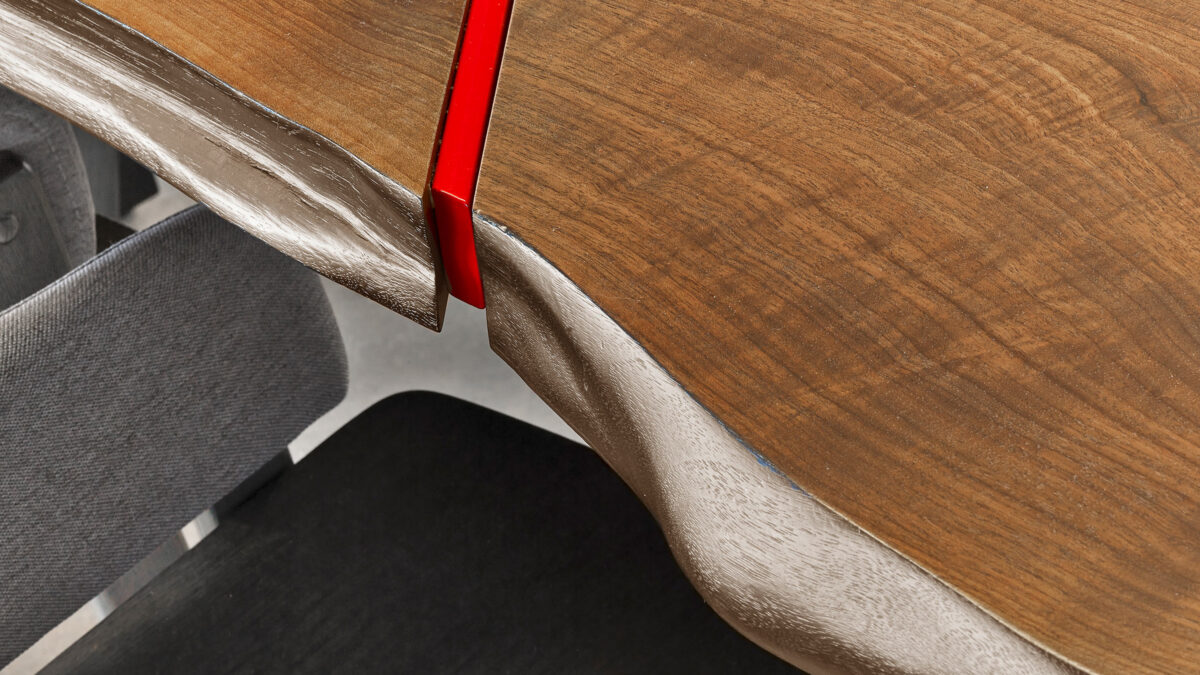
The design reflects a cohesive realisation of the brand by keeping the space as neutral as possible. This gives end users ample opportunity to pin up creative work in process. A neutral palette serves as a framework for the agency’s creative work, allowing brand identity to become the focal point.
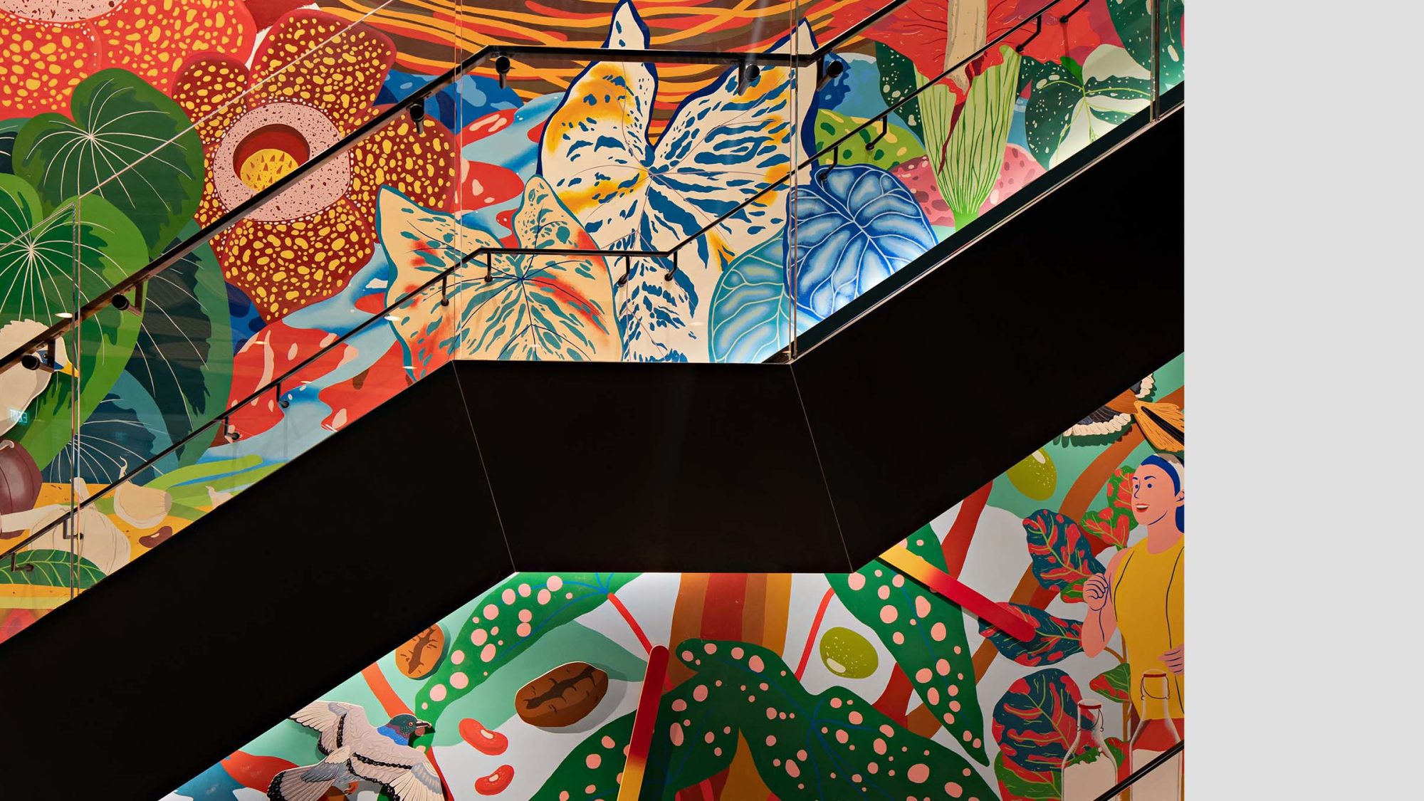
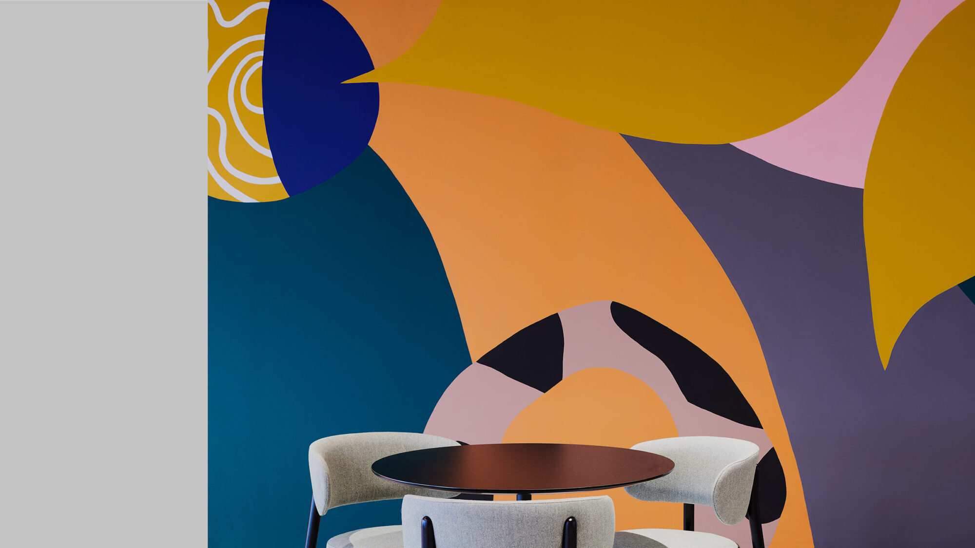
Many design decisions were a collaborative effort between M Moser and the Saatchi & Saatchi creative team. For example, a prominent design feature in the space is the Saatchi & Saatchi ampersand wall mural, which is composed of objects that help tell the brand’s story.
2017Architizer - Special Mention
Completed
2016
New York
44,200 sq ft
Eric Laignel